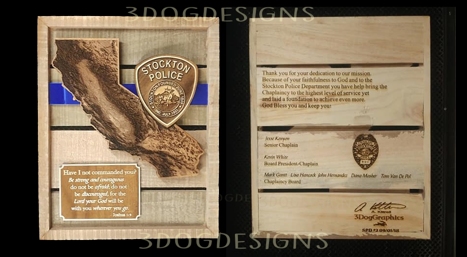
Variation on an earlier theme for a repeat customer. I never tire cutting the CA topo map though and I now have it in about five different versions. (Wanted just the right burn color/wood combo.) With just the right setting I can get really great detail in the Sacramento Valley. 
37 Likes
Your plaques are just amazing! The high standard of excellence to shoot for.
Poor California, it’s getting a bit too much burning right now, but I know that’s not what you meant.
3 Likes
I love it!
1 Like
Love the design. Very well done.
1 Like
Great share. I am in need to two retirement mementos and just can’t seem to narrow down the choice. I like the mixed materials and the use of depth in the design. Not just the 3D topo, but having different layers. Certainly makes a difference in bringing attention to the details and not just having the award sink into the background wherever it is placed.
3 Likes
What an absolutely beautiful plaque! I do various items for my local PD so am very interested in what you did  Where did you get the design for the topo map of CA. I’m in TX. Thanks!
2 Likes
That is a very meaningful piece. I especially liked the blue acrylic bar ( I think that’s what it is). I really hate to point it out, but you have a typo, in case it is important to you (“you have help bring” vs “you have helped bring”). I wasn’t going to mention it, but some people would want to know.
3 Likes
No worries about mentioning the typo! I appreciate the feedback. The message was sent to me and I asked if they wanted me to correct anything or if they wanted it word-for word and they said print it as is. It bothered me too lol.
3 Likes
Really cool plaque! They will be thrilled!
1 Like