I don’t know how clear-matte spray finish would adhere to acrylic, but that might be an option. There are a variety of translucent vinyl films that could be applied after cutting, for a tinted or frosted-glass look, but I don’t think that would allow the clarity you would want for the whole “floating image” look.
I know that when framing art, the step up to anti-glare glass is a considerable price hike, I have not personally come across anti-glare clear acrylic, but it could exist…?
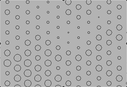
You can adjust the raster size so that the circles do not overlap. (0-70%) works well.
The easiest way to create depth and contrast in an acrilyc project it to leave the front face alone. You could use an anti glare film or spray that you would apply to a TV or computer screen to stop a mirror like effect unless that’s what you want. There have been a ton of hologram like work pieces made using an infinite light box design. An outer transparent but reflective surface is used then some lights behind it and then a mirror as the back drop. What you get is seemingly infinite depth out of something no thicker than 2 inches. But back to the original message. If you etched the back side of the acrilyc with your design then painted the back after with an automotive grade paint. Something with reflective properties . Lit it up after that with an oled strip ftom the bottom side. You would get an amazing effect where it would look like the logo were floating in thin air.
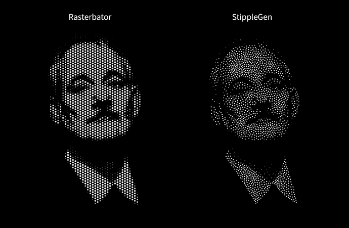
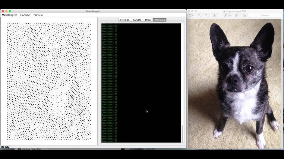
Something like Stipplegen or Makelangelo can produce more organic results than a halftone screen will give you, albeit at the cost of time.
But you still have the problem of overlapping circles, at least in the example of the original post.
Overlapping circles aren’t inherently bad. They blob together to form larger shapes, which may well suit your design aesthetic. It’s floating circles in a sea of holes that we need to watch out for, because that kind of detail is physically impossible to maintain without some kind of supporting material.
Regardless, most of the workarounds listed above apply here just as effectively. Tweak the settings, and your initial design, until the results are acceptable.
I didn’t mean to imply that that this software would offer fewer challenges than a halftone approach. But it may give you a more visually pleasing and easier to read result.
Agreed. Thanks for the link. It will depend on what you are looking for and the source artwork as well.
Here is a comparison, each has it’s own merits. Litchenstein vs. Seurat
StippleGen looks allot more 3D and defined then Rasterbator. Maybe it is just the settings but I do like the effect.
I don’t entirely understand what’s changing between each iteration, but letting it run for eight or nine generations seems to hit the sweet spot in my tests.
Here’s a video demo of the other program I mentioned. It won’t load images on my system, but it looks otherwise promising.
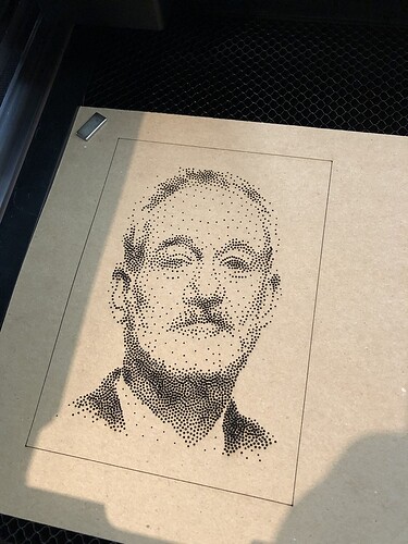
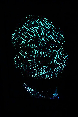
Coming back to update post. I finally got to print out one.
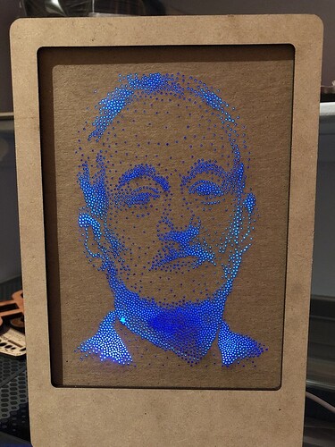
It will go into a light box gobo thingy that I am working on. It has a wemos in it so I can change it and update wirelessly.
I forgot to reverse it. I need to redo it so it will look less creepy.
That’s an amazing effect. What are the bag o’ parts for the lighting effect? I have a home theater that I would love to adorn with similar art. Really cool.
I was writing it up over at instructables, but missed the deadline for a LED contest. Still need to finish it. When I do I will post a new thread in the “made on a glowforge” category.
