It was interesting to work on, and went well but not without issue – I’ll probably revist and refine this some time in the near future.
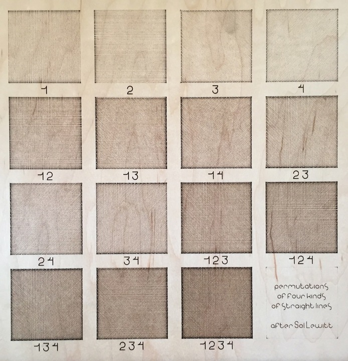
Above is the finished product of a 90 minute laser job last night. Almost entirely scores – about 1700 or so lines that make up the body of the work – along with an SD engrave for the numbers/text and a single cut around the perimeter of the piece.
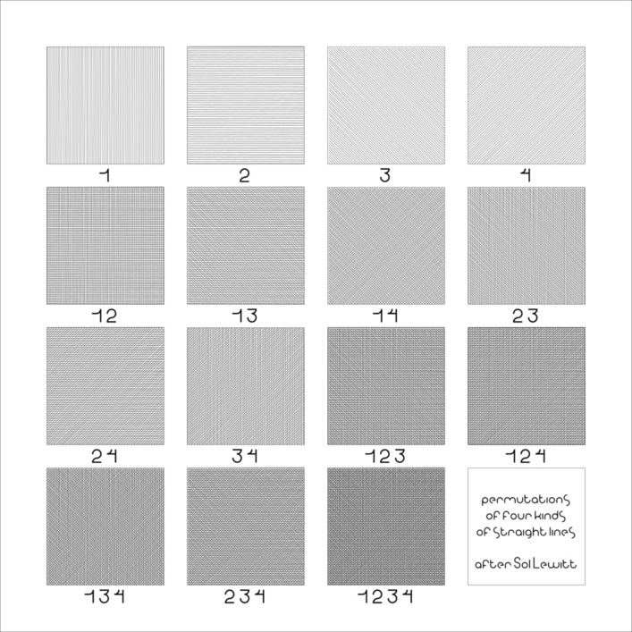
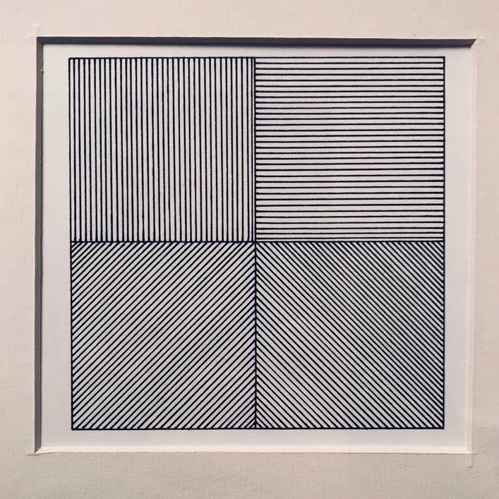
Here is the .svg from which that was derived, created in Inkscape, once again using my own custom typeface (which after some recent discussion elsewhere in the forum I think I might try to revisit soon to product a single-line version of, which its already well suited for).
The key bit of this was producing those sets of parallel lines. I wanted to capture something of the organic nature of a person drawing lines by hand, even though I was using a precise mechanical toolset to generate it.
LeWitt’s approach to drawings in this style was to (a) describe the concept of the specific piece of work and then (b) have that concept executed. So there’s the core idea itself – of parallel lines in various directions – and then the draftsman at work, whose lines would inevitably be imprecise, inexact, full of tiny little variances.
A very simple way to approximate that in Inkscape is to use the “clone” menu to create a set of repeats of an object, and use the “random” field in some of the options to introduce noise. So I drew a vertical line, and told it to clone 80 or so more off to the right, and for each of those asked it to vary the spacing by e.g. 10% or so, and to vary the rotation by some random fraction of a degree.
The resulting set of lines are still basically equally spaced and parallel, but with an inconsistency that better suits the hand-executed style of a typical LeWitt drawing than literally evenly cloned lines would.
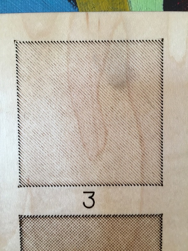
Here’s a detail of one of the individual drawings (and a bit of the next underneath), which reveals one of the most notable unintended aesthetic wrinkles of the piece: those teardrop start points on each score.
I’ve seen them before and understand it to be a product of however the GF mechanically manages the start of a cut – either the laser starts firing just before the head starts moving, or the head’s short period of zero-to-500 acceleration leaves the laser lingering around the start point longer than for the rest of the cut.
Usually there’s just a couple of those scattered among the edges of a larger design with longer, fewer, less densely packed cuts, but since the whole concept of this piece is a dense packing of short parallel individual lines the cumulative effect is a conspicuous border around the edges of each frame.
Which isn’t necessarily a problem here, since clearly defined squares is part of what I was intending, but it is a very tool-specific issue and one where I have to wonder whether it’s an unavoidable issue with how cuts start or something the GF software could route around by starting the movement for a cut/score a few mm away from the actual cut start point to get the head/gantry up to speed before turning the laser on. That extra bit of runway would add a small but measurable amount of cut time to a dense projects like this but would presumably be negligible for a less gimmicky typical cut.
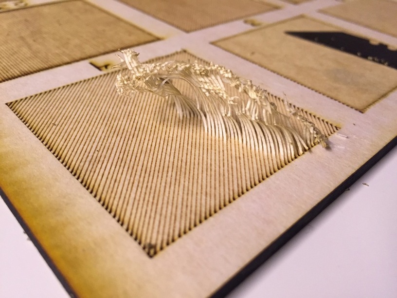
But I also found the machine was scoring both directions of the individual lines. Which I didn’t intend, but I had modified my power during testing to get the line density where it is without realizing the double-cutting was happening.
I assume that’s actually just a design error on my part – that I doubled up my lines somehow, and thus spent twice as much time cutting at half as much power for no good reason. Driving that assumption is that my surrounding boxes for each tile each only got a single score pass, which you can see in the detail led to a surrounding box that is barely there, just hinted at at the corners, because the full speed light power single score was mostly just enough to cut the masking material itself.
Of which, this was also a heck of thing to weed. Here’s a detail of one of the easier bits.
Unless my eyes are playing tricks on me, it appears that 13 and 23 are meant to be reversed, as are 14 and 34. Or given that this is art, perhaps you meant to do that and I’ve just missed the point entirely!
Either way, it’s nice to see the subtle variety of laser cross hatching, and a great design as well, thanks for sharing!
Your eyes are good – got hasty in my layout work and totally misnumbered some of the plates. One of the more significant things that’d need fixing on a second attempt, heh.
LeWitt was fastidious and straightforward about his conceptual work, and so while there’s probably some sort of argument to be made for the artistic validity of the numbering error as an illumination of the gap between concept and execution of a piece created via human mediation, it still definitely comes down to me goofin’ up.
Error is the teacher. Failure leads to understanding, understanding failure leads to success. “There is no forward progress without missteps.”
Enjoy the adventure!
Very nice! Great details and execution of concept.
My wife got me a Sol LeWitt screen print for Christmas (it’s actually a screen print from a limited edition book, which means someone cut apart the book )