A local organization in town wants name plaques for each of their rooms. This was a mock-up I did for them and they gave a thumbs-up on it. Have 9 total to make. 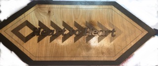
14 Likes
Beautiful design, but seems to need more contrast on the room name. White or Red/Blue maybe. Just my 2 cents…
14 Likes
Yeah, maybe it’s the lighting but they are a little hard to read. Great design though!
3 Likes
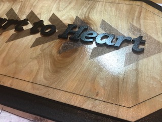
I should’ve added that I am going to make the letters much bigger as they are hard to see. I told them I was going to make the letters bigger to be seen from a distance.
Yeah, the lighting wasn’t the best when I took the pictures. I am always open to new ideas! Thanks 
1 Like
Looks great … Look forward to a photo with the larger text.
Going to engrave background lighter and increase size of letters.
I like the background fade as is. If the organization has a colour then some gloss acrylic letters would REALLY pop
We ran the organization’s color by them and only 1 of the board members liked the color. Everyone else wants black 
ah boards, so much fun lol
another option might be to score the outlines of the chevrons instead of engraving them. or engraving very lightly, but still scoring the outlines to help define them.
I’ll consider that! Thanks for the idea!