Hey folks, it occurred to me that if a stencil font on my system doesn’t have “stencil” as part of the name I would not know how to find it. For any other newbies like me, you want a stencil font if you are cutting out letters, so the insides don’t drop out. (You could always build a bridge to the inside but that can mess with the look.)
So I just went into my font listing (on the Mac it’s in Font Book) and stepped through every one of them looking for letters that are not closed in the A’s, B’s, O’s, etc. I found a number of them that I would not have found otherwise, that will give me a few more choices. Here’s my list:
Barber Regular
Blimpo Reg (except for the “o”)
Bordeaux Reg
Discotheque Reg
Fossil Regular
FuturistStencil
Portago ITC
San Diego
Stencil
Stencil Std
Stencil Sans
I guess you could get this kind of information if you have a font manager like Suitcase Fusion but at $120 it’s a bit pricey for me.
To be honest none of these fonts gets me excited. What is your favorite stencil font?
I add stencil features to the fonts as I need them (when I remember to…)
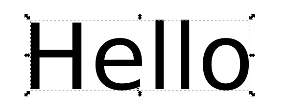
In Inkscape, start with writing in any font:
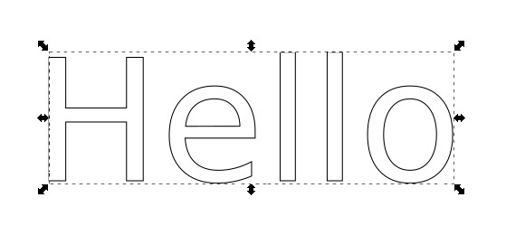
Path->Object to Path (CTRL+SHIFT+C), turn off fill and turn on stroke:
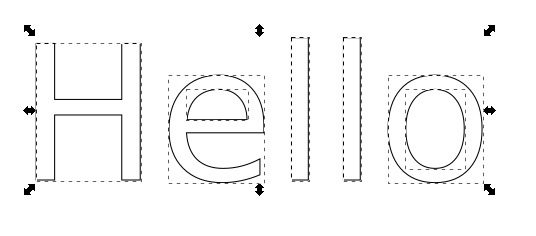
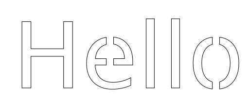
Path->Break Apart (CTRL+SHIFT+K), right click (on text)->Ungroup, select letters with voids, repeat Break Apart command and ungroup again:
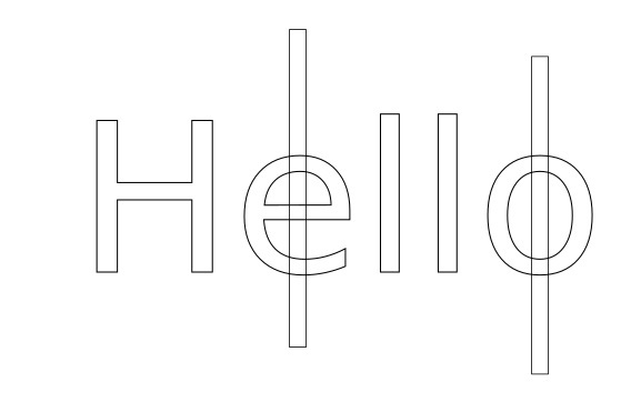
Now, the reason for this second break apart is so you can center your stencil-ization on each void. You can center on letter instead, but on some fonts that looks REALLY bad (or even completely misses the void anyway).
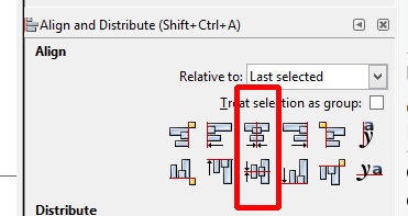
Now, make a rectangle of whatever size you deem appropriate, and center it on each void:
(Center using the Align and Distribute panel, you want to use these two options):
Now Path-Combine (CTRL+K) to recombine your voids to your letters, and then use Path->Difference (CTRL + -) to cut out the connection lines you just made (Note, I adjusted the box on the “e” so it wouldn’t cut the bottom tail):
If you lose the entire letter when doing the difference, Undo (CTRL+Z), then select only the rectangle and select Object->Raise to Top(HOME).
You could choose a specific size of rectangle based on the font you selected (A copy of the lower case L would have been a good choice) to make this consistent every time you design a new file. The size of the rectangle was really the only thing I did in these steps which is not consistent every time you sit down to re-attempt the process. Every letter in a given project will look the same because of the copying of whatever rectangle you use and centering alignment.
I think it depends on the application. I wanted something that looked “army”. Other times I need something to cut quickly on my silhouette to spray paint some lettering.
Thanks for the detective work. One other font challenge are letters that are attached at the bottom only, so instead of a stencil, they are a cutout. Not sure what you would call them. For example, a lower case “i” is no problem for a stencil, but an upper case “A” is because it has counters. The “i” is problematic because on a letter attached at the bottom, the dot would not be attached. So, as @jacobturner noted, you can bridge those gaps, but I’ve yet to settle on a font that would work without some manipulation. So when I cut out name plate silouettes, I have to do some work with some of the letters to keep them attached or use something like Copperplate and only use magiscules.
I don’t know if anyone still follows this thread, but I’ve been trying to figure out a way to do this all day. I am in Inkscape trying to follow the directions very carefully, but when I get to the “Difference” step it usually ends up just deleting the letter and leaving behind the rectangle I added.
I’m not an Inkscape user, but what you are describing happens in Illustrator if the rectangle is on the wrong plane. Try putting it in front of the other figure if it’s currently behind it, or put the rectangle behind the figure if it’s in front of it. Then try Difference again.
Yeah i saw that the other day…you might need to Ungroup first and take it one letter at a time:
1: Create your background shape. (Make sure it has a Fill Color and no Stroke.)
2. Type the text.
3. Convert the Text to paths. (Path > Object to Path)
3. Ungroup the text. (Object > Ungroup) (Make sure it has a Fill Color and no Stroke.)
4. Place the text over the background shape.
5. Select one letter and the background shape. Click on Path > Difference.
6. Do that for each character to subtract it from the background shape, one at a time.
Step 1 in Jules’ process is very important. Inkscape subtracts the most recently created object from the older object when you Difference. This drove me crazy until I found some documentation about it. “Why not subtract the one I select second from the one I select first?” It still drives me crazy sometimes, but at least I know why I it’s not working.
Inkscape only does its path operations (union, difference, etc…) on things that are paths (that includes basic shapes like rectangles that haven’t been converted to paths). When you select two items for one of these functions read the text at the bottom of the window, if it says something like “2 objects selected of type Group in layer…” you have to do some ungrouping first. You want it to say “2 objects of type Path”. And yes, it is very frustrating that when you go to Path->Difference and nothing happens the only hint you get at what is wrong is at the very bottom of the window, aka the text you never, ever read.
In many cases, this is correct, but not always. It has to do with the Z order of the objects. You might have made an object more recently, but then ended up shifting it lower or to the bottom. So the difference would subtract the older object from a newer object because that’s how the booleans are applied.