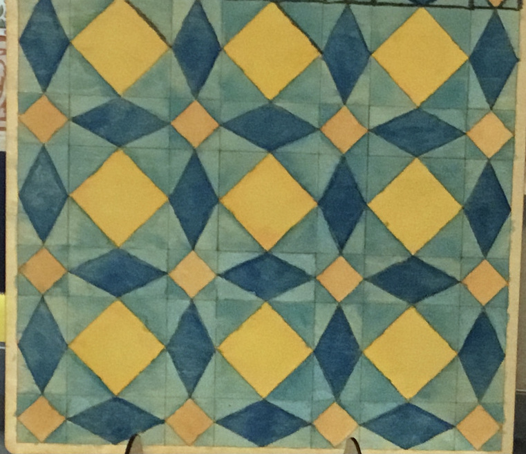
Photo doesn’t show the depth of colors–I used watercolors for the blocks, and a dark grey Sharpie for the lines. [Seal the wood FIRST!] Now it just looks OK, but it’s done.
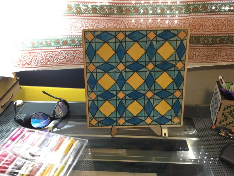
I drew the design in Illustrator and exported as a pdf. Cut out the panel and scored the lines, then painted everything. The nice thing is, I now know how to do this much faster on the next one.
I don’t so much dislike the black, but that they are too heavy for the rest of the design. The sharpie really soaked into the wood a lot. Had I used a dark blue instead, the drama of the shapes would shine more than the drama of the lines.
Thank you! I will probably make another, akin to a “coloring book” board. (Owner paints the elements in their own preferred colors.) I also want to explore other quilt blocks…you know, all those quilts I dream about but will never get around to making! Plus, I can have quilt wall art that doesn’t take up the real estate of a bedsheet.
OK; black lines win…I’ll make another one with thinner versions of the lines. Maybe instead of black, it will be a dark blue. That would minimize the heaviness of the line and tie them into the rest of the motif.