Inspiration, move me brightly.
Maple, figured walnut
I received a commission for “a Grateful Dead themed box”. I was told “Whatever you make will be great”. Hmm, ok, gauntlet thrown. Here’s what I did.
Notes:
- All woods 1/8" non-PG hardwoods, no ply.
- Finished in wipe on satin polyurethane.
- Sanded to 600 grit.
- Overall dimensions 5.5" x 5.5" x 4.2"
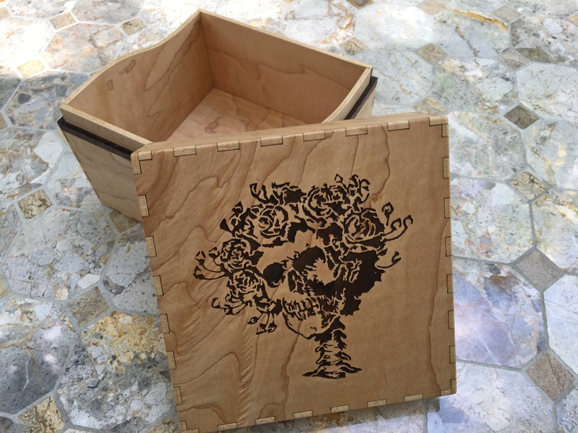
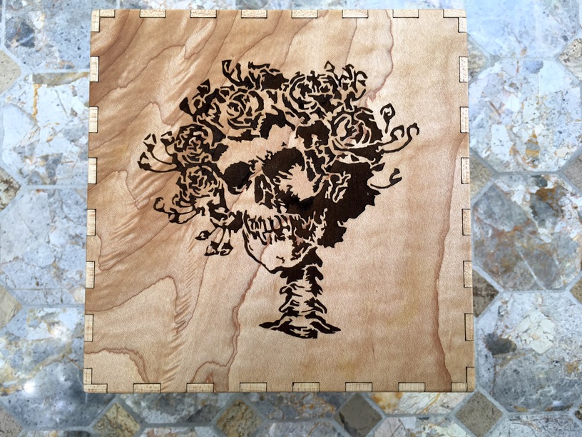
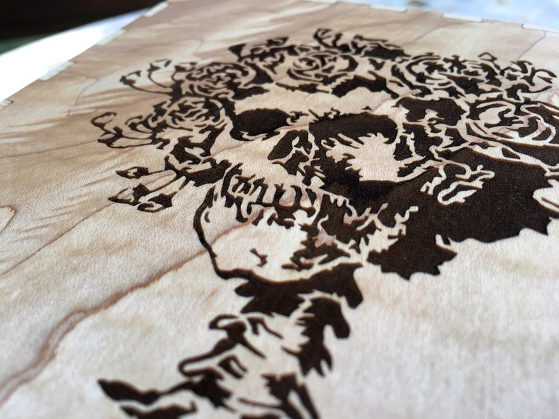
The design was supposed to have two Dead-themed engravings on the lid, so the decision was made to use a light colored wood to get sharp contrast. Maple was a natural choice, and I happened to have some really nice figured stuff on hand. Bertha was an easy choice for the top of the lid…
Maple
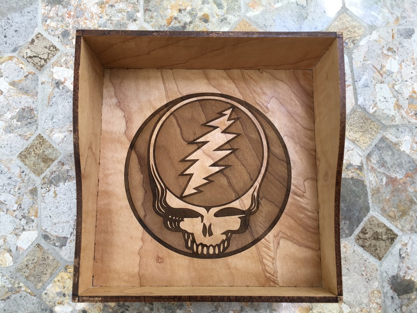
And Steal Your Face was the request for inside. I’m particularly taken with how the grain came through on the lighter-engraved parts of steal your face.
Maple
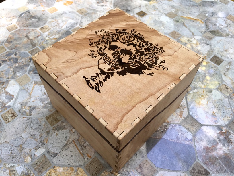
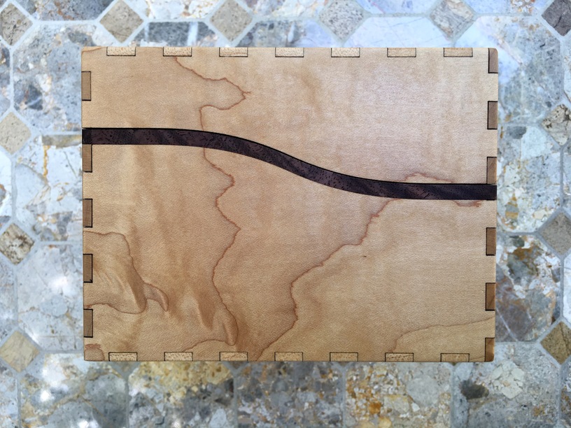
The 3 quarters view starts to show off the accent line I did with walnut. I felt like it looked good as monolithic maple, but the walnut strip would add some sense of intent to the design that was missing otherwise – the ornamental seam got lost otherwise.
Maple, figured walnut
Speaking of that walnut accent… My figured walnut stash never fails to impress, it is just an unexpected look.
Maple, figured walnut
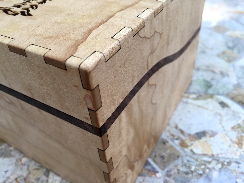
I hand-rounded the corners with a sanding block. I wanted to go with a fairly sharp corner, and knew I wouldn’t be removing too much material. In order to prevent overly dark “finger tips” I cut the finger a full 0.02" too long and sanded them flush. The end result is a fairly low-contrast tight-radius rounded finger joint, which was my goal.
Maple, figured walnut
Bertha, you don’t look so good. Oh also, I learned that the skull in the dead logos is named Bertha. (I’m not a deadhead by any stretch) Also TBH I think Bertha looks great here, it’s easy to get immune to what the Glowforge does but this is a really pretty engrave in person.
Maple, figured walnut
The inner sleeve is just that, I didn’t double up the bottom. I cut the inner sleeves to fit flush with a slightly looser finger joint kerf adjustment (0.004" instead of 0.006" as was done on the rest of the box). I did that just to make assembly simpler.
Maple, figured walnut
Speaking of kerf adjustment: I did kerf adjust but then I also intentionally put the outer faces “face up”. By nature if you arrange the top surface of your cut pieces facing outward, you will get a thin gap between the pieces. This was by design – it’s very difficult to get the gaps consistently to zero, so I decided to lean in and ensure that there were gaps everywhere, as I knew they’d be quite visible on the light maple. Rather than fight it, it seemed easier to make it consistent and therefore look intentional.
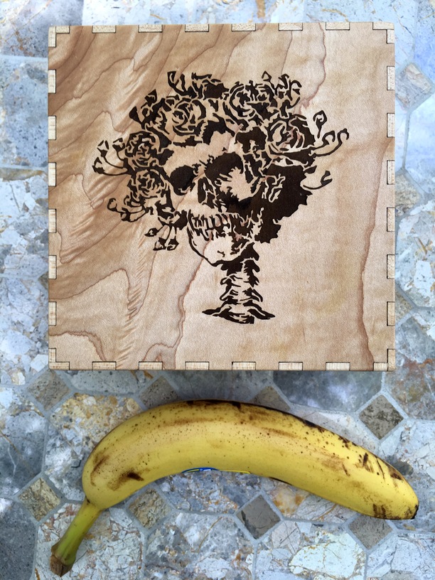
Maple, figured walnut, the almighty scale banana
Final notes:
I’m happy with the end result. Of course I could have decorated the box even more, but in the end I am still a fan of “simple concept done well never disappoints”. At its core this is just a box, but hopefully the engraves and overall composition and finish are well-received. I think they will be.
EDIT - oh yeah shout out to Kim Oberlin, whose hardwoods are affordable and high quality. Previously on the forum here:

