The Door Bell Chronicles (a.k.a. Learning the most basic lessons all over again)

So I made something, and I think its pretty cool… However, I made some pretty stupid mistakes…

Here are my lessons learned while trying to make this doorbell mount:

This was a super fun little project that was actually something that has been waiting for our :glowforge: to arrive for about 3 weeks.

See… Three weeks ago we decided to upgrade our doorbell, its an awesome doorbell compared to the old school manual ringing door bell we had that didn’t work anymore. :slight_smile:

One small problem the new doorbell button was actually too deep to fit back into the existing hole in the wall.
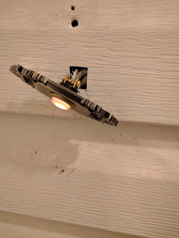
Problem easily solved… Wait for our :glowforge: to come and make a custom backer for it to mount to.
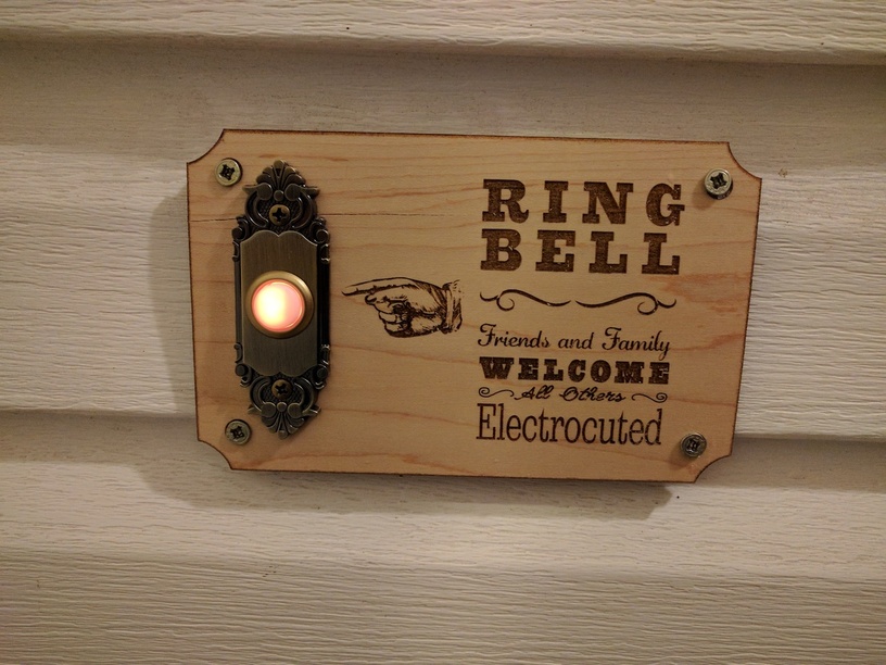
So this is what I threw together last night, I thought it turned out great!

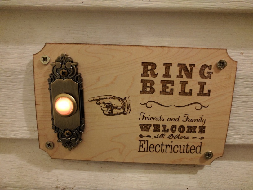
Notice something off about that? Yeah took me until I actually got it completely installed and my wife to point it out to me.

Lesson #1: Always proof read your designs with text on them.

I felt like a complete idiot, really beat myself up about it too. It was a little tedious to get all that installed even halfway decently.

After calming down, I realized all I really have to do is fix it in illustrator, and let :glowforge: do its thing. This time, however, I decided to go ahead and try to fix a few things that didn’t line up quite right the first time, so it was kind of a good exercise.

This time I added engraves for the screw heads to flush mount (which turned out to not be deep enough). and made the hole for the doorbell .15" wider to accommodate the taper of the button which I didn’t noticed when doing my measurements the first time.

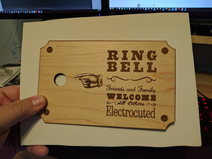
Lesson #2: Don’t be lazy. Add separate cut lines to act as pilot holes for your screws. This just means you need to take the time to accurately measure for all the required screw holes.

I included a gradient around the edge so the :glowforge: would add a taper all the way around. This actually worked really well. But I did learn another lesson.

Lesson #3: Make your edge gradients a little wider. This way you can actually see them without a magnifying glass. :slight_smile:

The “finished” product again. This time to call out my final flaw, which actually has a little bit to do with Lesson Learned #2

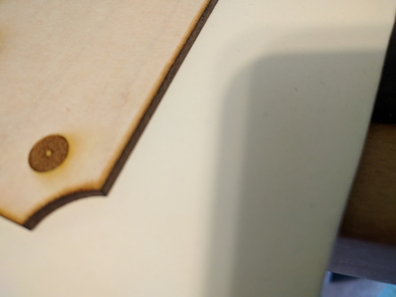
Lesson #4: To avoid cracking of wood make sure you drill pilot holes for your screws, or have the :glowforge: do it for you. See Tip #2

You know as a weekend woodworker Lesson #4 really hit me hard, because I know better. But that’s what I get for getting too excited and not paying attention. :slight_smile:

Overall, I am happy with it for now, though I might do another one because that crack will be staring at me every time I come home. :expressionless:

Also… I will be replacing the mounting screws to be a bit more decorative, and hopefully ones that will sit flush with the face.

81 Likes

I really like this. I wonder how many people would have noticed electricuted. You could have used it as a test :slight_smile:

6 Likes

Get some round headed brass screws. They will look cool and don’t have to worry about being flush. Nice job.

14 Likes

Ohh I like that idea!

3 Likes

Looks great! (I kind of liked the original spelling tho!) :grinning:

3 Likes

Love this. I plan on making a sign for next to the door with some dragon design that says,
“Welcome, foolish mortals! Friends, family and Girl scouts will be entertained, other solicitors or religious queries will be eaten. For you are crunchy and good with ketchup.”

9 Likes

Appreciate the lessons! Great post!

3 Likes

Outstanding!
Some very good lessons!
And, yes… Wouldn’t it be something if Illustrator had a spellchecker? Honestly I’m so afraid of spelling or typing mistakes I almost always take my text and pop it into Word just to be on the safe side.

8 Likes

It does.

Edit: probably need to click the picture to see where Spell Check is on the menu - and obviously it needs to be done before text is converted to outlines.

7 Likes

Lol, I have never seen that!

And I use Illustrator quite frequently.

Thanks for pointing that one out!

2 Likes

Oh wow! So it looks like it’s a manual one-time function rather than a live spellchecker like writing applications. But that’s awesome!

1 Like

The sign looks fantastic!

1 Like

hahaha not me, I didn’t realize until I saw your post :sweat_smile: I was looking in everything else except the grammar.

2 Likes

Correct.

It’s important to remember that the origins of Adobe Illustrator is in Desktop Publishing. It shares a lot of commonality with InDesign.

The point of saying that is that the workflow generally used by designers is that large blocks of copy are composed in other programs (like Word - and generally received from clients). So, if I were designing a tri-fold brochure that was text heavy, rather than typing the text into Illustrator, I would “place” my text document into my design document. It’s also easier from a project management perspective to concentrate on just the text of my document in a word processing program, without worrying about the initial design.

Here are some example screenshots of doing that. The advantage is that the text comes into my workarea as a block of text, which includes “overflow”. Once my text area is full, the remaining text goes into the overflow and can be placed at the next design element. These elements are connected, so that if I adjust font sizes, kern, leading, text box shape, etc. the text will shift between elements.

You can see the red plus box on the below screenshot indicating that text is contained in the overflow section.

I’ve created a second text area and the blue line and arrow signify the text flow.

And finally, I resized the text area on the first fold and you can see how it interacts with the second area to fit the text.

9 Likes

To be fair, Illustrator long predates InDesign. Illustrator first shipped in 1987. The very first (an not widely used) version of InDesign debuted in 2000. It also predates InDesign’s predecessor at Adobe, Pagemaker (which was purchased from Aldus in 1994). If anything, InDesign has pulled features from Illustrator. They share many functions/features because Adobe has spent a lot of time and effort to make all of the creative suite work similarly so that it’s easier for users to switch between programs and be able to do similar things with ease.

4 Likes

You just reminded me how much I miss Freehand. :cry:

2 Likes

omg i hated freehand. i started w/corel 2.0, got used to corel. then had to convert over to freehand for a while and then illustrator at illy3 and hated it at first. i got used to it. i still miss a couple of corel features, but i haven’t used corel since corel 6.0. it’s been 15+ years now. i’m all adobe all the time.

I was on the mac side, so it was better then Illustrator 88 at the time. You could actually see what you were drawing in real time!

1 Like

This is great. And your comments were fun and helpful. Makes me wish I had a doorbell.

2 Likes

you could have one! ours is wireless and needs new batteries once every year or two. there’s a little button stuck to the front door frame, and a receiver with four C batteries (that sounds a real bell) located behind the kitchen. works great.

3 Likes