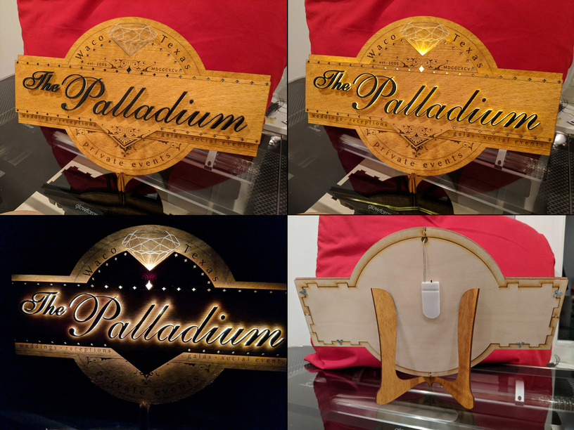
My first big project, made as a birthday gift. I prototyped in cardboard at 3/4 scale before cutting the final piece. All design work was done in Inkscape, The scrollwork was cribbed from some antique banners and then customized for my layout. (MDCCCXCV is the date the building was built.)
For the bias-lit lettering I used two layers of 1/8" proofgrade clear acrylic (oops, no 1/4" on hand!) topped with some pre-painted 1/8" MDF. The (stained) wood is baltic birch.
The front layer is raised by an outline of more clear, scored acrylic, and behind the press-fit letters is a short string of those copper-strand warm white LED lights (I used some “Kohree” branded ones I had on hand) powered by a button battery. Sorry I didn’t take any pictures of the interior, but it’s basically lights taped in a zig-zag pattern and backed by white cardstock.
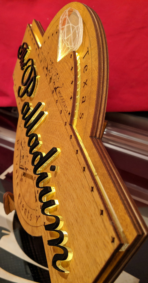
The diamond is clear proofgrade acrylic etched on both sides and lit at the tip with two LEDs from the strand.
Everything is held together with DAP Rapidfuse “Fast Curing All Purpose” adhesive from home depot. It was clean and easy to use and sets in just a few seconds, so you have limited time to re-position before things lock in place.
The stand is custom-made, the third iteration. I love how easy it is to prototype in cardboard and just nudge things around until they work…
Lessons learned:
When bias lighting, consider cutting the top (opaque) layer slightly thicker/fatter than the lit layer behind.
Outlines from cut parts make great jigs for precisely placing those parts (especially “bendy” pieces).
Test score settings to ensure they aren’t deep enough to significantly weaken the material. I came very close to breaking the top layer before it was integrated.
Keep and “original” and “flattened” version of designs in Inkscape (either in hidden layers or separate files) in case you need to make alterations.
I now keep an svg handy called “just_a_line.svg” that I import to make extra cuts that aren’t in the original design file. I’m sure the web GUI will eventually have basic shapes built in, but until then…
Adjusting for kerf is a bit of a pain in Inkscape. I appreciated the nice tutorials available here!
If a design won’t load (returns to editing after “preparing design”), look for any layers that might have out-of-bounds elements. I had to re-create a vector object that somehow generated a strange out-of-bounds element once “prepared”, but it took nearly 45 minutes to finally track down the problem!
@timjedwards is my baby brother. We have very similar brains (as evidenced by our both, unbeknownst to the other, jumping on the GF bandwagon!), but his is a later model and has fewer software glitches.
Ahhhh! Keeping it all in the family! That is cool (we’ve got another set or two of sibling owners here, but I’m not sure if they’ve all received the units yet). Awesome!
Well, keep poking him to make him display his stuff…
I’ll do my best. He’s never been the showoffy sort; while the rest of us (all older) were competing to prove who was best at stuff, @timjedwards always just seemed to be content in the knowledge of his own superiority and didn’t feel the need to prove it to anyone.
I’m quite certain that quality is a product of my training, as well. I obviously excelled at big sisterhood.
Sorry for hijacking your thread, @timjedwards! And thanks for the detailed explanation. I’ve been staring at the photos trying to figure out the parts that didn’t show; this explains it really well!
On the curved edge of acrylic that shows up top, are the score lines on the surface and just reflecting inward to look like edge cuts? It’s a cool effect!
On the curved edge of the acrylic between the first and second layers, there’s a engraving of “rays” casting out from from the imaginary center of the material. The original idea was that I’d place a bright light source there and the rays would be clearly evident. Since I ended up using a string of lights, the effect all but disappears…
Hmmm…when I figure out just how I’m going to go about copying your ideas for my own use, maybe I’ll incorporate one of my favorite touch-sensitive USB LEDs and see if I can get the effect you were going for.


 )
)