I have B&W bitmap images that I can trace and cut, but it has many delicate connectors that are obliterated. (Wow… don’t think I’ve ever used that word online before!)
I’d like to be able to “thicken” those parts. I’ve got plenty of experience with image editing but not so much with “artistic” vector software. My vector experience is with CAD - such as Sketchup, Fusion360, and similar, but going back >30 years.
After playing around with stroke thickness, and carefully learning the kerf adjustment techniques posted here, I’m leaning towards this being impractical for complex patterns with many elements. The design I am trying to produce has several hundred individual shapes, which will also be the case for other designs I hope to use. I can accept that free software doesn’t give you the flexibility of other tools.
I actually have a very simple solution I’ve used many times, but it’s not going to work here. I take the bitmap and copy it to 4 or 8 layers, and offset each by 1 pixel in each direction (for 8, the four corners are moved 1x1) - the difference b/w using 4 or 8 depends on the design, the desired effect, the outcome, application of softening/blurring filters, etc. It works great for “solid” designs with fine elements, but the reason it won’t work here is that my design has many small “holes” inside many of the “solid” areas. If I apply this technique, many of those details are lost. They are an important part of the design.
Do any of you oh-so-knowledgable forgers have any thoughts or suggestions?
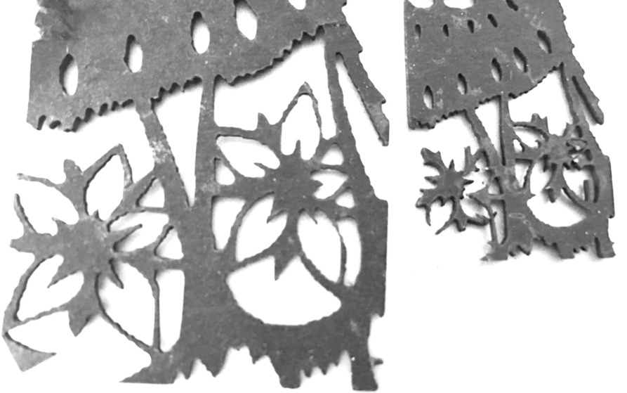
Here’s a section I extracted for testing, on the left is 2x required scale, the right is 1x - if I could “double” the thickness of those intricate connectors, I’d be in good shape!
If it’s a design you’re going to be reusing, which it sounds like it is, maybe it’s worth using the path tool and individually moving nodes to thicken the parts you need thicker. Time consuming, but also a permanent fix!
If you have a hint of OCD personality, as I think many of us here probably do, it can be rather soothing after a long hard day at work to just get lost in the process of moving nodes around for a while and not really having to think a lot.
Hmmmmm. If it were me I would do the thickening in a bitmap editor (Photoshop or Gimp) before doing the autotracing. In Photoshop I’d try to select everything and then expand the selection by one or two pixels (or more, depends on your resolution), then fill with black.
I would agree, but these days I would prefer to go for a ride on one of my motorcycles, and wait and see if there is a technological solution to the problem at-hand.
I doubt I’d be re-using, so the time investment is not justified. I also expect to have the same need with different designs going forward, so spending hours adjusting each would be out of the question.
Thanks, though - if it were going to result in mass production, it would absolutely be worth it!
Heh. You know what we in the medical community call those things, right?
If the repeat pattern isn’t too difficult to reproduce, maybe you could just scan/trace/fix one element of the design and then duplicate it yourself to recreate the pattern, and still have plenty of time left to go for a ride on your donor–oops, I mean, MOTORcycle.
It’s not a regular/repeating design, unfortunately.
Not a rant: Despite what the general public, and EMC/medical community, may think, there are many sensible, cautious, and situational-aware riders that have ridden their entire adult life without major incident. Unfortunately, more often than not, when I see someone on two wheels, I understand why the general public feels that way.
Oh, I know. No judgment intended. Hospital humor helps us cope with the things we have to cope with, and doesn’t stop a lot of us from riding them anyway. (Not me, though. I’m 'way too ADHD to be safe on a motorcycle!)
I’ve have good results using gaussian blur then boosting contrast in order to thicken thin elements, but this design is more complicated and might need more manual or localized work.
GIMP does have nice brush dynamics, and settings to allow you to smooth brush strokes. You set the strength of the affect to what you like, but what basically happens on-screen is you see the actual brush stroke lagging behind the brush cursor as you move it across screen. It’s averaging out any bumps and squiggles along the way in order to make a smoother flowing brush stroke. It’s the bee’s knees.
If you’ve ever used ZBrush for 3D sculpting, it’s just like the Lazy Mouse feature.
The only thing I can think of is still going to be slightly time consuming, but it does give you the option of thickening parts of the design but not others. (Lets you retain control.)
I know that this works in Photoshop, - if you have that to work with, great. I’m not sure you have the exact options in GIMP.
Take the black and white image and remove the white background.
For the remaining black design, select it and apply a Stroke effect to it. (In Photoshop, you can set that stroke to be as many pixels wide as it needs to be to thicken the image. I would set it to be a different color so you can still see the original image.
Then you extract the Stroke to it’s own layer. It will be the shape of the original image plus the stroke width, and located on a layer underneath the original image.
The time consuming step is to go in with an eraser tool and erase the stroke layer where you have lost small details so that they show up again.
Final step is to change the color of the stroke layer fill to black, to match the other image, and merge the two down together.
It’s not the best method, but it does give you control back over what gets expanded and what doesn’t.
I probably don’t fully understand the issue, but the way I would thicken those areas in Inkscape is to widen the stroke to the desired thickness, and then execute a Path To Stroke command, which essentially outlines the stroke width. The problem comes in selecting the bits you want to thicken, but that depends on how the file is organized. If the parts aren’t broken up, thickening the stroke for the whole image is probably not what you’re after, but perhaps it’s part of the solution.
… as does this method, which is how I originally tried to solve it. Also, it puts cut lines on both sides of the stroke, so now I have to delete the “inner” ones…

 Hospital humor helps us cope with the things we have to cope with, and doesn’t stop a lot of us from riding them anyway. (Not me, though. I’m 'way too ADHD to be safe on a motorcycle!)