ooohh… it’s very very similar. and i’m downloading it now to play.
1 Like
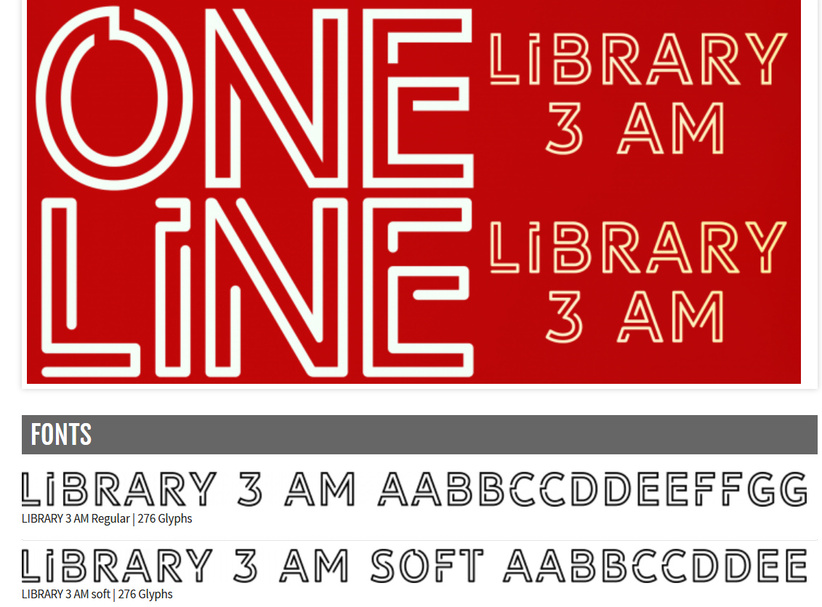
This one is really close too. (Actually, on closer inspection, this might be it exactly.)
This one’s a little different, but pretty good too.
11 Likes
That first one is the closest match, imo.
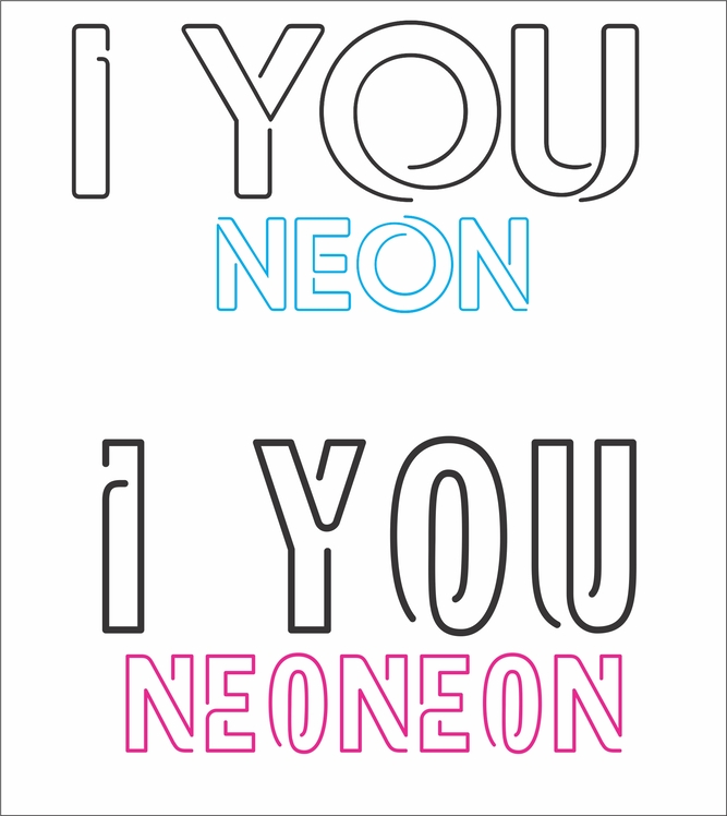
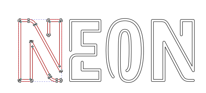
Interesting use of a “neon” font.
1 Like
Neoneon definitely looks like “it.”
thanks! and i hope i’m not the only one who takes advantage of this. will have to do some playing around with it this week.
7 Likes
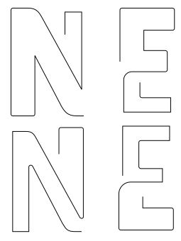
I did a little comparison of the first font ‘Neon’ and the second ‘Neoneon’ and I’m pretty sure the second one is it.
4 Likes
LOL, guess we were both doing the same thing.
2 Likes
hey man, don’t steal my bathroom signs!
5 Likes
I can make an etsy account…
Hey, there’s an idea…
2 Likes
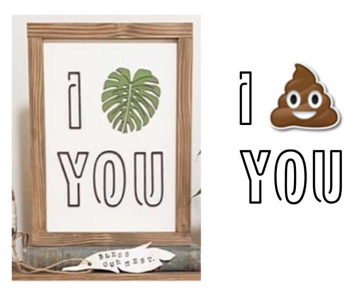
Isn’t that missing something?
6 Likes
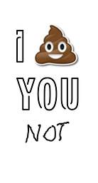
I think if you add “not” to your version you’d have a definite Etsy winner. 
2 Likes
It’s not actually a single stroke - but I’m betting it would still score crazy fast going around quickly!
and if you do break it apart it’s still readable
4 Likes
OK, apparently I’m running a minute behind everyone else lol. I swear your response was not there when I started typing lol.
1 Like
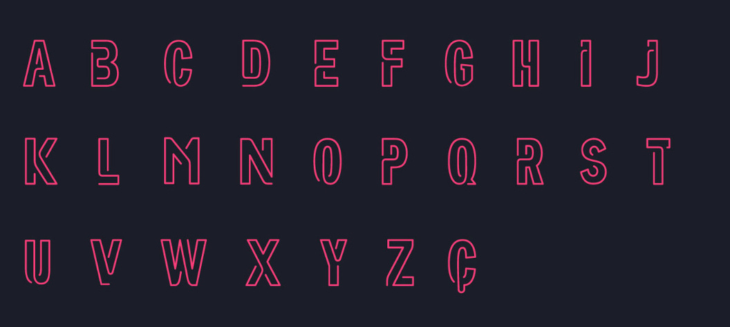
that is why i said “kinda” in the subject. it’s not a true single-line font, it’s really a stencil, as @evansd2 said. but it has that feel to it in a stencily way. it’s designed for each letter to look like one single stroke, like a neon tube.
2 Likes
To be fair the bulk of the time it took me to post that response was in a different program - so I’m guessing as you were typing I was over there, and then we both hit enter at practically the same time 
2 Likes
This topic was automatically closed 32 days after the last reply. New replies are no longer allowed.