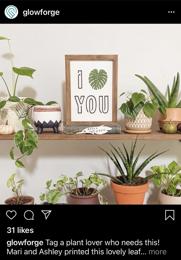
Seems like it would be perfect for knockout lettering. Or even out-of-focus scoring. Saw it on the GF IG feed.
Tough one.
I tried three font identifiers online, no dice.
If you are a reddit user, you might want to ask here:
2 Likes
I leaf you?  A jealous heart?
1 Like
yeah, i tried all the places i knew to identify it. it doesn’t help that there are only 4 letters, but it’s fairly unique.
posted on reddit, we’ll see if anyone there has a lead.
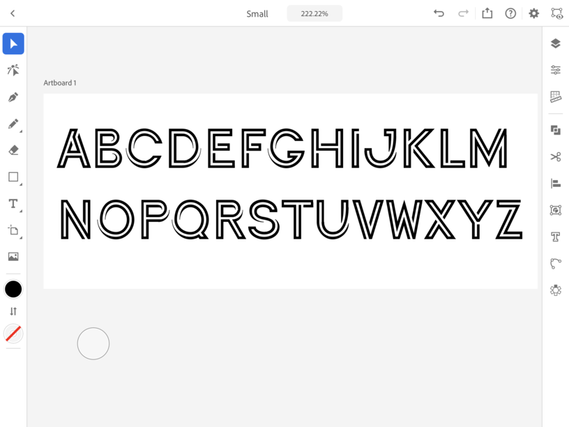
Curious what the rest of the alphabet looks like. Anyone try making their own fonts? I bought the silhouette business edition a year ago and barely use it for anything besides cutting the things I make in Inkscape to sublimate onto my GF cuts. But it has that font-making option. Curious how successful people are in making their own single-line font.
1 Like
Cool font. I have never seen it before.
Seeing as that it’s only 4 letters, a pretty decent chance they just drew it up in-house (whoever they were featuring). Looks like about 40-clicks with the pen tool and a few handles pulled.
3 Likes
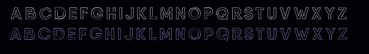
I was also, so played with it a little
Have two fonts sort of like, but the one @shop showed is more elegant.
it’s possible. i was hoping i’d get lucky. i could probably do the same, but it’s a lot easier if someone’s already done the hard work for me. ![]()
but hey, maybe if it’s not a font, it’s an opportunity for me to make one and sell it.
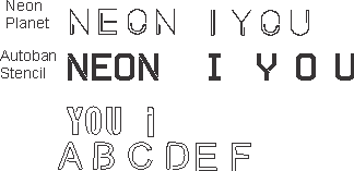
Closest thing I could find in Adobe fonts was Continuo, designed by Delve Withrington of Delve Fonts:
4 Likes
“I plant you” sounds much worse.
2 Likes
I fern you?
1 Like
I monstera you. Stalker? (I’m gonna stare at you…)
2 Likes
I asked the original artist on instagram. Hopefully they will respond.
1 Like
I know the leaf is in the Premium stuff and there are many blocky fonts that should be very similar if they were scored instead of engraved depending on how much you wanted the little flourish in the letters.
the key to that font is that you could negative space cut it out, since you wouldn’t lose any centers. and it would still have some bulk to it.
2 Likes
Yeah it’s essentially a stencil. I dig it and hope you find it.
Continuo is pretty cool too, for the same reason.
That is a really cool font - hope you’ll let us know if the original artist identifies it for you!
1 Like
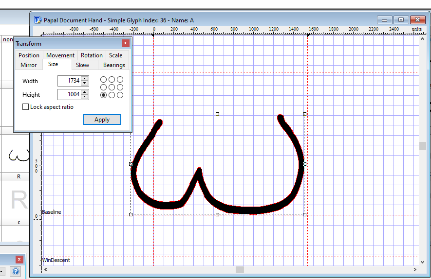
I’ve made a number of my own when I’m learning a new calligraphic hand - I make a font, type out what I’m creating, and then copy that until I can do it free-hand. It’s tedious but not difficult. I use High-Logic Font Creator (I use 7.5, I think they’re up to 12 now) and it looks very much like your art program. You can free-hand or use shapes, and then move nodes to clean it up how you like.
2 Likes