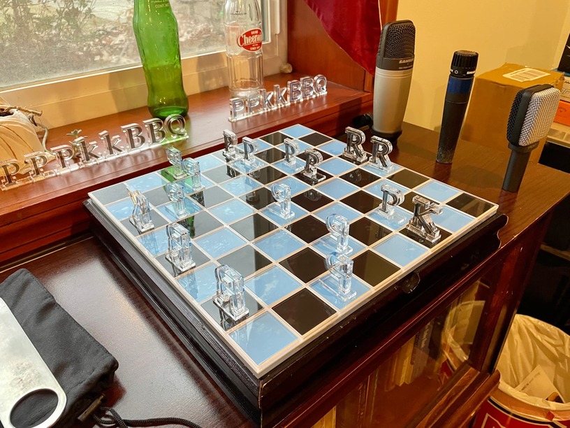
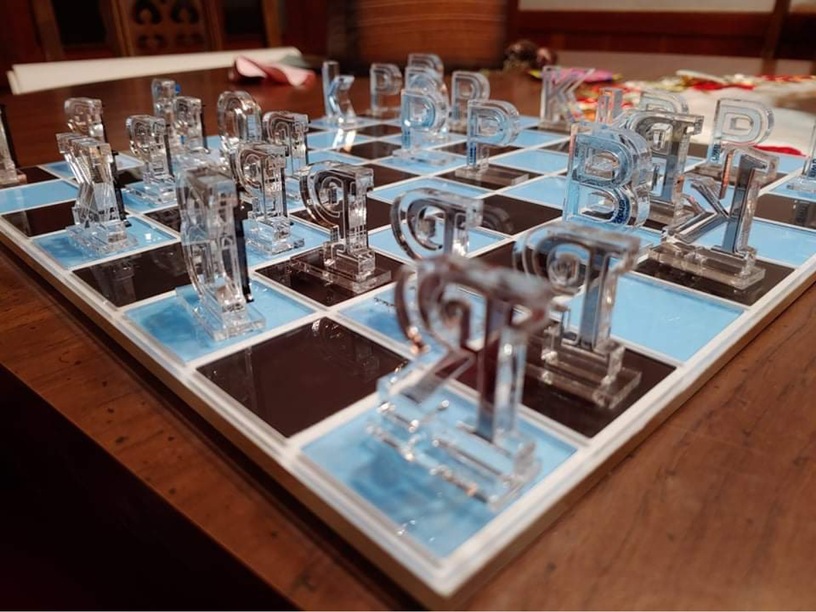
My brother is super passionate about fonts (seriously, don’t mention fonts around him unless you want to hear a lecture). I was told he needed a new chess set for Christmas on account of his old one had a few broken pieces. I wanted to make something specific to him, and my husband came up with the idea of using letters for the pieces. I used his favorite serif and sans-serif fonts, and it took a good five days to make. It was definitely a challenge. No way am I making another one, but at least I can send him new pieces if any of them break.
67 Likes
Oh my, that is truly beautiful!
3 Likes
What a great idea - and well executed!
6 Likes
Perfect for your brother, I would say! Well done!
3 Likes
A perfect personalized gift and it is gorgeous too! I don’t think I have ever known anyone with a favorite font 
6 Likes
Very cool! Although the evil sister in me might have chosen Comic Sans and Papyrus instead…
15 Likes
His most hated fonts are actually Times New Roman and Arial, and it was very tempting to use those. But I decided in the end to make something he would use. As it is, he always plays as the serif side because he claims serif fonts are better.
10 Likes
Clever and beautiful
4 Likes
That is a FONTastic idea! So creative. Did it take some restraint not to use different fonts for each of the pieces? I’m sure it would have driven him mad.
13 Likes
Wow!!! As a type nerd myself, I love this!! I’ll bet he was/will be blown away!!
6 Likes
A beautiful and inspired labor of love!
4 Likes
Super clever, personal and beautifully executed!
3 Likes
And he hasn’t given you the lecture on calling them “Typefaces” instead of Fonts?  Gorgeous job!
5 Likes
What a clever idea! I am sure he loved it!
3 Likes
Never seen a chess board like it. I’m sure he loved it! So well done.
10 Likes
Wow! That is really cool looking. It is creative and beautiful. Did you make the board as well. I love the way it looks like glass. I have seen chess sets were the pieces were the words were spelled out, but never with just a single letter.
4 Likes
I love it.
4 Likes
I did make the board, but in the first photo it’s sitting on top of his old chess set. He loves it so much, I doubt I will ever be able to give him a better gift.
6 Likes
The epic battle between serif and san-serif coming to a chess board near you!
That’s perfect for a font person!
5 Likes
Nice job! Did you make the board, as well? Looks like glass tiles—is that right?
Sounds like your brother and I would get along well.
Currently, my favorite typefaces are Mikado and Neutra (sans) and Clarendon and Caslon (serif). 
3 Likes