User Failure - AKA learning experience

my exact thoughts - even with some stray dots, this is gorgeous :heart_eyes:

but then I remembered how I view my own work. I expected to make “X”, but “B” came out instead (right, not even “Y”), so I think it’s terrible, but someone who has no idea that I had “X” in mind thinks “B” is just lovely and not a failure.

8 Likes

s w e e t - I am going to start doing that. thanks!

4 Likes

You’re very welcome! I am a self-taught (still learning) web and graphics guy, so I really appreciate any little tips I can learn and enjoy helping when I can. I read here every day, but have been looking for ways to contribute.

8 Likes

Good eye!!

3 Likes

Excellent tip!

4 Likes

I didn’t know that either…so, yay…another good tip for me, too. Thanks.

4 Likes

Thanks for the tip, and to everyone helping me grasp this. It really has been a learning experience. (and thanks for the complements).

I really thought it was a failing on my part, and sought to demonstrate “how not to” because that has helped me learn when others have shown mistakes.

Off to learn ‘tracing’ in inkscape :no_mouth:

6 Likes

It doesn’t look like it’s directly a result of noise in the images - the white background in both the .jpg and the .png are noisy, but the patterns don’t appear to line up with the extra dots that you have. Here are the two files with the contrast jacked all the way up (after being converted to grayscale) - any pixel that isn’t full white (255) will show up as black.
Eyebrows:


Sam:

So yeah, it doesn’t look to me like the dots from image noise line up.

*One small caveat - I don’t know how this forum software handles images, and I know that some web pages do some minimal reprocessing automatically whenever you upload a file. This might change the pattern of noise. If that’s the case, then the version I downloaded from the forums could have a different set of background noise than your original files. I don’t think this is the case, though - I suspect that if you expand the image in the forum and click the “download” link, you get the original, unmodified file (which is what I did).

12 Likes

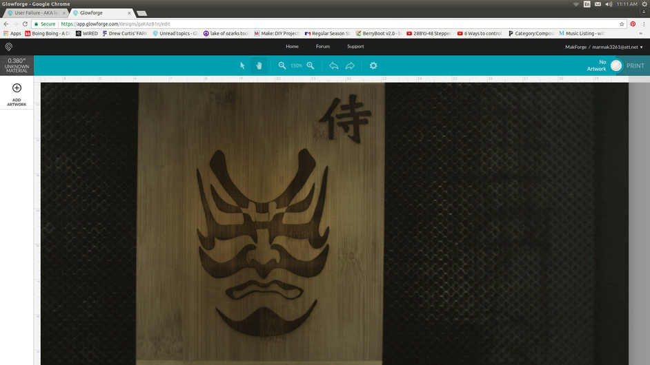
This is just an excellent exercise in design all the way around. What looks simple, and really is simple,allows us to explore some basic functionality of the Glowforge and how to set up a design to efficiently process.

@scatterbrains has the right idea, putting green paths around all the objects will import them into the Glowforge will default to two operations according to the color fill, but will default to a cut. But you can convert this to an engrave in the GUI. For closed path vector fills that you want to engrave, you might want to give them a different stroke color so you can set the power for each object individually when you score. At least that’s what I experience. Someone can chime in to tell me differently. It’s your choice if you want to score. My engraving at 340 left some crisp edges, and since the original is brush art, you might not want so well defined edges.

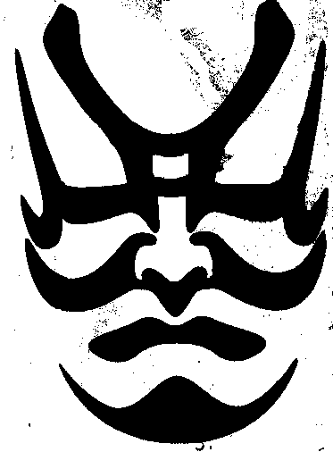
Here is a photo of my file that I prepped using Inscape scan. You can’t tell that there is a colored path at this resolution, but it’s there at .25 pixels.

Here is my Inkscape trace. This file is set up for just two engraving passes, like @scatterbrains. It will default to a cut because it has painted paths, but you can still convert to an engrave… Depending on your Glowforge and preferences and your materials, you will want to put some percentage of power, 335 speed and then do 340 LPI.

If you think you need the score, once the engrave is over, don’t move the material in the bed and convert the operations to score and do a 1%, 197 speed and it will outline the whole work. At least that’s what I intend it. Edit: it is better to duplicate the paths around objects to score and just make them a different color so you don’t have to redo the job, but it’s all in one setting without risk of shifting material or reorienting things in the bed.

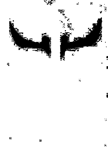
Here is a bed shot of my first trial of this, bringing it as one operation trying to do the engrave in one pass, but indicating full black for the highlights and 30% for the rest in the design file didn’t translate right in the GFUI. It had not colored paths around the objects so it defaulted to one operation. Note that the black didn’t engrave black, but was punched out.

So this may confuse folks and I will most likely have to clarify things, but just trying to move the conversation along about engraving closed path vectors.

18 Likes

Thank you sir, that is very helpful. Appreciate your time!
With your ability, I would never guess you were new to this a short time ago. :+1:

8 Likes

I was going to chide you last night for using the phrase “failure” (though I do realize that you tempered that some by pointing out that it doubles as a learning experience ) but as I read through your post + the one that @Xabbess made, I noticed a commonality…

While there was a commonality in the design problems that you both encountered (unexpected dots) there was also a common thread in how you interpreted this: you both assumed that the error was yours, rather than the machine’s. I realized that I do this too when projects don’t come out as expected … I assume that the problem is my own newb-ishness (and TBF, that probably accounts for most of my wonky attempts) rather than an aspect of the :glowforge: that may need fine tuning.

Because of this assumption, I typically don’t report the problem … not necessarily because I’m embarrassed or anything, but because my inexperience makes it hard to discern if the misfire is due to my mistake, or the machine’s. I have a feeling that you’re both doing this too :wink:

So from here forward, I’m going to make a greater effort to report anything that seems weird. Even if it makes me look silly, even if it might bug them with trivial questions. Worst case scenario - it helps to detect a bug, best case scenario - they write back and explain my newb mistake, and I actually learn something. Win-win, either way - I hope. @staff , let me apologize in advance if I end up annoying you!

14 Likes

Oh yeah, Rita has gracefully answered several from me.
I can only imagine she and her team will be earning their pay in spades for a few months after mass shipping.
Shouldn’t last long, because the machine is so newb friendly. :+1:

7 Likes

Everything you said here could have been written verbatim by me. Dan called it modesty, but I call it not wanting to whine or complain…especially about things that I consider not the fault of Glowforge. I made a vow to Dan though, that from here on out I would report any and everything that was not either as I thought it should be…or that I wanted it to be. I’m just going to start jotting things down and do a few at a time in one email to support. But, I’m still going to ask questions on here, too…as I’m usually too anxious for a solution to wait for support to answer. .[quote=“Drea, post:31, topic:7073”]
Because of this assumption, I typically don’t report the problem … not necessarily because I’m embarrassed or anything, but because my inexperience makes it hard to discern if the misfire is due to my mistake, or the machine’s. I have a feeling that you’re both doing this too
[/quote]

Thanks for reading my mind! :relaxed:

4 Likes

I do the same when removing background from an image. I use white, black and grey generally. These will usually show stray that aren’t showing up.

4 Likes

On behalf of everyone here who will benefit from your feedback: Thank you!!! :slight_smile:

16 Likes

I agree! When you are beginning to use a new product EVERYTHING you struggle with or that goes wrong is helpful because it is the only way that they will be able to see if it is something newbies will struggle with and need more guidance or if it is something actually wrong with the forge. I think ALLLLL information is great information at this point. You either help Glowforge or help your fellow users learn so they aren’t blowing up the help line after everything ships… I never judge anyone and just look to help where I can. I have beta tested so many different things because I love the process… so mess up and don’t be embarrassed to share because you might save someone else the same fate! :slight_smile: Everyone is killin it in here! I am impressed!

12 Likes

You can also use the magic wand tool and set the tolerance to 0, and turn contiguous off. That should do a pretty good job of highlighting any odd pixels on your background.

3 Likes