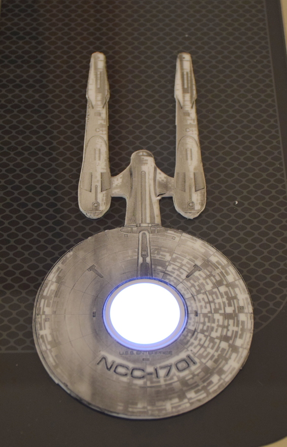
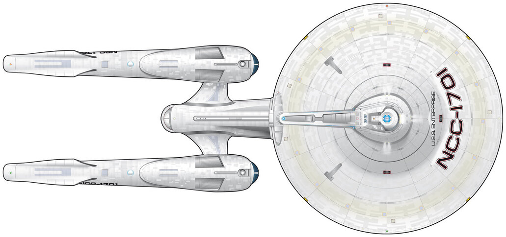
Since my forge is named “Geordi” (as in Geordi La Forge), it seems I needed to follow the theme for my escutcheon. I have mixed “generations” by using a “re-imagined” original Enterprise graphic as the basis for my design, but the “Next Generation” Enterprise just didn’t look right from a shape perspective, so we’ll assume that lasers enable time travel and Georgi has gone back in time / to an alternative universe to create this Enterprise.
This is a first attempt, and I’m pretty sure I need to go deeper / stronger on the engrave. Using non-proofgrade acryllic (white) sourced from Amazon at about $10 per Square - but i was able to get it same day. I’m using a carbon black acryllic paint to create the contrast, by painting it on, then wiping it off, and using Isopropol alcholol (as necessary) to remove excess paint (when rubbing it off with a paper towel was not as effective as desired).
I still need to work on getting cuts down right, as when I attempted to use some of the tricks others have listed here for using photoshop / illustrator / etc to get an outer shape “cut”, I somehow ended up with THREE cut paths (concentric) for the Enterprise, which made it rough as opposed to smooth. The circle for the glowforge button, however, was perfect, using the circle from the set of cut shapes that another member put together and shared.
Settings I used for the engrave (Georgi is a “basic” Forge) are:
Speed: 600
Power: 80
Greyscale: Vary Power
Min Power: 0
LPI: 225
Focus: 0.121 (which matches the caliper measurement for the Acrylic).
Passes: 1
Any suggestions for what / how to change to improve / deepen the engrave? I’m pretty sure that if the engrave were deeper, the paint not have been so blurred on the surface (left side especially) when I went to remove it (immediately following painting it on).
Depth, at its root, is going to be a function of energy delivered to a spot. Basically every component has a hand in delivering energy, directly or indirectly. Speed, power, focus, LPI, passes.
You could give it more power.
You could slow it down.
You could increase the LPI.
Your focus is already set (you could defocus on other projects to get thicker/softer lines, which delivers the energy over a wider area)
You could make 2 passes instead of 1.
Being a 3D engrave introduces an additional factor because the beam power is modulating depending upon the grayscale value of the pixels. So if you upped the power, you’re basically decompressing the range of power delivered. (Ex: change power from 80 to 100 or full, and you’re now delivering power from 0-100 over the range of grays instead of power of 0-80. The lighter areas won’t be impacted much but the darker areas will get deeper).
Ultimately, I’d look to either lower speed or 2 passes for this project, if I wanted more depth.
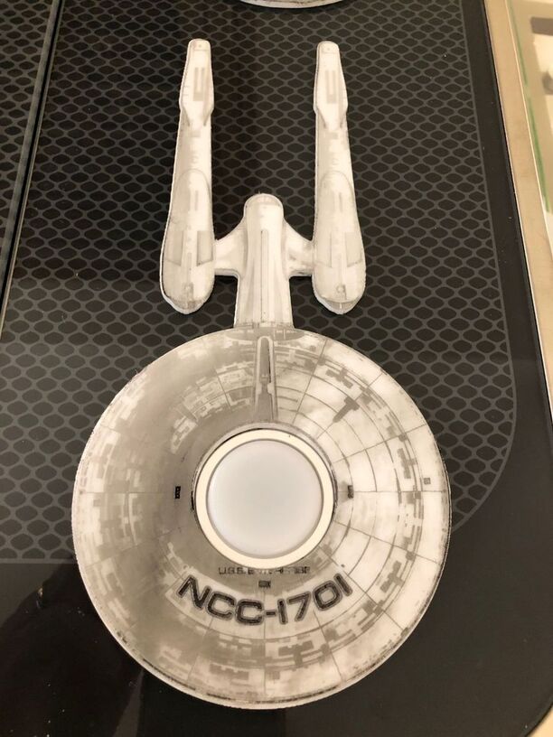
Thanks for the suggestions. I re-ran it using the standard Proofgrade acrylic settings, and it did a little better (thought I made the mistake of re-starting the Forge between the cut and the engrave). and ended up just a bit off. (I did the original in two phases as well so I could peel the masking off after the cut portions)
Upon further examination, it looks as if the source file had show “shadow” in it which I have since cleaned up using my old standby, Picasa. Next run will be with the cleaned up version, and on a slightly larger size to provide a bit more space for “Enterprise” to be visible (cut off on run # 2).
Greetings! New GF owner here as of 10 days ago, and wanted to try out this excellent design. I have zero (well, 8 days of Inkscape) image manipulation experience, so I thought “how hard can this be?” Well, I have watched 4 hours of youtube videos and so far no one explains how to make a trace image of a complex design that takes less that 2 hours to complete. I am missing something really basic here and was hoping you could point me to a useful video. I can engrave just fine, but I can’t easily cut out what I just engraved. Every tutorial I find assumes users know how to do this already.
P.S. I a nod to both Roman mythology AND Star Trek, my GF will be named Vulcan…
Justin, first of all, Welcome to the Glowforge Community - meaning both the Forum system AND the group of owners!
Your question is a valid one. I didn’t remember how I did it - nearly two years ago (can’t believe it’s been the case, but it has been) - and as I looked at the many multiple versions of the design files, I was reminded of the many challenges I had.
What I ended up doing was a bit non-intuitive, but worked well. I’ll see if I can remember and summarize for you, Note - it looks like some of this was done in Photoshop Elements, but could be done in a variety of programs.
Starting with the Enterprise shape in one layer, I added another in a bright color.
I then copied and pasted (MERGED) into a separate file.
I then selected by color to get the background (not the enterprise) selected.
Used an option to invert selection (which then selected the Enterprise.
CUT out the Enterprise, leaving a shape that is the outline of the Enterprise.
Used the Inkscape Trace function to trace that shape.
Use that shape to color the stroke / path / etc - can;t rememeber the exact usage in Inkscape.
(And I only did this after a few fails) - edited the stroke / path since the trace created inner and outer paths, which resulted in a double-cut. You will want to merge the two, or separate them and remove them.
Drop that outline back into the SVG that has the original image, and potentially increase the size very slightly to avoid cutting out any of the outer “hull” area.
I might do it differently today, with two years experience now, but this process - including all of the mistakes I made - was a very good learning process for me.
I’d suggest looking at this not as “I can’t believe I’ve spent hours trying to do this and it’s taking too long - but rather - I’ve got several hours of new learning under my belt!”
If, however. you are at a point where you just want to be done, here is the end result of the cutout. Note: it’s not pefectly smooth - but it’s the latest version of the cut - so if you want to use it, feel free.
If you haven’t checked out the Free Laser Designs section here on the Forum, it’s a great place to see what people of done, and get the designs. A great place to be inspired, to learn, and some amazing tools people have shared.
One of the absolute MUSTS there is the Honeycomb Holddown Pins design. You’ll want to print and keep a number of them handy for holding down slightly warped materials. Better than magnets because magnets do hold a risk of interfering with the moving head (magnetic fields can cause some issues ).
I love all the designs, and plan to use what files other people have shared. I am EXTREMELY spoiled by my Silhouette Cutting machine. In its program, I would Select Image - Trace Outer Edge, done.
Six seconds, 3 clicks.
The downside: that operation only works in the Silhouette world, it is not exportable as a usable file for any other program.
Inkscape is too complex to do something that simple for my GF purposes.
I quickly moved away from Inkscape, except for a few things that I need to do occasionally. Because I really did not want to pay Adobe a monthly subscription, I downloaded the trial of Affinity Designer (and Photo) and was very happy with the programs, so I bought them - both the Mac and Windows versions - for a one time price ($50 per platform, unlimited computers that you own - for personal use.) I was lucky enough to find / wait for a deal that was 20% off, so my price was $40 per platform.
jb messaged me privately, so for the benefit of others reading this, here’s my response: There are a dozen or more ways to do this. The way I would do it involves GIMP and Inkscape. Fill perimeter with a color, select that fill, invert the selection, clear selection. Import into Inkscape, trace bitmap with default settings.