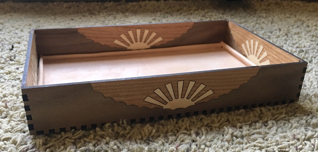
Sigh. I really studied all the advice about kerf and thought I understood it when designing this dresser valet for the DH, but I clearly still don’t get it. I guess I need one-on-one personal face to face lessons or something.
It looks wonderful from here! I have the same problem with Kerf. I’m trying to make small test samples with the actual material early to make sure I’ve got things right. Always takes tweaking to get a great fit.
As regards your kerf/no sneezing comment, I have the same problem with something similar but different. I am using Inkscape and the Path to Stroke method of kerf compensation. After much frustration, I discovered that if I overlaid the two kerf-adjusted halves in Inkscape the overlay was imperfect. Therefore, even if the glowforge does exactly as instructed (by exactly I mean absolutely zero error no matter the number of decimal places) you still need to over adjust. This leaves gaps.
This is not an issue when I use the Stroke to Path method on basic geometric shapes. Finger joints, inset ovals, etc… are all perfect. But when I use a complex shape with plenty of concave and convex curves, I wind up with the mismatched overlays.
In my case I’m using a png image I traced, which results in all sorts of Bezier curves. I think if I was able to create it using a bunch of basic shapes joined into something complex I would be alright. But that is just my guess.
Looks great. The way a stroke to path gets converted on on a twisty compound path seems like a good question to figure out. You are using Illustrator, right?
I didn’t run into this issue when inlaying letters, but they were pretty small and were not full depth cutouts.
Did you have an issue with the draft of the resulting cuts, with the kerf being wider at the top than at the bottom? This means doing the inlay from the back and the cutout from the front to get a better match?
I haven’t done an a full inlay like this in a while and when I get back to my Glowforge, I’d like to do something like this, using @evansd2’s cool joints.
No, I did flip the suns to make the fronts/backs average out. It was the curvy clouds that didn’t match. They were off in multiple directions in a way that’s hard to explain. I guess that particular pattern was a real kerf challenge in ways I don’t understand.