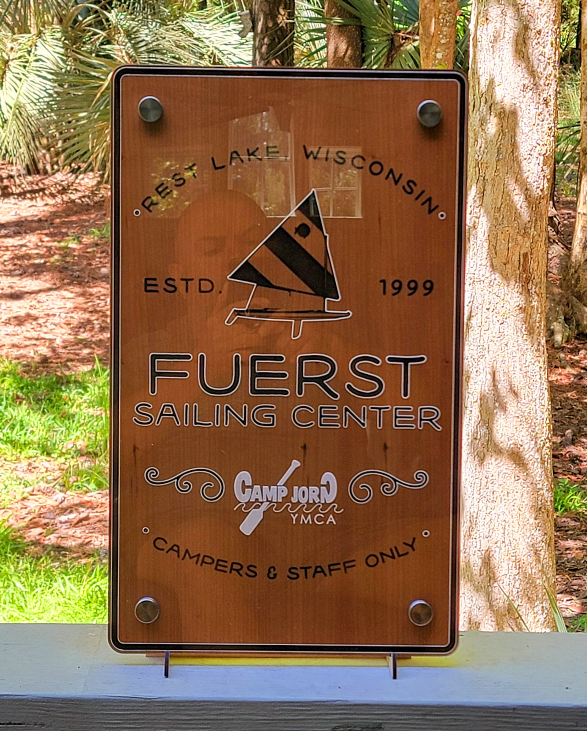
Commissioned sign using ![]() clear acrylic and
clear acrylic and ![]() cherry and 3/4" standoffs. Reversed the engraving so it would be on the backside, and Viola!
cherry and 3/4" standoffs. Reversed the engraving so it would be on the backside, and Viola!
24 Likes
Really nice. The white engraving pops.
9 Likes
Very classy. I am certain the client was quite pleased.
8 Likes
Looks like a lot of work, but turned out beautifully! Great job!
7 Likes
Fabulous!
How did you do the white outline on the black? Incredibly steady hand, or is a different channel, or ??
6 Likes
This turned out great!
5 Likes
Very professional! Impressive!
5 Likes
The black is the cherry plywood engraved on the bottom layer. The white is the engraved acrylic, but used an offset path and then outline stroke for the white. No steady hand, just illustrator trickery.
7 Likes
Oh wow - that’s brilliant!
6 Likes
That’s a clever technique. It doesn’t look like the black is lower than the acrylic. Cool result.
6 Likes
The engraving on the acrylic is on the back, reversed, so literally touching the wood engraving.
4 Likes
So very shallow standoffs? I don’t think I’ve seen ones that didn’t leave something of a gap between the lower section (post) and the cap.
4 Likes
I think the standoffs are three quarters of an inch, but I didn’t leave any gap between the two layers. This way the sign is mounted and stands off from the wall versus having a gap between the back and the front layer. Hopefully that makes sense
6 Likes