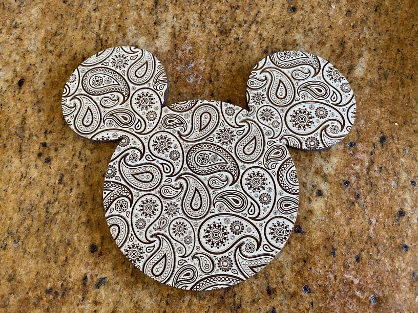
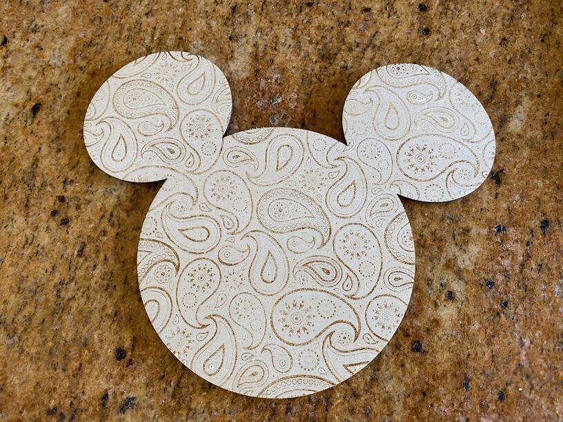
I used the same file to make the following two engravings onto Proofgrade. One was in draft, that’s the darker one.
Then, I realized that I had done a draft before, so I set it to do HD engraved for the second. It took two hours and while I could see it being much more subdued and faded, I expected a second or third pass to fix it, but nope. The second engraving didn’t even make it through the film on the Proofgrade.
What happened? Why is an HD engraving not the same darkness but at better resolution?!
Draft graphic is vary power
Draft photo is convert to dots
HD graphic is convert to dots
HD photo is convert to dots
I’m guessing you went from draft graphic (vary power) to convert to dots (and possibly looked at the settings which will alter it to a power of 1) but cannot be sure with your comments above.
How dark it is will depend a lot on your art, and if your art is all one colour vary power will be darker than convert to dots - but convert to dots does a nice job with variation (like in a photo)
Did you pull off the masking before doing the engraving? For an image like this (very cool by the way), I would highly recommend it. If you are engraving finished Proofgrade the char/resin will wipe off fairly easily with a number of different solvents (I use denatured alcohol).
The answer is simply that the machine uses different settings to produce different results, you need to test them to see what works best for your project. You may even find using your own settings work best.
In-general, the HD settings (graphic or photo) provide higher resolution/finer detail than draft or SD, but that doesn’t mean the output will be “better” - that depends what you are looking for. For many materials, the HD settings use much reduced power in order to preserve that detail, rather than vaporizing more material than needed and losing that detail.
Settings also vary by material, as some are better suited to certain applications than others.
I’ve always assumed, and I thought I had some evidence, that if I like something as a Draft, then the SD or HD would look so much nicer. Of course maybe the Drafts had been set up as Dots and not Vary Power.
If significantly more detail is desired, the HD settings will provide that. They won’t be as dark, because there’s no way to preserve that detail when vaporizing the surface of wood (nor many other combustable materials).
If more contrast is required, then you have to sacrifice detail. That’s not a Glowforge problem, that’s a material problem. Wood (any wood) won’t give you ink-on-paper resolution and contrast.
Take a small portion of your design, and print again on some identical material scraps, using increasing power or decreasing speed until you see the same contrast on the masking as your draft version. Then remove the masking from both and compare.
$0.25 says you won’t see a significant different in “niceness” between them - assuming (again) you’re working with some kind of wood.
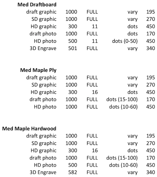
Here is a small sample of default Proofgrade settings the machine uses to give you an idea of what’s going on (these are for a Pro):
Thanks for the help @deirdrebeth and @eflyguy! The convert to dots settings looks to have been used for the bottom photo while vary power was used for the top resulting in a better looking finish.
Since it seems like there may still be more discussion to be had, I’ll move this over to everything else.