The more I try to produce my own file the more I realize I have no clue what I’m doing.
Makes me wish I had done some work learning design software.
I’ve been using Inkscape and am very slowly improving.
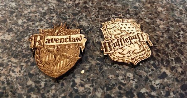
Today I messed around trying to create some pins of Hogwarts House crests. My wife and oldest daughter have determined they are Ravenclaw and the son is Hufflepuff. So I threw these together. It was a bit of a challenge adjusting the images even with the tutorials here and what I found on the internet but I got there. These are done on “medium proofgrade”
I am more happy with the Hufflepuff one.
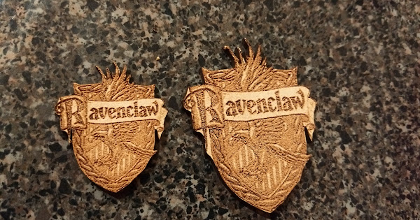
The raven clae one was an attempt at a gray scale engrave. I think I may have been better off treating it the same way I did the Hufflepuff one which was to use “trace to bitmap” and play with settings until I liked what I saw.
Finished the evening by engraving my Daughters contact info on her new graphing calculator. Not sure the material was safe but I’m still alive and didn’t destroy my Glowforge.
The material you Engrave on makes a big difference. I did a successful greyscale Engrave on PG solid maple Hardwood and after a scrubbing with an old toothbrush and some water, it turned out beautiful… however the same done on PG Maple Plywood yielded lesser quality results.
I think this is because the ply has draftboard/mdf in the middle and from what I’ve seen, draftboard/mdf doesn’t create a lot of contrast in an engrave.
Good to know.
I was going to do these on maple but didn’t want to waste the quality product if I screwed something up. They may be worth trying again. If I do I’ll post the results.
They turned out fine for trying to engrave on plywood. If you want to use a depth engrave though, you’re better off doing it on thick hardwood. The thicker wood will give more depth of field and you’ll get better definition.
So first of all, very nice job! Stop selling yourself short!
I think you’re probably looking for more detail… more contrast between your subject and its background. Yes?
Well, I’ll tell ya… When I did my Harry Potter coasters I spent hours in PhotoShop getting what I wanted out of the artwork I found on the internet. I boosted up the contrast on each one, added a thin black line around each subject part so it stood out from the background, and generally played with brightness and contrast until I got what I thought I wanted. As far as I’m concerned, it worked out really well. Worth the effort? Well, yeah, since they were a wedding gift for my cousin. My point? You CAN get it the way you want. But you really have to work with some images. Some will certainly be considerably easier.