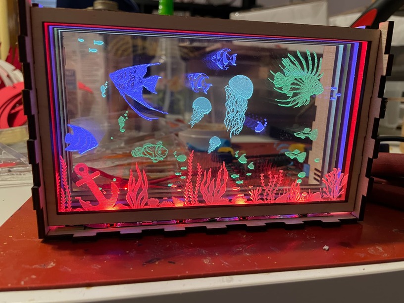
I like both of them. Looking at the aquarium, what if you painted the edges of the acrylic black? I think it would hide the colored edges and actually make the fish brighter. The mandala is awesome too.
Truly amazing!
The dot technique on the fish could be a lot brighter and less bubbly with a much higher LPI with the intensity down some on the darker end so the dots did not run together.
When I get some more acrylic I will give that a shot. Usually I like the look of the Vary Power, especially if you flip the acrylic after the engrave. The opposite side seems to have really nice detail.
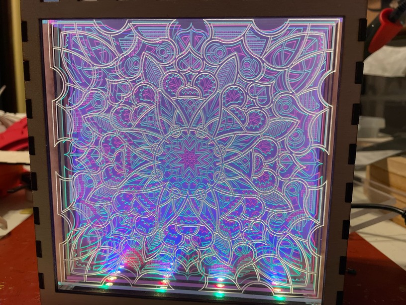
I love these, such a great idea with the different colours. the mandala is completely mesmerizing and kind of reminds me of an infinity mirror - it has got me back thinking that I should make one of those now
I would agree that the 3D of vary power looks best if the image supports it, though in either case a very high LPI is an amazing increase in the look, even when it takes hours to do. In many images the dark or light coloring is about shadows or like the angelfish’s stripes, about different shading of the image and looks funny as different depths. In those cases the dots make more sense.