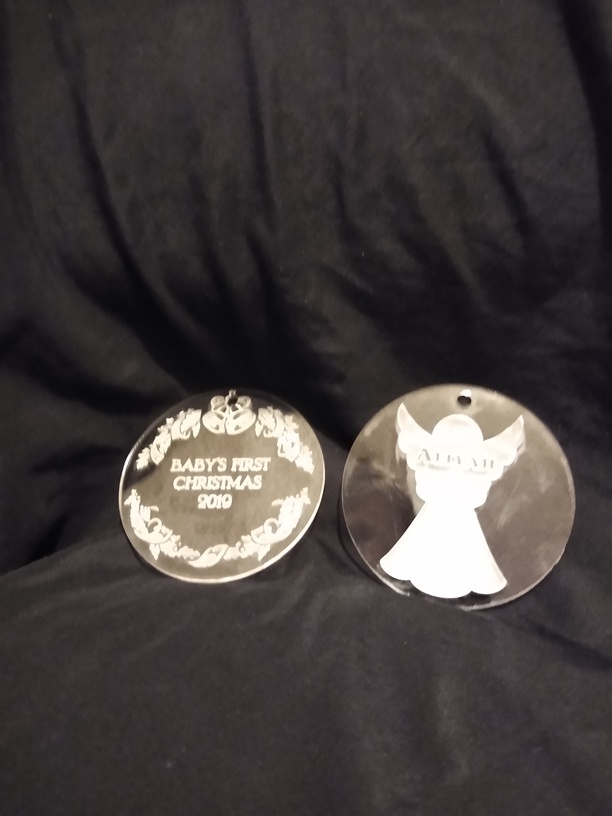
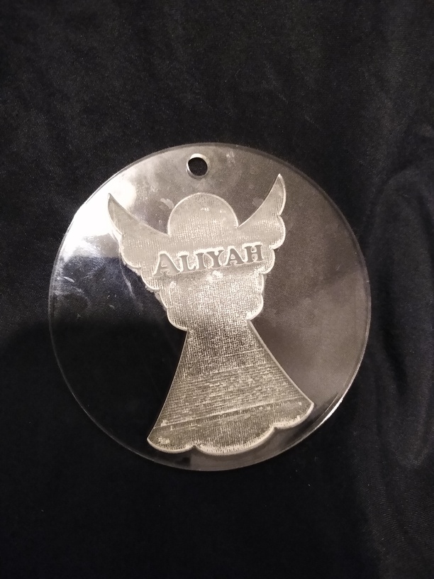
These are two of my acrylic ornaments. One turned out fine. The one on the right was engraved about twice as deep below the name as it was above the name. The middle of the robe had a different pattern than the rest; there were visible lines. Why did it turn out so poorly?
Thanks!
Well, that was weird. I don’t know why it didn’t upload the artwork.
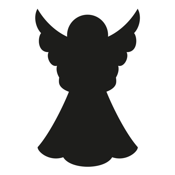
I put it together from the ornament blank I made (which seems to work just fine) a text box for the name turned into a path on top of the angel silhouette clipart.
@jules I don’t have silhouette, but shouldn’t all of their “clipart” be vector formats? If they are graphic based like jpeg, then that could possibly be the issue, right?
Nope…no apparent gradient in that. From the results of the engrave though, it looks like there is a secondary band across the skirt that is darker, so it’s possible that if that is a raster image, there are slightly different shades of black in there, or some other issue. We’d definitely be better off looking at the actual file.
Usually, but their files can contain raster images as well. We used to do Print and Cut files with them.
Hey @Silverlight, have you heard of “defocusing”? I don’t think that’s what happened with your ornament, but it made me wonder if you knew about it. Defocusing works really well with bigger acrylic engravings.
I’m not sure what happened with your ornament engraving though. If you find the file and want me to do a test run of it to see if it’s the file or, just let me know. I’d be happy to do it for you.