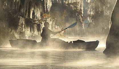
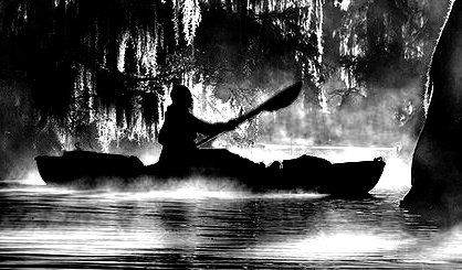
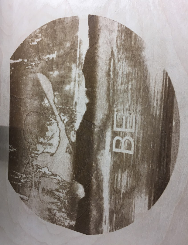
I am trying to get this image (well, anything with a kayak on the water, and trees in the background) to be a 3D engrave.
I have not played with this feature at all yet. And the wife wants this project done by Friday ><
So… Reading around on the forums and seeing everything which has been done so far (by @takitus, @mpipes, @tom, @joe, @Jules, @paulw, and @pauljima), I see that I can play with lower max power, more total passes, and different LPI.
Plus in the tutorials there are plenty of topics about adjusting light levels and contrast pre-engraving, which this quite likely needs.
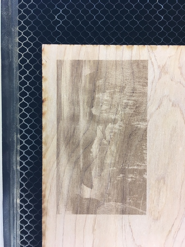
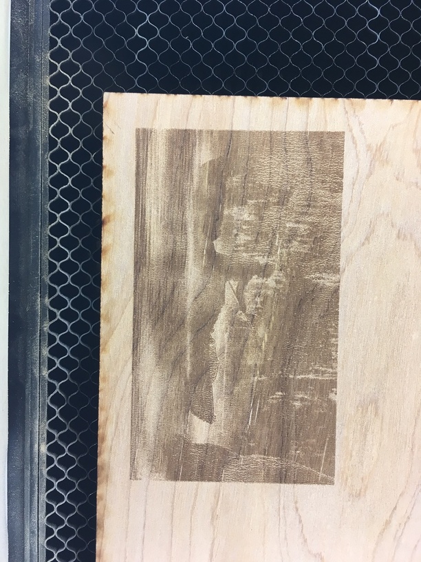
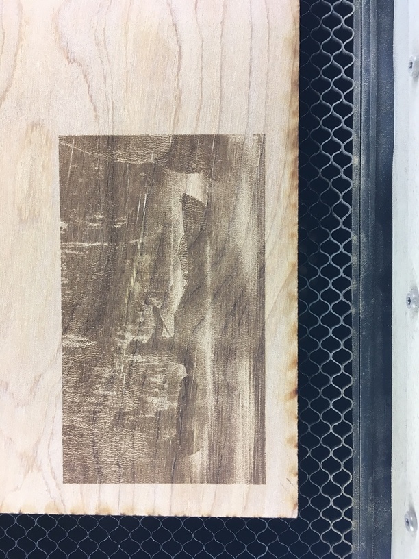
Anyone have a good sense on where about I should look to start to get a nice engrave on these? Below are my results doing the 0 to 100 default style greyscale engrave at 700 speed after 1, 2 and 3 passes. I stuck with the default LPI, which I believe was 255.
contrast, contrast, contrast. one of your primary issues with that image is that it’s very “flat” in a lot of areas. so you’re going to, at best, see a lot of solid block areas.
try looking at it in adobe capture on a phone/tablet and you’ll see some more of what i’m talking about when you start to play with it.
Ok, well I think we need to temper expectation here… If you mean “3D Engrave” as in you want it to ultimately appear as a relief carving, this won’t happen. If you give GF an image like the above, darks are recessed while lights are relief… So the image above will have the kayak recessed while the leaves in the background as well as the mist (in the foreground as well as background) will appear to protrude (relief).
However, if you’re just trying to get the image to appear on the wood like a print, yes, contrast contrast contrast. Take it into Photoshop and adjust those Levels or Curves, make it Grayscale (Image -> Mode -> Grayscale) as well to clearly see what will be true black, grey, and white.
Then just engrave, I don’t think “map to grays” is even necessary for this… haven’t tried a “print” type appearance yet, though.
Yes, not expecting a tactile 3D engrave, just some representation of the image on the wood. But forum searches for greyscale had far less help than for 3D engrave, so I just went with that one as my terminology.
The “Basically all black” is what I am seeing so far. Playing in Photoshop a bit more before I attempt any further, but sadly when I enter photoshop my “too many tools” handicap kicks in and I turn everything into crap very quickly (Ooh! What if I apply this filter ALSO!)
High contrast is definitely needed to make it pop, but using Levels adjustments instead of Contrast/Brightness will be more flexible.
Sometimes even selectively inverting colors (ie change dark shades to light) will help create contrast.
Since you’re using Photoshop, you can do a lot of this work non-destructively by using Adjustment Layers and layer masks. An Adjustment layer is basically an empty layer (no pixels) and it allows you to adjust Levels, Curves, etc on that layer directly, and it applies its affects to the layers below it. You can use layer masks with an adjustment layer and it masks the affects over the underlying layers the same as it would if you were painting with brushes. You can stack adjustment layers and they will have a cumulative affect.
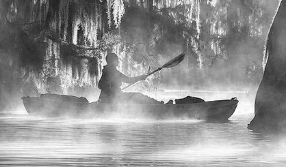
This one’s gonna be tough because of the mist in front of the kayak but what I’d do is try using one levels layer to darken the background but maintain contrast in the details in the trees. Use a second layer to control levels/contrast of just the kayak/kayaker. Use a third layer to control levels/contrast in the foreground area. So you basically split the image into three main areas to give you some flexibility. I think simply running a contrast adjustment over the image as a whole will not give you the result you’re really looking for.
Also you don’t absolutely need to change an image to greyscale, the GFUI will simply discard the color info just the same as if you did it, but it might help you spot areas that need a little help because sometimes the eye is tricked by color in regards to contrast.
If you’re ever not sure if a color design has enough contrast to be clearly readable, making it greyscale helps you see it.
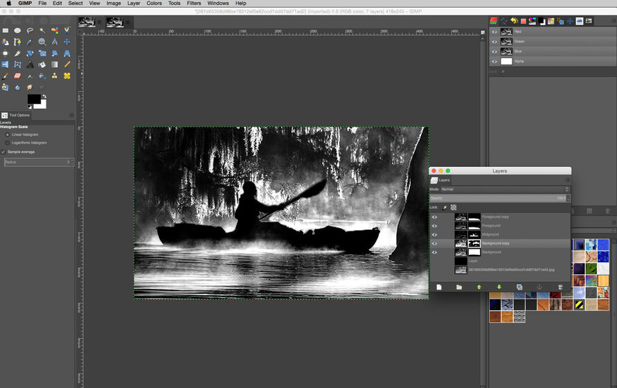
I gave this a quick run and while I’m using GIMP, I got a screenshot showing the layers and layer masks. I started off with the background, midground and foreground layers then made copies of those to help make tweaks to specific areas after the fact.
This was adjusted using layer masks and Levels, that’s it.
In the Levels command, on the top set of sliders (usually labeled as “Input”) you’re going to move the black slider to the right and the white slider to the left. You’ll see the affect in the preview window but basically this “compresses” the dynamic range of the image (256 levels of gray) into a narrower band. If you move the middle slider left or right, it shifts the midtone values of the image to either the darker or lighter end and is sort of like a contrast adjustment.
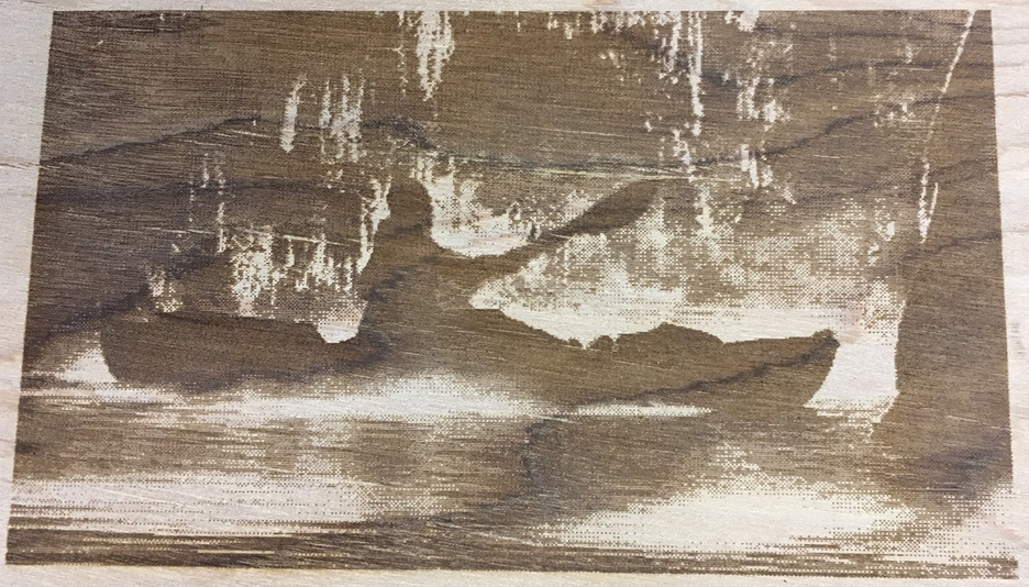
Looks like a single Levels adjustment over the whole image looks pretty good on this one, probably no need to isolate background, middleground and foreground unless ya just want to.
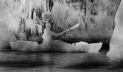
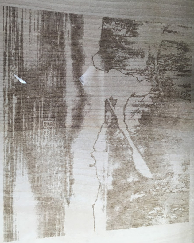
Yes, the mist in front of the kayak was a serious issue. I hadn’t considered isolating the kayak to manipulate by itself. Doing that would allow me to just go full silhouette to remove the mist entirely and draw out the feature.
Playing with levels alone, I wound up with this:
(Fortunately saved these very early in the process. Things got notably psychedelic a few steps after acquiring this version)
I had also wondered if inverting would come out nice. Will have time to run a few more test engraves tomorrow and see how things are looking. Absolutely doing @mpipes version first.
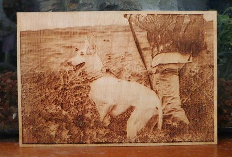
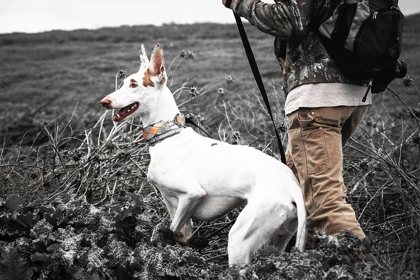
Great write up and advise mpipes. I don’t have anything to add to it other than an example of a photo engrave I just did. Maybe it’ll help seeing an example. I had done previous color enhancements to the file to remove all the green. For the engraving I just upped the highlights and darkened the midtones a bit. I finally figured out that when the highlights look bad/blown out, they’re just about right for engraving lol.
Oh, and one possible piece of advice that may be wrong, but is worth considering. If you’re engraving for color, what you’re doing (more or less) is minimizing char in the lightest ares and maximizing it in the darkest ones (unless you’re doing some material like slate where the opposite is true). So some of the rules for cutting/scoring/flat engraving, where you want depth while minimizing char, have to go out the window. In particular, multiple fast/light passes tend to leave a cleaner surface than one slow/heavy.
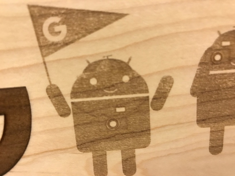
In my small amount of experimentation so far, it feels like “map grays to power” pretty much crushes the contrast on wood, which makes sense. There’s only so much difference in char level you’re going to get, it’s kind of quantized: not at all, really light, medium, and really dark. Here’s an example: this guy is wearing a hat and a camera, and they have some definite differences in gray level:
The best I could get after trying half a dozen engraves with different power ranges is still rather washed out. You can absolutely see and feel the difference in depth, but the coloration left on the wood doesn’t change much in the middle range:
The camera in particular is quite dark in the original. I didn’t want to crank it up to full black like the letter to his left, but I probably would have had to if I really wanted it to stand out.
Using dithering, on the other hand, ought to be able to bring out more of the subtle differences in color by using consistent power but varying the dot pattern. I didn’t try that while I was making these because my brain was stuck in one mode. And I’m still pretty damn thrilled with the result.
The major frustration is that it changes with engraving speed settings. At 200 I get a proper fill as expected, at 1,000 I get a total kayak and rider void, while at 600 I get a rider void buy kayak fill.
The 1,000 speed is the only one I have repeatedly run, and it came out with the full void all three times. The 200 and 600 have run one time each, and the 600 at a different size. So not sure if those getting better fill was really due to speed, or a fluke happenstance.