Lovely.
Ooh, I like these!
Nice work!
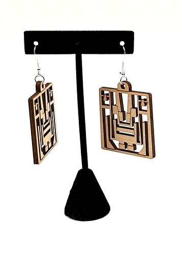
Unique design that is very appealing. ![]()
Very nice! You need a banana for scale, so people know how far from the ear they will hang.
Now, they are different!!
Very unique. I really like them!
Very nice!
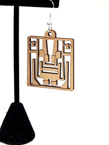
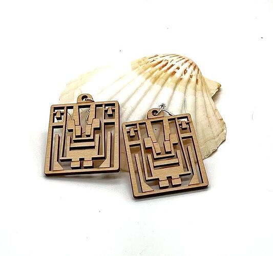
I really like this design! Love the bold graphic with rounded corners.
Love your original design @gensd, they are both lovely and interesting.
My experience with Aztec glyphs is that they are more rounded and organic, however inspiration comes in many shapes. Congratulations!
In my experience, I believe Mayan are the more rounded, but I’d have to take a look and compare them. Thanks!
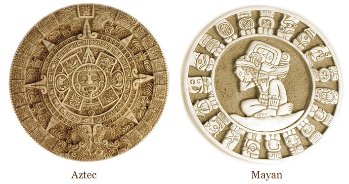
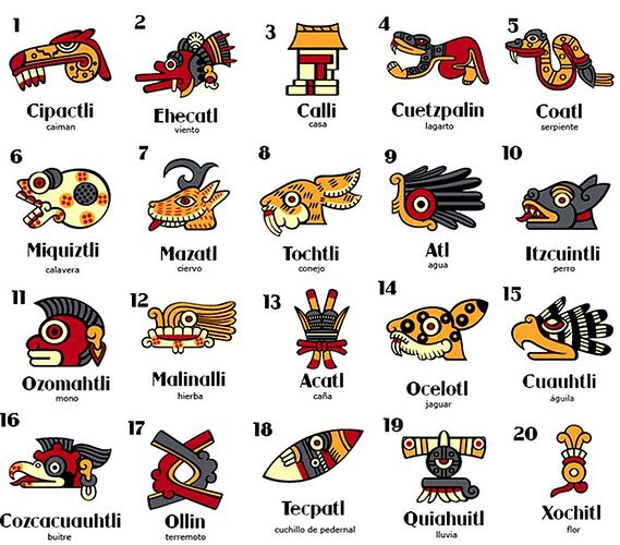
Added a graphic of the two calendars, the Mayan glyphs are overall rounded in appearance, while the Aztec appear to have some curves, with a lot of sharp turns, zig zags, and triangles in their glyphs.
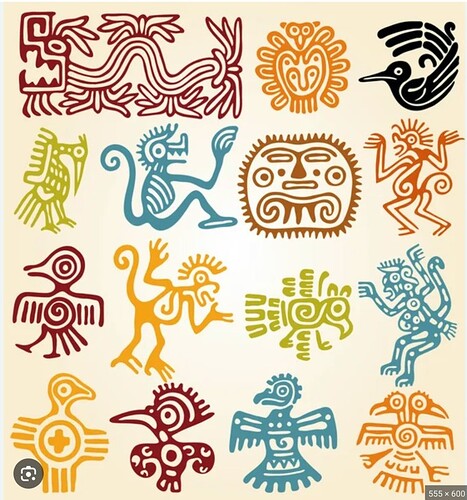
Yes, I agree, but the Aztec ideogram writing is also rouneded (sample enclosed),
however the Aztec sunstone pictured above and other significant Aztec emblems are very angular.
Aztec and Mayan art are both a wealthy source of inspiration.
These are now in the Glowforge Catalog, if you’re interested in getting the design file!
