Hi All, Wondering if someone could please help me with an svg I am trying to enlarge and cut…
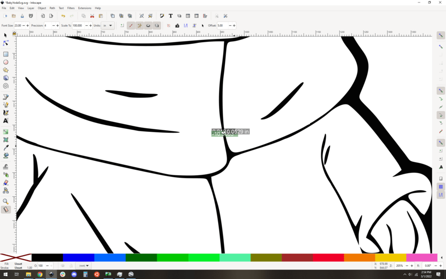
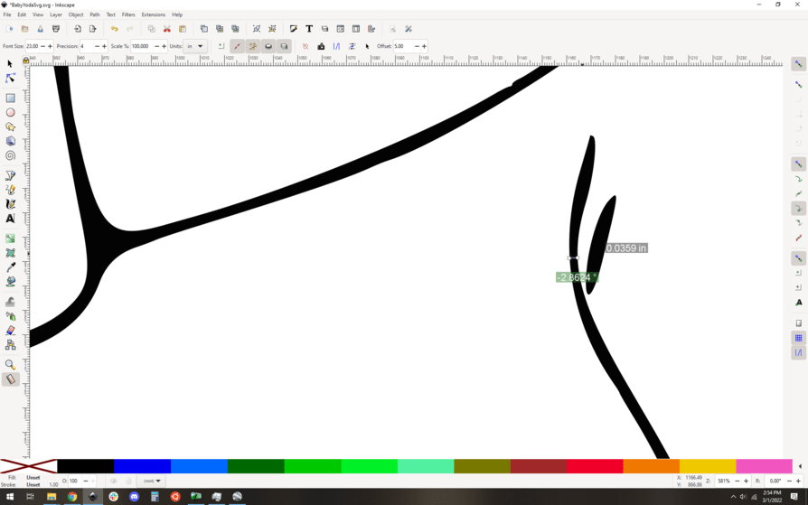
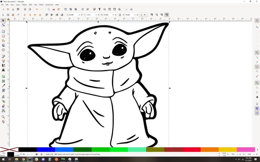
My customer wants this specific svg/design used. I need to enlarge it to 15.5" x 15.5", but the inside lines are REALLY narrow, so I’m afraid it will be much too thin. I tried to enlarge the width of the lines with )+ (in Inkscape) but it distorted the hands & proportions of the fingers.
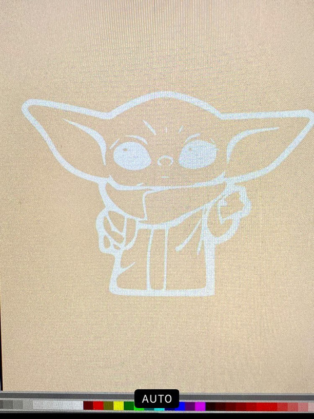
I am attaching a photo of a different svg, just to give an example of the final look they want (a cut-out of yoda, painted white and mounted on a natural backing).
Can anyone help me thicken the overall cutout for 15.5" x 15.5" proportions? (I am lengthening the overall design to be slightly less square and a little more rectangular)
I would be SO grateful. (And of course I need to have this done today…eek!)
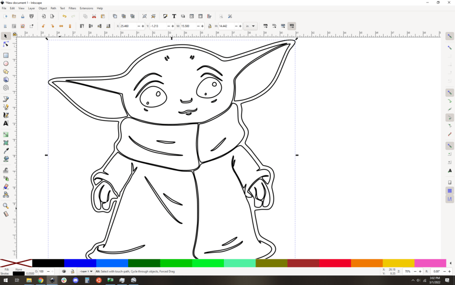
Svg I am using:
Overall look I’m trying to achieve (this is a different svg, not the one I’m using):
Yes, I will be cutting from 1/4"BB…and painting/assembling onto a 1/4" backing.
I did see the specs when I enlarged it, and the width is just too narrow for such a big sign.
When I increased the width using )+ it looked much better overall, but the hands need to be adjusted because they get distorted. I tried to adjust the hand lines, but I am just not well-versed enough in Inkscape so I couldn’t get it quite right.
Bottom line (no pun intended) - Could someone thicken the overall design substantially, and adjust the hands/fingers as needed?
TIA!
Here is a photo of what the hands look like when I thicken the overall design:
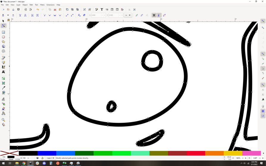
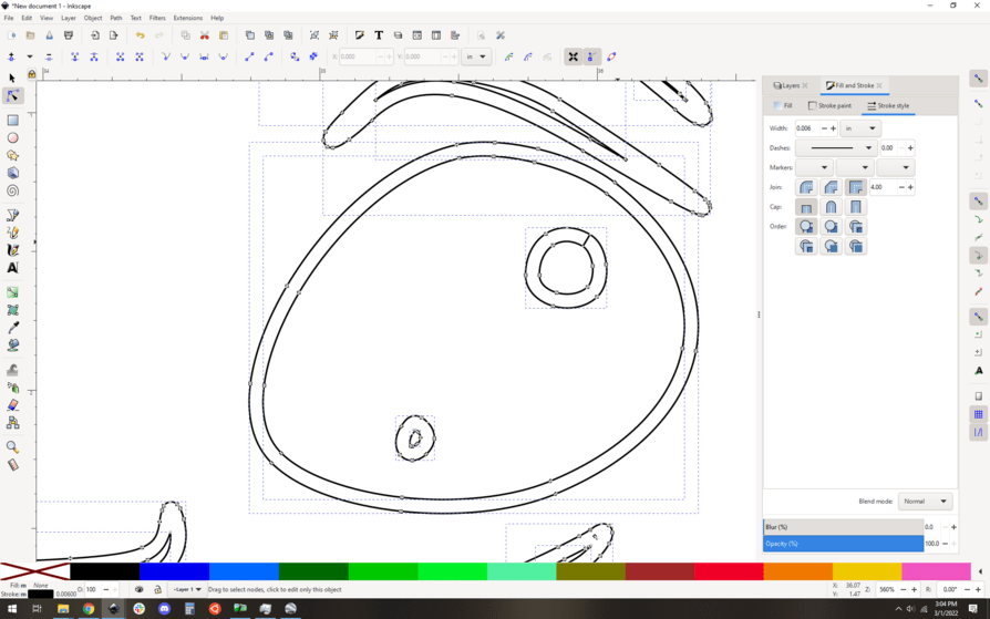
You have to do this to anything with an “island”. Unfortunately, it’s a fiddly job, but there’s not much to be done about that.
You could probably shortcut this whole thing by exporting it as a super high res png and then reimporting it and tracing it. In fact, that’s what I’d do now that I think about it.
Better yet, we can tell you how to do it yourself, so you don’t need to ask for substantial free work. You might get someone who has the time to do this for you, but it isn’t very simple, especially since you’re asking for design decisions. You definitely can’t count on someone doing it so quickly as you’re asking, and tbh it seems to me to be a lot to ask for free no matter the timeframe.
This is what Fiverr is for, you might want to try there. Modest prices for fast work, you may well get it done there.
Ahh - this sounds like a much quicker/more efficient work-around (esp. since I don’t have the skill set - or TIME - to identify & clean up all the areas that would need tweaking!). I’m assuming you mean thicken it, then export it to png, then trace it? (But the hands would still need adjustment)
Here is a case where making the design into a Png and engraving it would be a good idea with the caveat that the engrave will take a really long time, perhaps many hours, and trying to shorten the time will make it look horrid.
I agree - this design is MUCH more conducive to engraving. But they really want the raised (cut-out) “3D” look. I didn’t see any other svg’s out there (with this same “look”) that appear any better for cutting, so hopefully I can make this work.
Unless you are going to cut several layers engraving is about the only way to get that. Under that circumstance, the width of the line does not count. The image is not conducive to relief carving that would be engraved in any case. Even as many layers it would be a problem as his eyes as an example would look horrid as either dark pits or bug eyes.
You might engrave the whole thing and cut him out like a paper doll and that could look very good but you would still have to engrave the whole shape and even when there are only a few tiny lines the machine still has to go back and forth like the whole area was engraved.
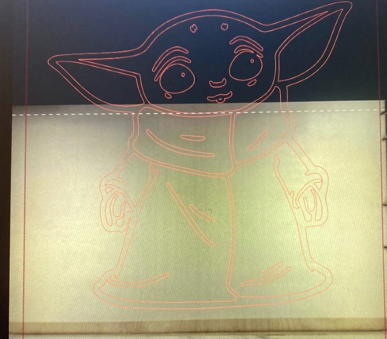
Thanks, everyone! I went ahead and just cut the “thicker” version I made in Inkscape. I realized I was probably over-thinking and being too much of a perfectionist (as usual). The hands were fine. And the eyes cut fine too (just have to cut separate circles to put inside).
After all that, however, I couldn’t get the pass through to line up correctly, OR the laser to cut through my material (same settings that worked with the same material last night). So apparently this is NOT my day (& the “force” is not with me)!
I have found that the best place to line up are where the lines are vertical. Using the passthrough app those places have to be all at the same level so I use the older tricks before they had the passthrough app.
The first thing I do is break the design into two pieces with different colors, making my breaks where the lines are vertical. in that design, the three lines of his collar would work best, with the horizontal parts being all in one side or the other.
Then I would line up the material hard on the right-hand side rail and get the image aligned selecting all pieces and using the perfect placement numbers carefully note the x value. Even writing it down. Then after cutting, you can slide the material down keeping it hard against that rail so the total x value remains the same. Then you can close the lid and use the Set Focus to get everything aligned again. Now using only the up/down arrow keys with the entire piece selected you can now bring the piece down until the vertical bits align. Checking that the x value has not changed, you have only the y value to worry about and if the piece overlaps by as much as a millimeter nobody will know as the lines are vertical there
This is really helpful! Thank you so much for taking the time to explain it so thoroughly. I was relying on the auto calibration (since eye-balling/manually aligning it wasn’t working any better). Your method seems pretty foolproof.