Welp, there you go, I spoke too soon. That’s much better.
So I come at this from the perspective of wanting it to be pretty perfect so my method here is fiddly and will likely take an hour or two to clean things up with some practice – more time for your first go at it.
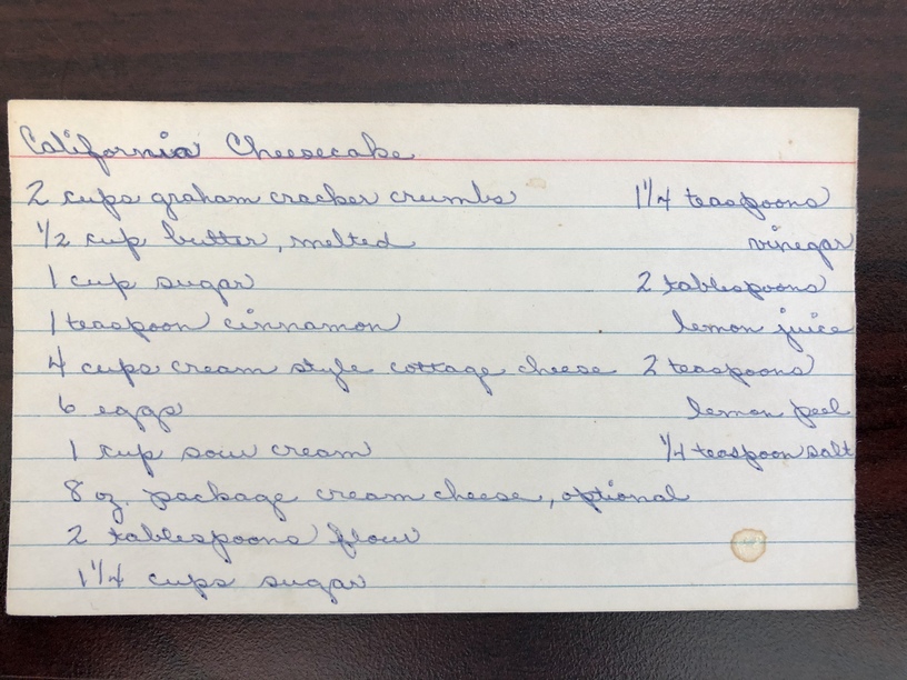
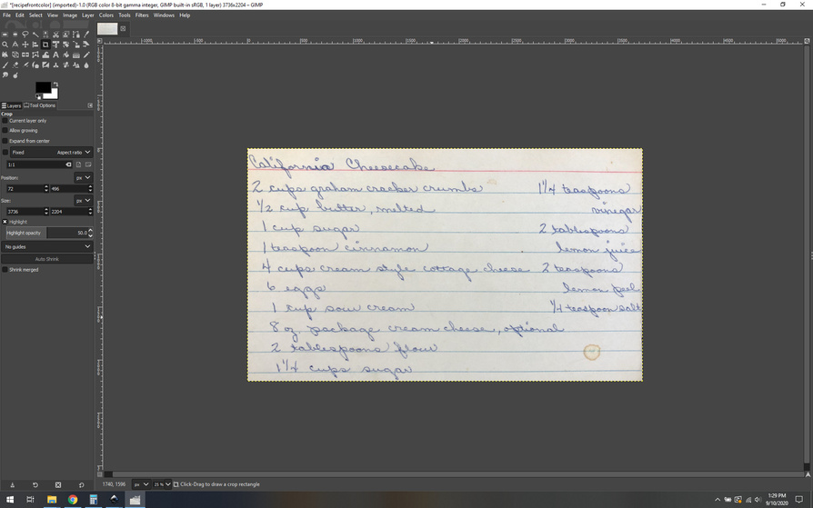
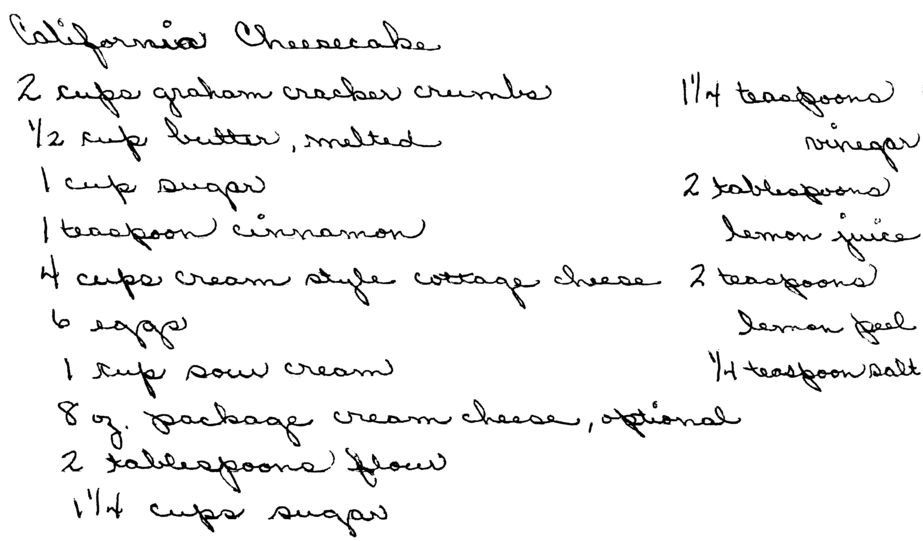
First off, don’t fix parts you don’t need. I immediately crop this down to exactly the recipe area.
Much better.
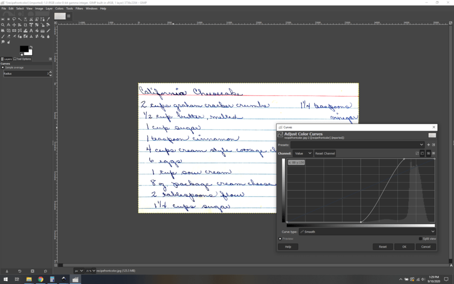
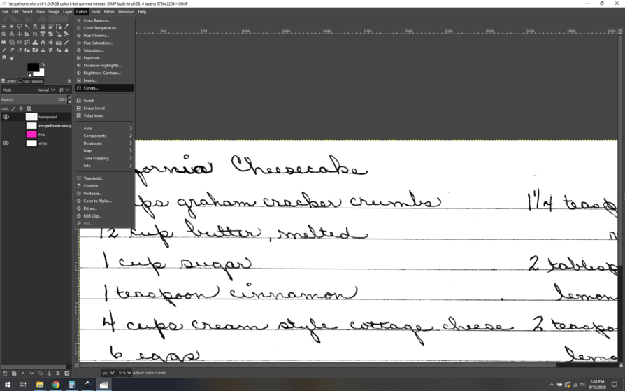
Now I want to use curves to up the contrast and get a clean separation.
Ahh, cleaner already. Now you could go a few ways, color select is one way, but in this case, the blue lines versus the text has enough color overlap that I think it’s too clumsy. The red, however, that might work. Let’s see. With a little effort and messing with the sensitivity of the color select tool, I was able to remove that red line in 2-4 select/delete stages.
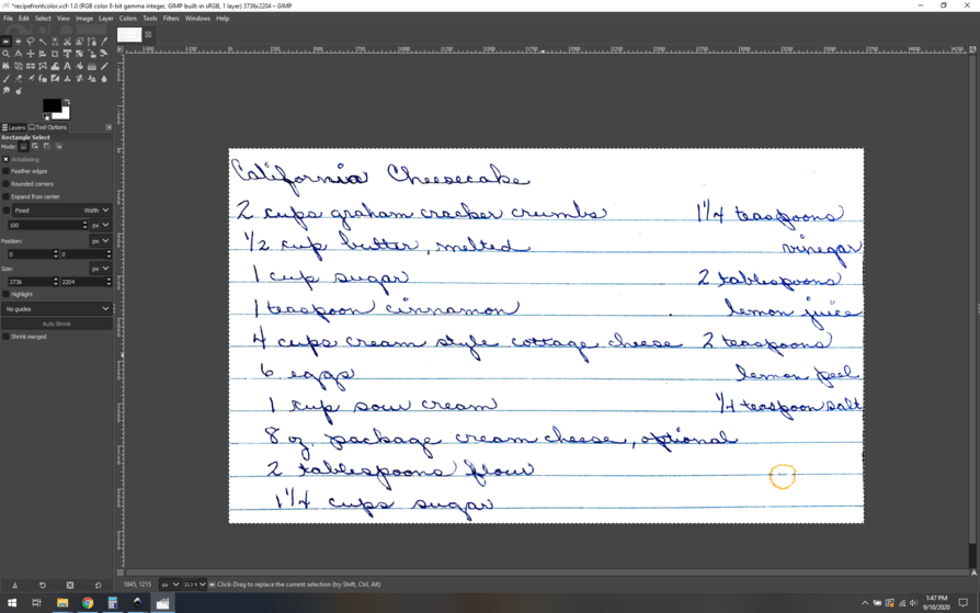
That’s a nice little bit of effort saved. Now, just to see if it can work, lets try to manipulate the image and use the color selection to remove the blue lines. (spoiler alert, no.)
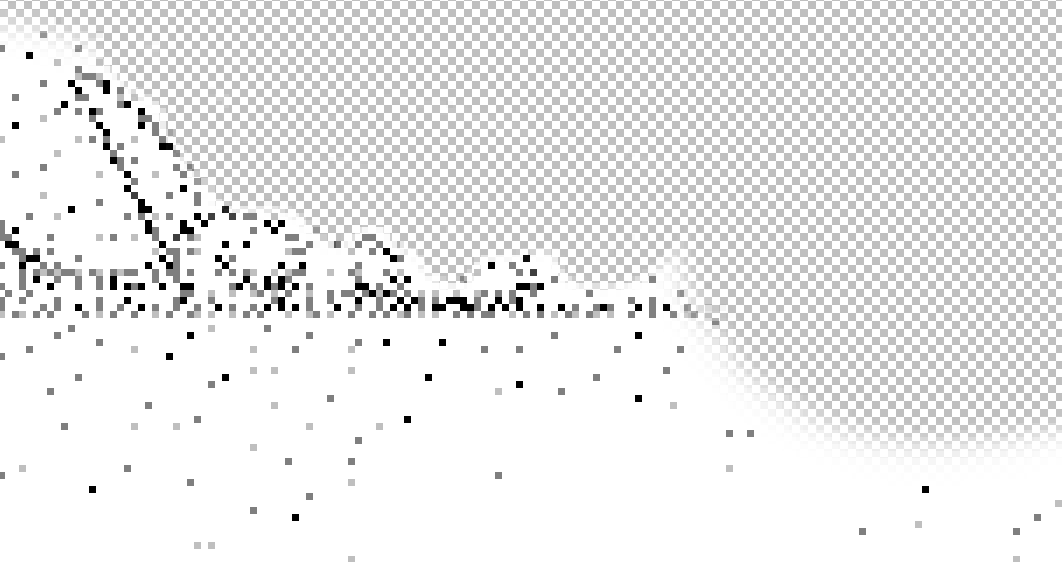
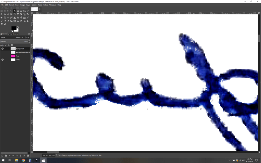
I start by pumping the saturation of the image to make the colors as poppy and distinct from each other as possible, then use the color selection tool. It starts off well enough, removing big swatchs of the blue lines… but eventually I am left with scraps that are the same color as part of the desired words, and we start to see this:
Notice the white pixels in the P of “cup”, that’s bad news. So, I am back to my original thought, we need to manually erase things.
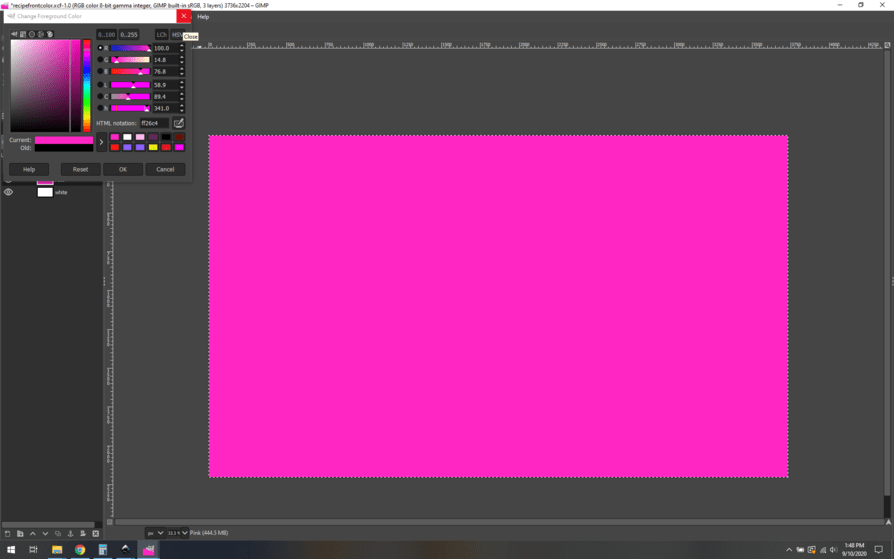
Luckily, I have a few tricks to make that go quickly and accurately. First up, I make three layers, a transparent layer and two white layers. I rename one of the white layers “pink” and then use the paint bucket to fill it a solid bright pink.
It’s important that the transparent layer is on top, with the white/pink underneath.
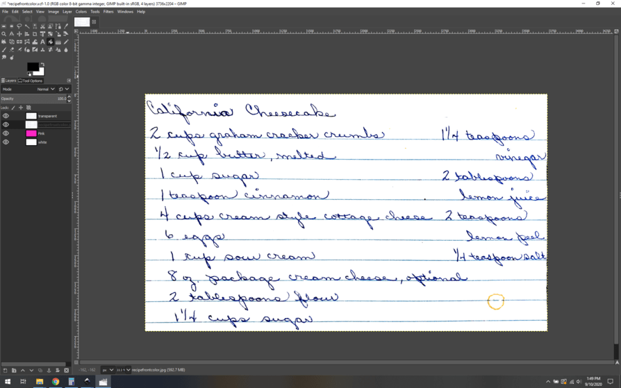
Then, I paste the entire recipe image into the transparent layer and either hide or delete the original layer.
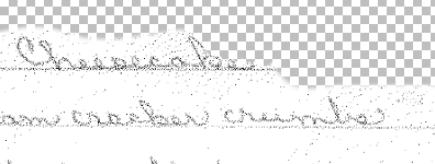
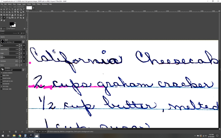
Like this. The key part here is that as we delete lines from the transparent recipe layer, the pink will show through and easily show us our edits. I zoom in with the eraser tool and go to work.
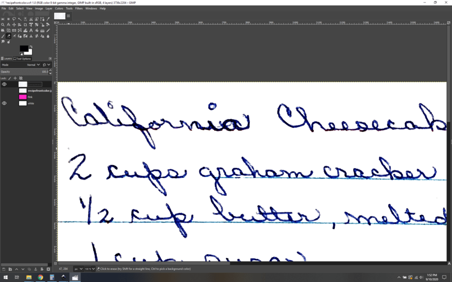
As you can see the hot pink really shows where the edits were made. To see how it looks as a final product, you can simply hide the pink layer for a moment:
Looking good! The rest of the process goes the same way, lots of fiddly erasing to get it just so.
When you’re all done with removing the blue lines, then I’d convert it to greyscale using desaturate:
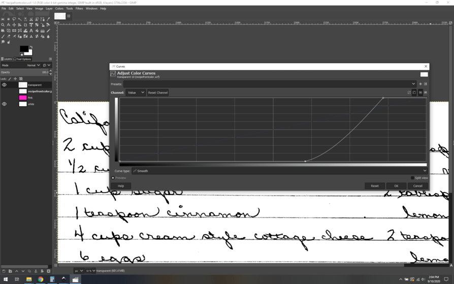
Then I would use curves to pump the contrast just how you want it:
I ensure that the whites are pure white and the darks are very dark this way. Then the final step is to export the entire thing as a png and integrate it into your SVG.
I know I went a bit quickly, if you have specific questions I can answer them, but my method is just one of many to get a similar result. I like my technique, I find it to be relatively quick and gets great results, but ymmv.
Here’s the GIMP file if you want to pick up where I left off, It’s right after I first show you the hot pink trick.
recipefrontcolor.zip (3.1 MB)