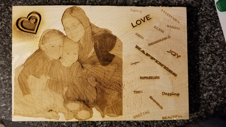
Job 1: The Photo. This was the whole point of my test. To see if I could reasonably produce a photo onto wood. I think it turned out pretty nice, however any advice in good settings or preparation would be greatly appreciated!
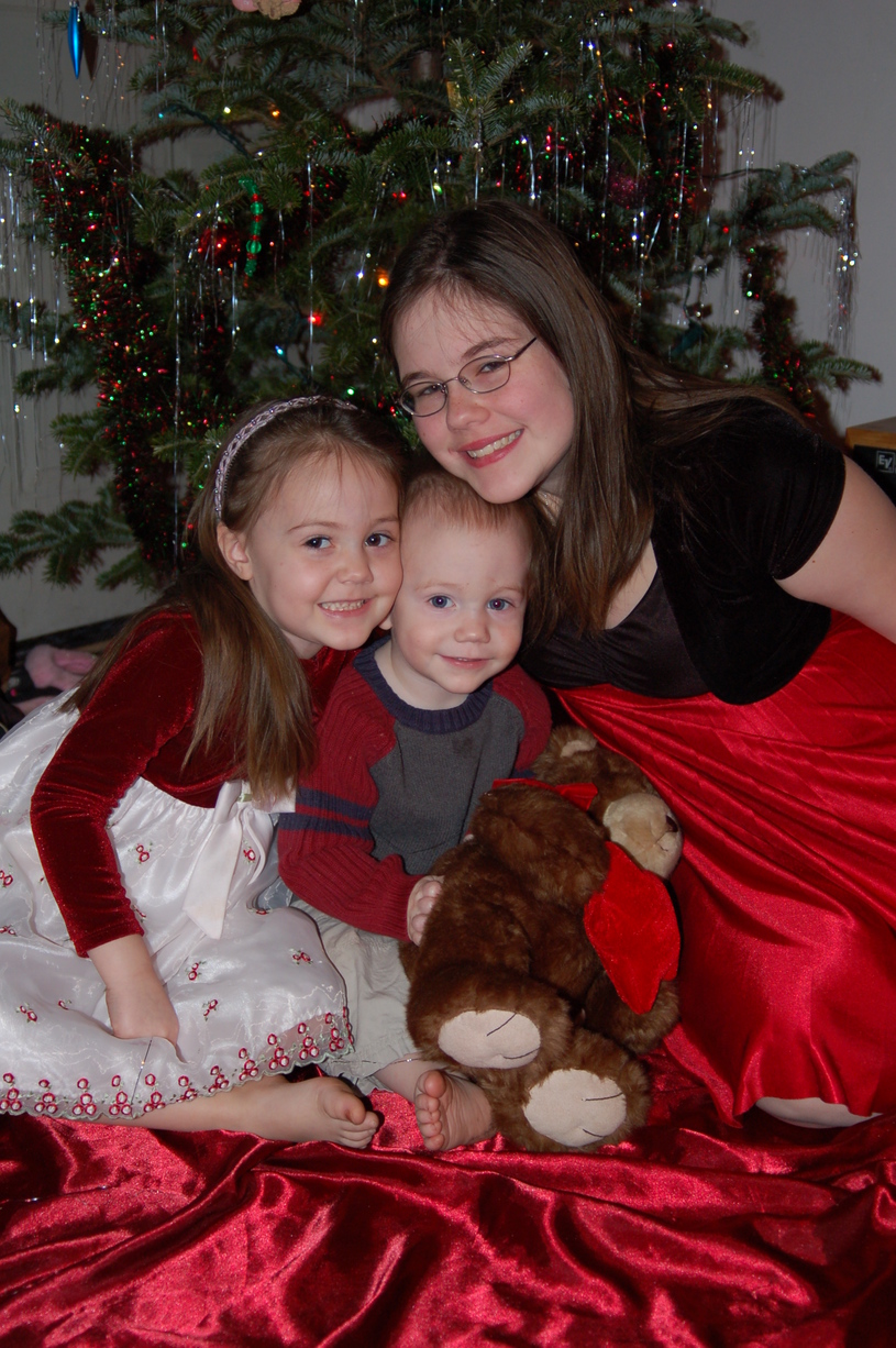
The original photo:
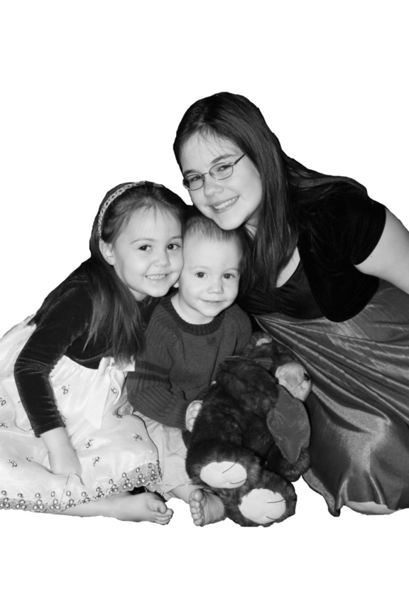
The edited photo that I actually used:
Job 2: The Hearts. A nice heart SVG I found online. In case you can’t tell, it DEEPLY engraved. This was a rather beautiful surprise as I watched it evaporate the wood in stunning clarity.
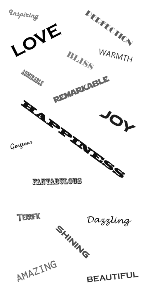
Job 3: The Words. My wife decided this was no longer a throw-away job. And rather than have me cut the excess wood, she decided we’d just fill that space with words. So we created some words in Photoshop (because I’m a Photoshop guy, not an Illustrator guy). It was saved as a png and uploaded into the GFUI. Again, deep engraves as required. (We purposefully varied the shading of each word slightly to get a different depth on each. Randomly set each word anywhere 000-127.)
All three of these things were set to Engrave By Color and the GFUI was told this was this was 1/4" Maple Plywood. The material was not touched between jobs.
My confusion is… If all three were done the same way, why do we only get a deep engrave on the heart and words?! Why didn’t the photo have varied levels of depth per color? (Not that I would have wanted that. Just trying to understand the process.)
I don’t have the answers, but I’m sure someone else might. (do sure and might belong in the same sentence?). I wrestled with photo reproduction on PG maple all of Friday evening. In my particular situation, it was areas of white with no borders that was causing the problems, and I never did get a satisfactory print. I’m truly thinking that some of this will be resolved when we get the very low power settings that have been mentioned. Not sure though, that your issues and mine are even the same. I’ll be following the replies to this, closely. Good luck, Tom.
Mmmm… I really didn’t though. I mean, there’s a slight difference in each shade, but nothing even remotely deep as the heart. Even my daughter’s black sweater. And there was only one engrave setting available. I did not adjust manually for any of these.
And maybe that’s the difference? Did something happen automatically? If so, what caused the difference?
Thank you. Very kind but unnecessary. I’d already used at least two iterations of the photo…one from JBV and one from Jules. I’m beginning to think that maybe it’s just me being too picky.
Is it because the photo and the words were raster graphics and the hearts were vector graphics. Don’t get to set the parameters for each colour in a vector file, whereas for a picture you just set the overall settings and power is then scaled by blackness.
Tell it you have proof grade maple installed and it will give you 3 unless you got a very different gfui build than I do. Pick the darkest and you’ll see a definite difference in depth between the lightest and darkest.
You’d think that. But only the hearts were vector. Both the photo and words were pngs. So raster.
I’m beginning to think that may be the case. That it saw 256-levels of gray and decided to come up with some sort of balance between all of the shades.
Only 2. The photo and words were png, the hearts were svg. If anything, I’d expect the words and photo to have the same effect.[quote=“johnse, post:12, topic:8555”]
I don’t yet have a laser, just making some guesses.
[/quote]
Reasonable ones!
Could be. I thought material that you choose is ? In this case I chose 1/4" Maple Plywood from the list. I think that’s a selection. And it only had 1 level of Engrave By Color.[quote=“jonny_firebrand, post:14, topic:8555, full:true”]
Perhaps the photo needed dithering to reproduce the shades?
[/quote]
I think it shouldn’t since it was grayscale already.
From experience with other lasers there are 2 very different modes. One mode is called 3d engraving/mapping or something like that. In this mode the power of the laser is mapped to the grayscale value (possibly non-linearly) with the intention of creating depth.
The second mode is normal raster engraving. In this mode the bitmap is dithered at 1bit depth (B/W) and the laser is simply on or off at the fixed power settings for each dot. In this mode it often makes sense to convert it yourself in advance to fine-tune the dither settings. The laser drivers I have used have various settings for the dithering when you are using a grayscale or color image.
I think the heart is using something like mode 1 and the picture is using something like mode 2.
On another note, you almost certainly want to jack the contrast way up on that photo. You want to make sure you are using the full dynamic range and clear areas (pure white) look nicer than little bit of gray. You probably want the faces mostly white. Images tuned for lasering do not look great by normal standards.
I am also wondering about why you saw a difference between the vector and the JPG. Maybe you don’t have a true black on the JPG?
Playing with contrast before converting to black and white, and using the “Posterize” filter both might be worth burning a couple pieces of scrap wood.
Here’s something kinda interesting that may correlate to how the GFUI reads bitmap images.
I opened the image in GIMP (Photoshop will also have this feature I’m about to mention) and just for giggles, I opened up the histogram. A histogram in digital photography, for those that haven’t dealt with such things before, is basically a chart that represents the number of pixels (height of each bar) in an image that hold whichever color value as represented left to right, 0-255. In this case, the image mode is grayscale so all we see is data for black/grey/white. If this were an RGB image, we would also be able to see Red, Blue and Green histograms individually. The useful extent of this in photography is it can be used to help determine the proper exposure (light/dark) of an image and also the color balance of an image (in a “neutral image” the Red, Blue and Green histograms will fall very closely directly lined up with each other).
How does this relate to laser engraving? I don’t know but this just may be some insight to how GF’s algorithm works. I’m going to ALL CAPS some terms I think may be important to us here.
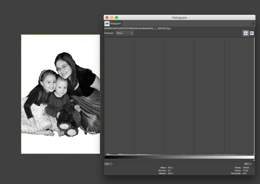
Look at the image that was engraved just below, superimposed with its histogram. There’s a huge spike of white pixels way on the right side. That is apparently the white image background. All the other pixels in this scene though have very low numbers IN RELATION to that white peak, they almost look like they have been AVERAGED together. There is very little difference in height between the columns representing each of those 0-255 pixel values. This makes me wonder if the GF software is somehow reading this information as well as the pixel values, because when you think about this, the GF software has to take the pixel data and correlate 256 levels of gray to power level. If those 256 levels of gray are all very similar to each other as we can see in the histogram, maybe we end up with an engrave that has very little distinction between the different color values.
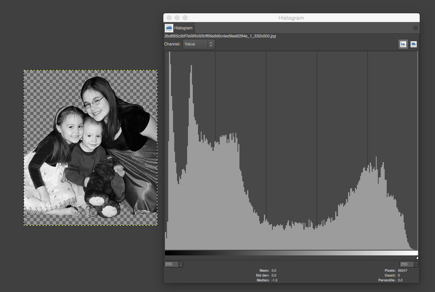
Now here is the same image but instead of a white background, it’s transparent. I made no changes to this image other than knocking out the while background. Suddenly we can see all kinds of variation between the different levels of gray. Judging from this histogram and the “jaggedness” visible at both the darker and lighter areas, an engrave might show better distinction in those areas, but may look a bit muddy in the mediums. Maybe, maybe not.
I agree that’s what’s happening. I just don’t know what the trigger was for that.
Okay… I’m putting speculation on hold for a little while. I’m on a job right now, but when I get home tonight I’ll do a test… 1 gradient shape as vector and one as raster. Print 'em out the exact same way, on the same material, and see what happens.