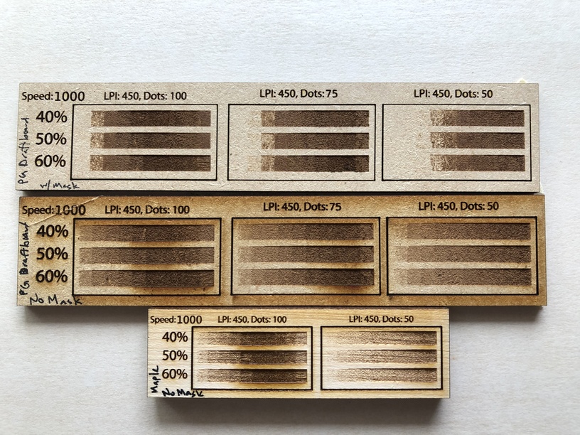
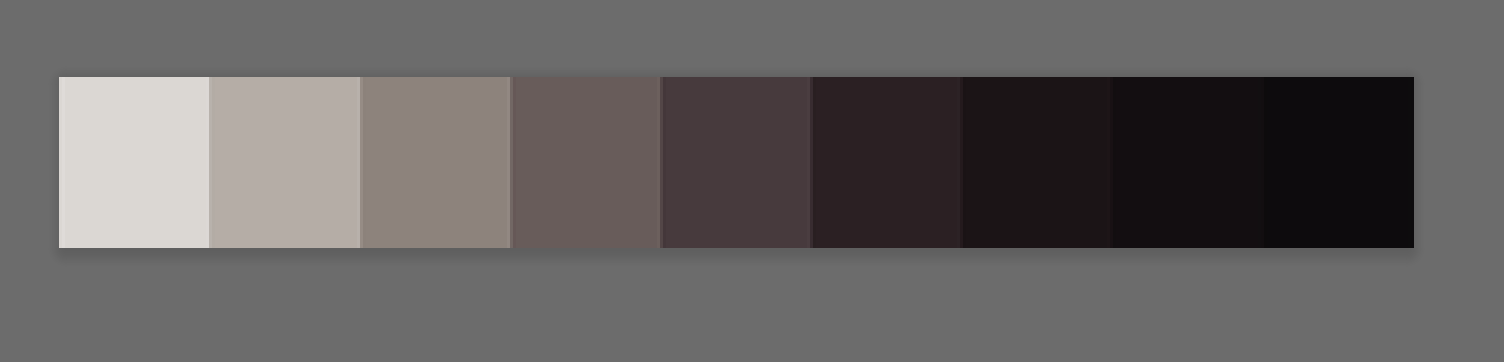
I have been testing engrave settings using a test file with increasing darkness from left to right. All of the engraves were done at 1000 speed, 450 dpi. The power was varied between 40 and 60 and the dot range was varied from 0-100 to 0-75 and then 0-50. I noticed that as the image gets darker, the engrave initially gets darker, then gets lighter again. Why is convert to dots doing this?
The photos below show this phenomenon on the following materials, from top to bottom: PG Draftboard with mask, PG Draftboard without mask, and Hardwood maple without mask (non-PG). All three materials show the same pattern.
The color space also identifies funky in Illustrator as indexed (but I don’t believe that’s the same “indexed” as you’d expect in a GIF). It’s almost like it has some kind of inherent blend mode that’s not showing up, but is there…
Though, the file you uploaded does show up in the Glowforge app correctly.
You can convert the images in Illustrator by selecting the images, going to Edit > Edit Colors > Convert to Grayscale and it gets rid of that whole indexed color space - it copies into Photoshop as you’d expect also at that point.
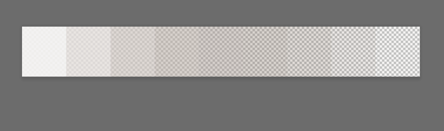
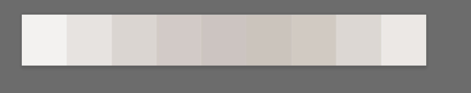
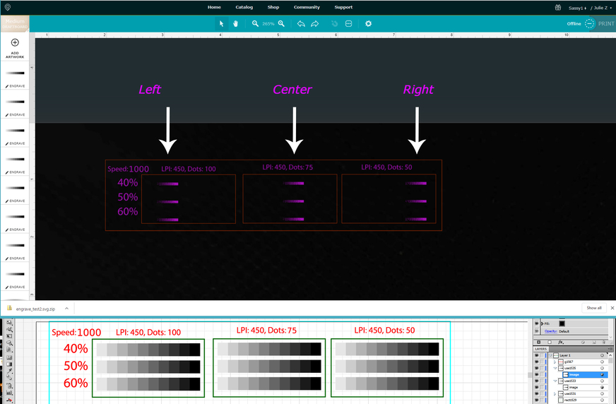
That jives with how that file is being interpreted by the GFUI…if you zoom on the results when you take it into the GFUI, you’ll see something strange going on with the alignment of the preview…it’s interpreting the file as darker in the left, center and right, instead of getting progressively darker as it moves right.
Since JB looked at it in Photoshop and identified something hinky going on…I’d suggest reworking the file. The interface appears to be picking up what it sees. (Odd that the display on AI shown underneath does make it appear to be darker at the right side.)
Wow @jbmanning5, thank you for looking into this! I hadn’t thought about investigating the raster pattern - it looked right in Inkscape. It is easy enough to convert the raster or just create a new one. I am away from the forge over the weekend but will test on Tuesday.
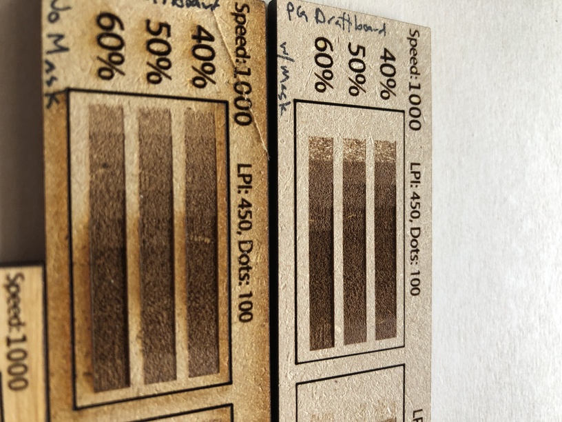
@Jules I did not see this in the GFUI at all! It was just progressively darker left to right for all three dot ranges. I will double-check because I am still getting used to the GFUI but my understanding is that it is a pretty good representation of what the print will look like.
It pulled into the app ok for me. It gave the right representation, but what’s showing in that copy that I brought into Photoshop shows basically what you were experiencing with the light/dark/light.
Also odd, is that PS will create a new document based on the selection, or clipboard size, and it did - but the image didn’t fill that clipboard size.
Lots of oddities going on with it. The colors that I was getting also were coming through funky (indicated in the third picture).
I would definitely set out to create some new graphics.
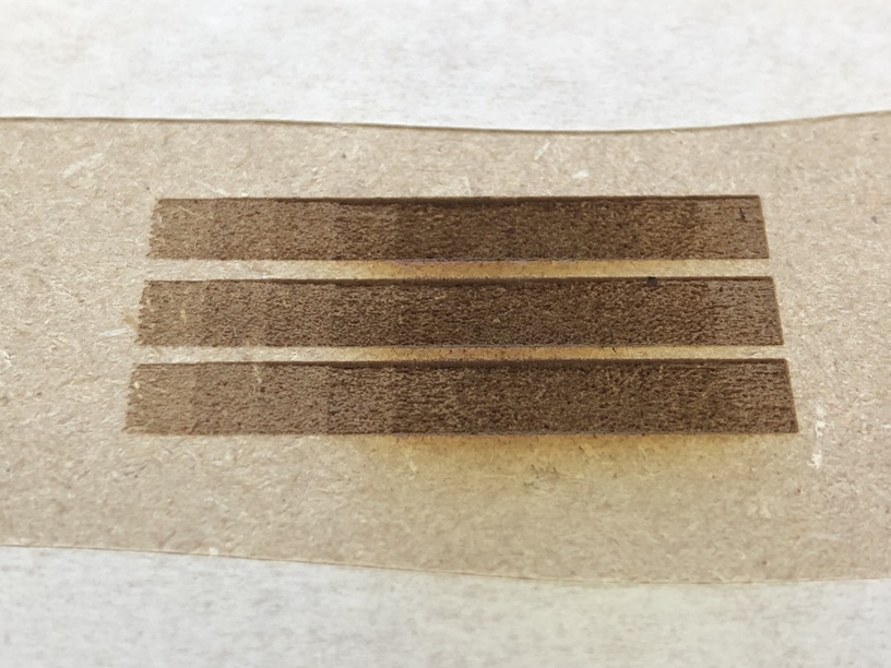
I recreated the svg, using a raster I generated myself programmatically, with no transparency. The resulting burn on unmasked PG draftboard looks about the same as before. The burn shown below is the 0-100 dots range, increasing power from 40, 50, to 60 top to bottom. (1000 speed). It looks pretty much the same with the lighter burn on the darkest cell.
@RyanArt I’m curious why this is outside of the GF team scope. I am testing GFUI engrave settings on PG material and it doesn’t appear the resulting burn aligns with the settings. There is the chance this could be a laser issue, so I’d love a look by a GF team member.