Since getting my GF, one of the things I’ve really wanted is some sort of detailed break-down of engraving settings on various materials. What settings work best and why? What causes poor results? What needs to be done to a photo to make it work? The PG defaults in GFUI have universally produced bad results for me. I read through many posts, and I saw a lot of engravings. But what I didn’t find was some really rigorous description of how to get good results. I did find the following recommendations:
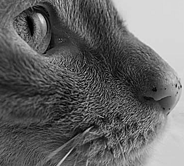
- Photos that have high contrast between features works better than smooth gradients. Over-sharpening some photos helps because it creates this.
- Lighter images work better than others (although note this is entirely due to the default PG settings - see below).
- If possible, remove the mask over the area to be engraved.
- Dot density and pattern grayscale methods work better for photos than the 3D setting (varying laser power).
To start advancing the knowledge in this area, I decided to do some experiments to try and answer the following questions:
- What is the dynamic range of this medium? In other words, how many levels of grayscale can be reproduced in a way that the eye can distinguish them?
- How deep should one etch? Does a shallow surface etch produce better results, or a deep etch?
- Do the layers in plywood play any role? Are materials with more uniform layering better than others?
- Does pattern engraving work better than dot density, vice-versa, or is it image dependent?
I am hoping that this thread will be the start of further explorations, and that we may eventually see the knowledge gained folded back into the GFUI.
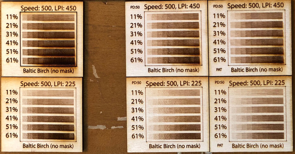
So to get things started, last night I stayed up until the wee hours of the morning running some experiments. In Photoshop, I created an image with a stepped gradient going in 10% increments from a grayscale value of 10% all the way up to 100%. In Illustrator, I replicated this image into a tile with gradients and labels for “power” levels. I replicated a number of these tiles with different engrave settings: LPI, dots versus patterns, and maximum dot/pattern density.
I set things up to do some runs with a spectrum of parameter settings:
- LPI: 450 (the default for PG engrave) and 225.
- “Power”: 10% - 60% in 10% increments. I stopped at 60% because there did not seem to be any reason to go higher (wood is already charring).
- Speed: 600. This is the PG default setting for Medium Hard Maple Plywood. I didn’t see a need to vary this parameter. It interacts with the other parameters in a fairly predictable way, and it seems like a reasonable thing to fix.
- Grayscale mode - Dot density versus patterns.
- Maximum pattern density. I did one set of tests at 100%, but also added one at 50%. The 50% value was included because of #2 above (lighter images work better) - it seems like a way of letting the GFUI compensate for this rather than having to wash out the source photo.
Here are the results for PG Medium Hard Maple Plywood:
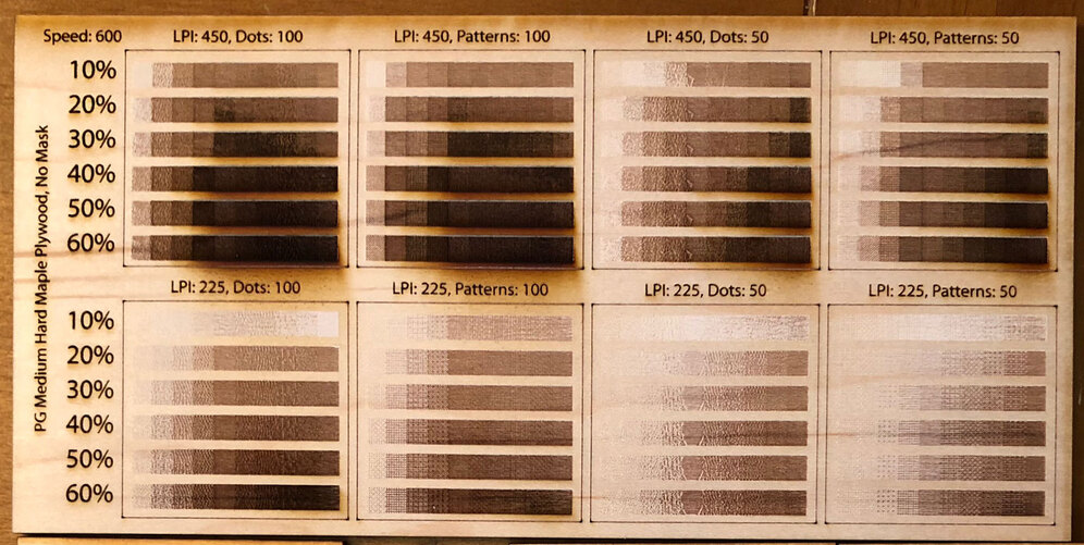
All samples are PG Medium Hard Maple Plywood, with Speed 600. The top row is at LPI 450, and the bottom row at LPI 225. The leftmost two columns are at a 100% pattern density, and the rightmost are at 50% pattern density. And the sample alternate, going left to right, between “Convert to Dots” and “Convert to Patterns”.
Some obvious conclusions:
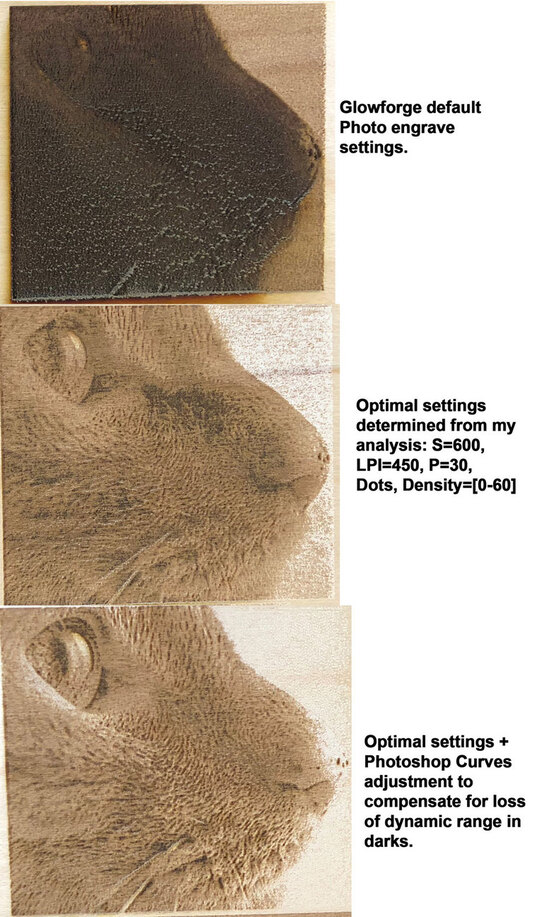
- The GFUI default PG photo engrave settings are crap. Using PG defaults on a photo with any grayscale value over 50% will result in charred wood. I’ve seen posts on the forum here suggesting people lighten their photo to make it work. Nonsense! Rather than make the photo look washed out on the monitor, why not fix the settings in the UI so that the engraving more closely matches an unwashed out photo?
- With wood, there is definitely a burning effect where lased dots spill over into neighboring regions. I think there is a maximum LPI*Power value above which this effect becomes predominant, and you lose all ability to see detail in the engraving (for proof - see # 1 above).
- Layers in the material can cause counter-intuitive effects such as a darker portion of the image producing a lighter result. This is because the engraving settings often used, particularly the PG defaults, are removing a lot of material. When working with a layered material like plywood, as you remove progressively more and more material, eventually you will transition into another layer. That layer may be relatively less lased than the previous layer is on a lighter engrave, or even have different properties, and so it can appear lighter. This can also be seen at lower power in material which has had a finish applied (the PG woods and plywoods). See my photo below where for some settings on the Maple Ply the 10% gray setting is lighter than the surrounding wood. I believe this is because that setting has just burned off the finish layer, and exposed the underlying veneer layer.
- The behavior is decidedly non-linear. This shouldn’t be a surprise, as pretty much all human senses work in a non-linear way. This is why we have units of measure like dbA and canedlas. Some of this non-linearity may have to do with the “power” units in the GFUI. I need to go back and read through how this value is calculated, and see it’s actual relation to power (I suspect it is not a linear relationship. Perhaps affine, but perhaps not even that).
I also have some similar results with Baltic Birch. I didn’t have my nice panel made yet when I did these, and I don’t have results for at 100% pattern density, “Convert to Patterns”. The tiles are layed out in a similar order.
EDIT: Adding source and generated SVG and PDF files in case anyone else wants to use this on some other material.
Engrave Test.zip (796.0 KB)