Hello, we are Engravings. I’m the pretty one, this is is my twin sister.
I was rooting around the internet and stumbled on to the world of cartouches. They immediately jumped out as possible engraving targets and so I muttered something like “well, I’ll just go nail this thing first try.” You see, I am super duper expert on engraving and nothing can go wrong.
Right?
RIGHT?!
Well, yes and no. These engraves worked nicely but it all comes down to intention and materials – and I think that aesthetically it wasn’t what I’d hoped for. Let’s dig in.
Some notes:
- This is in “Beyond the Manual” for a reason, settings and whatnot are fair game
- All materials are 1/8" thick.
- The finished pieces are about 5.5" (140 mm) tall
- All engraves done in one pass.
- All engraves were washed thoroughly with denatured alcohol (not wiped, I just went nuts and sloshed it around and gently brushed it). The maple – as expected – warped heavily during this process for a while but settled back down once it dried out. Its almost perfectly flat now.
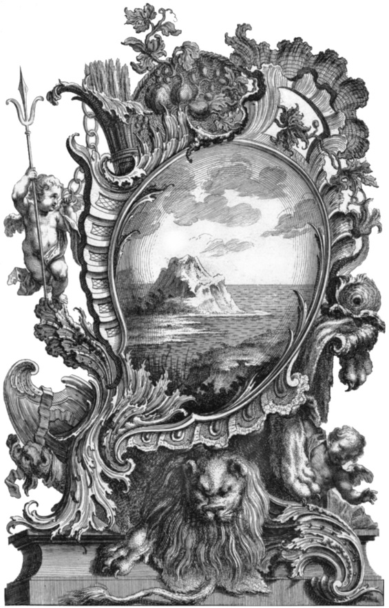
- There’s no copyright on this image – it’s from 1738. (I’ll include links and files at the end)
- I did the engrave in two different materials with roughly identical images, though I did tweak cut paths and settings between the two. I’ll compare below.
- I’m going to assume that you, esteemed reader, are familiar with the following skills:
*1. Converting images to black and white and curve-based contrast adjustment in your favorite raster editor.
*2. Bitmap tracing to get an outline path.
*3. Path management and specifically the use of stroke width to offset a traced path.
*4. Basic parameters of engraving, understanding the relation of speed, power, lpi and dots vs vary power – especially as it relates to desired contrast and depth of the engrave.
So let’s get to the pictures!
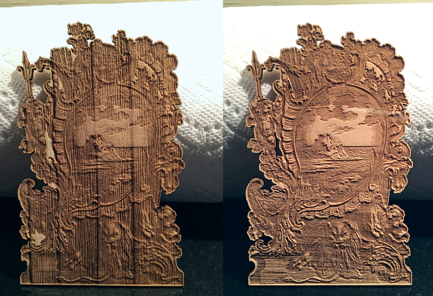
Material choice makes a world of difference in your final outcome. I originally thought I should make this in maple, it’s my go-go light-colored wood for engraving, it gives consistent results, well-behaved material with tight consistent structure. Then I got stingy. I thought I would do this in a material I had on hand but never tried before, Paulownia. Paulownia is lightweight, almost like balsa, and is very uniform in color. What’s maybe not too surprising in hindsight is that the laser eats it up – and not very uniformly.
The vertical banding is grain, and the very thin vertical bands are inconsistent engrave depth, Paulownia is a nice material but small scale engraving like this? It’s not ideal, it just doesn’t hold fine detail.
Paulownia, sorrow
A closeup reveals the banding. The grooves aren’t quite the same pitch as the laser, I used 800/30/340 lpi/vary power here (and cut it at 350/full(pro) which was actually probably overpowered), and there aren’t 340 lpi in the grooves. For that reason, I think they are caused by variations in the wood structure and not just laser effects.
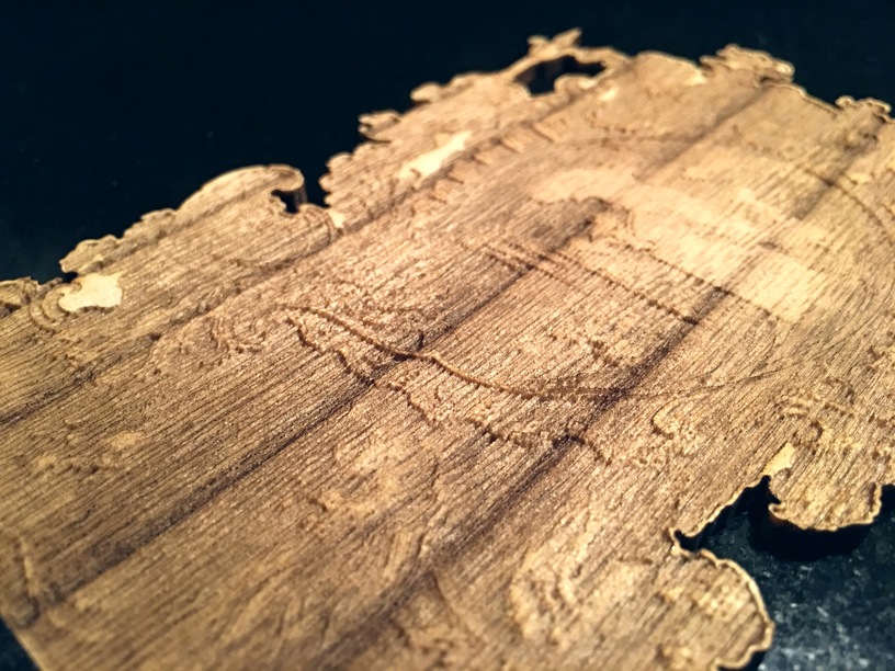
Paulownia, regret
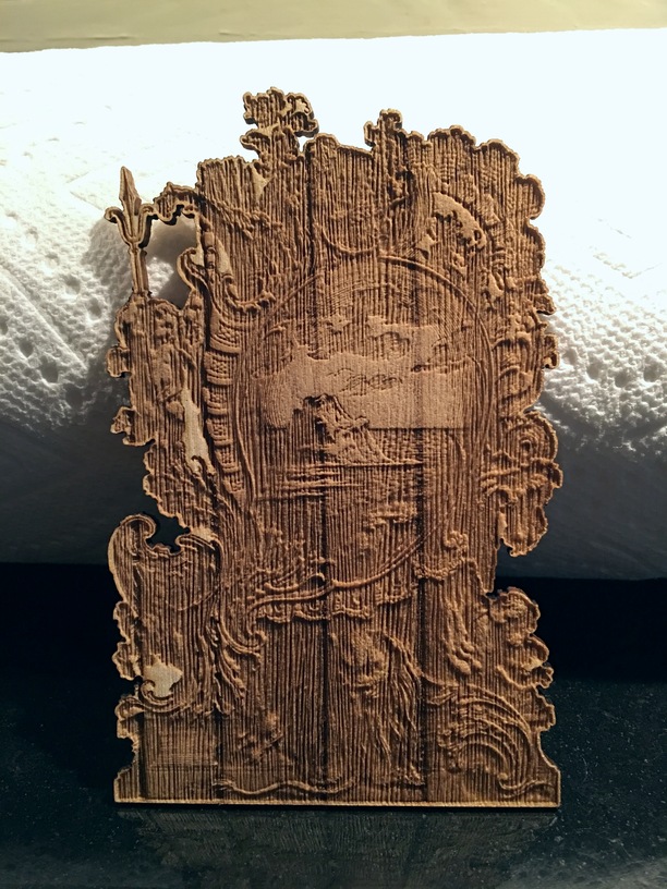
So, I decided to try again, this time in maple. I tweaked a few things before I started here: I cleaned up the perimeter cut line and added a few additional small cutouts to remove larger whitespaces from inside the engrave area on the left side. I did 800/60/340lpi/vary here, (215/full pro cut) which I’ve had good success with on other engraves. I’ll let you decide if you like it, but personally it wasn’t what I was looking for.
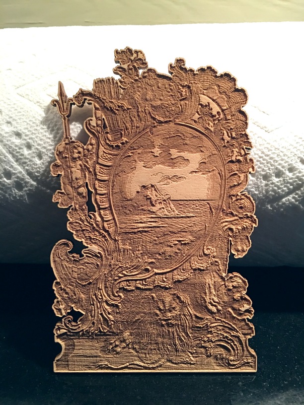
Maple, disappointment
The grain in the Maple is running horizontally, you can see it’s visible (on the left side below) but far less pronounced than the Paulownia. The real improvement here is the overall tightness of the maple structure, you don’t have those grooves that were visible in the Paulownia.
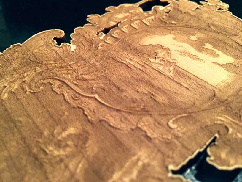
Maple, that feeling when you get home and find out they screwed up your takeout order
So, what would I do differently?
There are as many answers to this question as there are variables in engraving – again it all comes down to what you want.
I could try slowing the engrave down, that generally increases contrast.
I could drop the lpi, 340 was probably overkill.
I could go back and tweak the root image, I think enhancing the contrast in the image will be necessary to prevent the muddiness.
I could (and rbtdanforth would probably concur here) do multiple passes to increase depth.
I could scale things up. This would probably look worlds better at something more like 11" tall, give the details room to breathe.
I could do a gentle mix of all of these things… except at this point, I’ve used up my time I want to spend on it (especially after this writeup). I found a whole world of these cartouches, and there’s a lot more to explore.
If you want to give it a go, or try other cartouches (RABBIT HOLE WARNING – so many to choose from), here are some things for you.
My engrave file with cutlines and processed art:
frame_cut.zip (2.8 MB)
The original image:
https://collection.cooperhewitt.org/objects/18238015/
My processed image:
(Again, I would seriously bump up the contrast curve here to avoid the muddiness if I were to try it again)
Anyway, that was my engraving adventure with this cartouche, hopefully you’ll find something useful in this.