I’m trying to make plaques for students and none have turned out like my setup. It looks terrible! The club logo design is too high while the text is crooked and overlaps the logo when it’s supposed to be below. The files were made in Adobe illustrator and the material is 11/16" cherry.
These are supposed to be for a banquet. Any help would be appreciated.
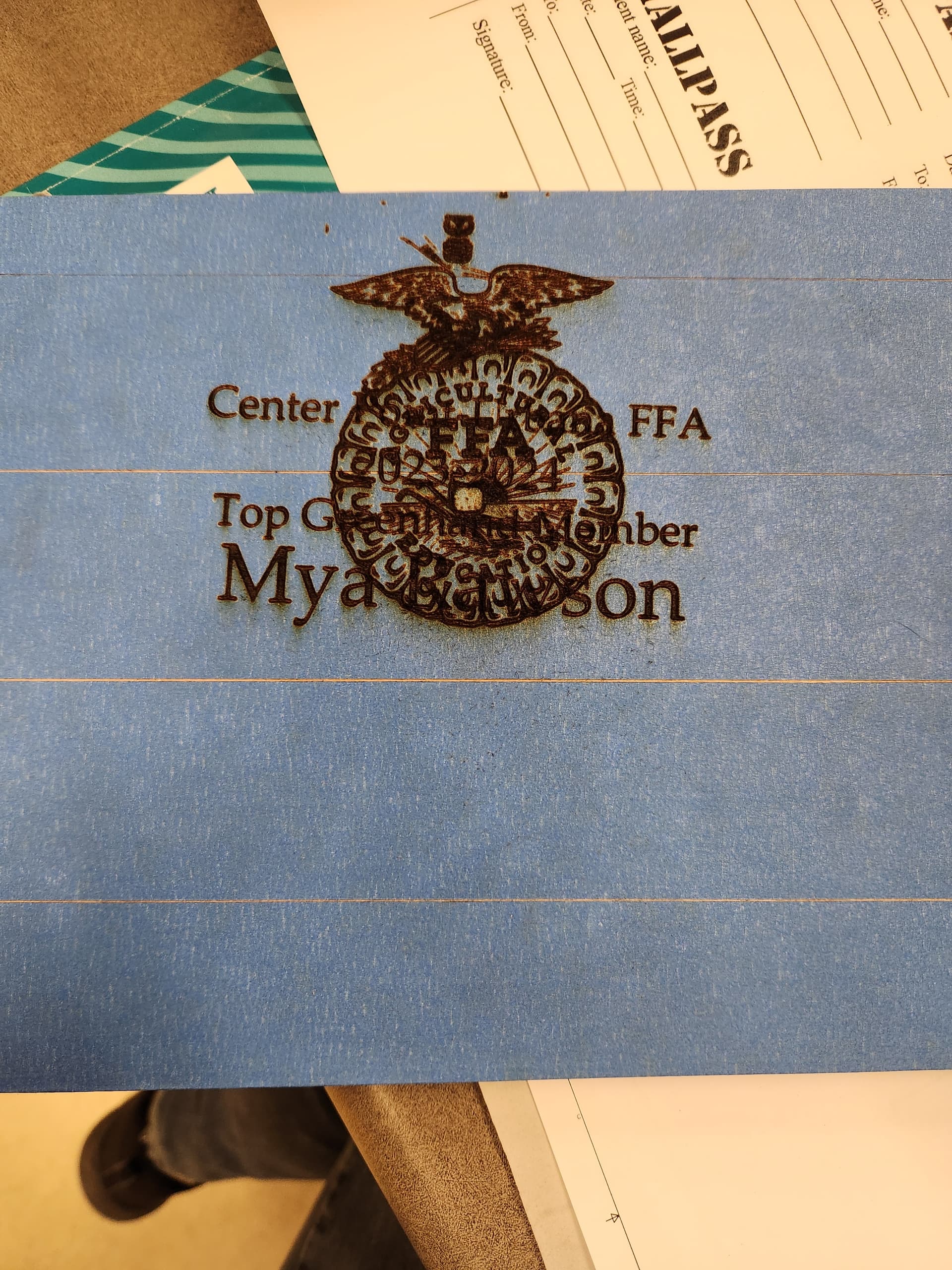
Kindly supply a picture of your project that shows these flaws so that someone can help you. Did you produce the item with the honeycomb tray removed?
3 Likes
For any item thicker than 1/2", you must remove the tray. It looks like the printhead repeatedly crashed into your plaque. Remove the honeycomb tray and elevate the plaque so that the surface to be engraved is between 1.5" and 2" from the floor of the Glowforge. Set focus on the material and make sure that the red beam lands squarely on the plaque. Place your design and engrave. For more precise placement of your design, make a jig.
7 Likes
Can you upload your art - not what it looks like out of the machine, but what you uploaded to the GFUI?
4 Likes