Hi all! First time posting and I hope this is the correct spot or someone can point me in a different direction.
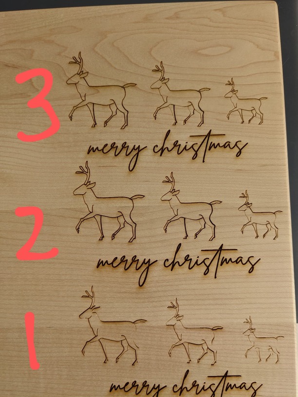
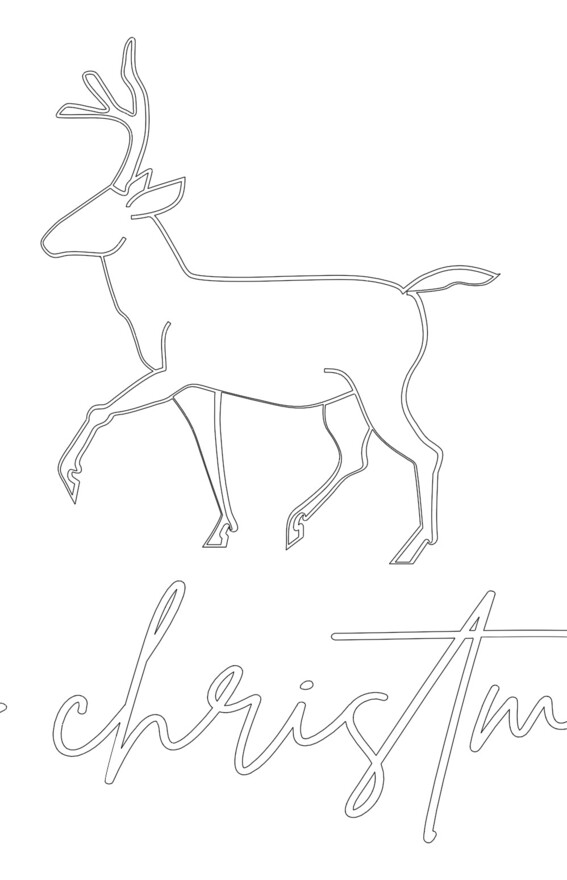
I am messing around with some engravings on a maple cutting board and they are not engraving as I hoped (or expected!).
I drew an image in Adobe Illustrator and then added some font. When I engrave, the font is coming out much deeper (darker?) then the image. I am using the same settings for both.
Welcome to the community. Nice drawings! You might want to thicken the lines up, then rasterize the images. I think that would allow for a better engrave. Someone else in here may have other suggestions, as well.
Also, using draft settings will not give you as good results as SD or HD, although it will take them longer to complete.
If you are engraving the file as-is, the reindeer will never be as dark as the text as they are red, which is 50% lighter than the black they be need to be.
I tried thickening up the lines and it already looks better. Also, I didn’t realize that draft settings will not give as good results. Thanks for the tip!
Ah, I didn’t even think about why I had them two different colors. I changed them both to black. I always think of the colors as “steps”. Can you explain a little more by what you mean the red is lighter?