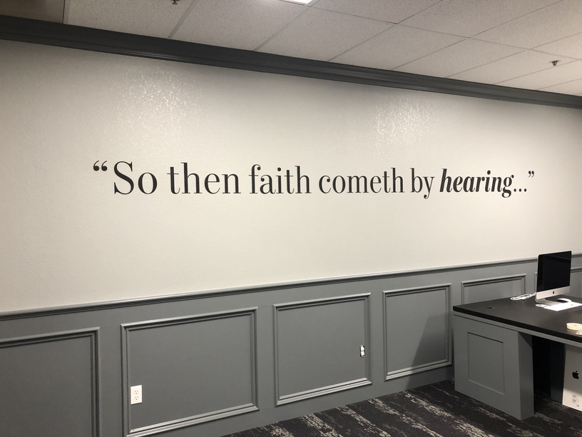
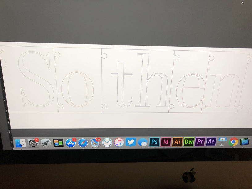
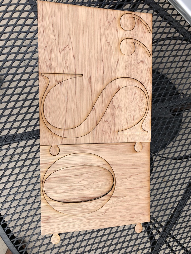
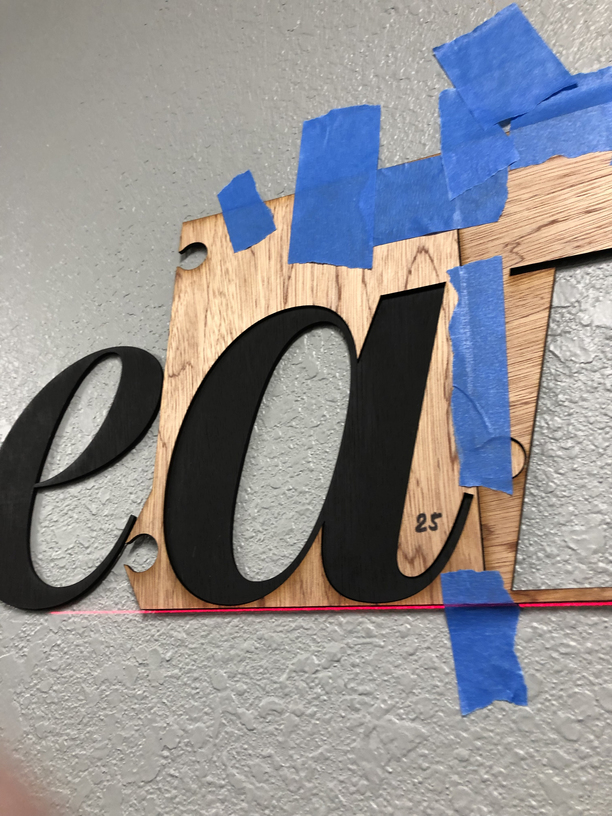
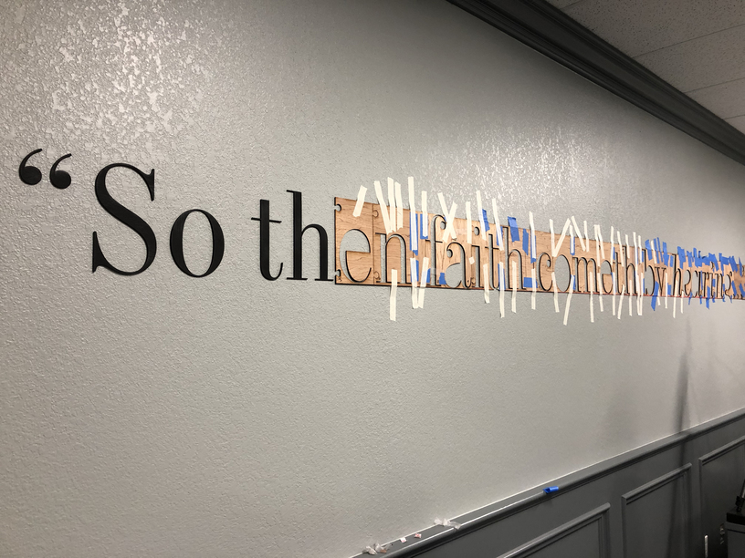
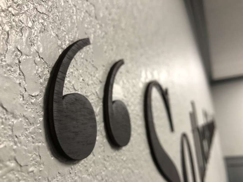
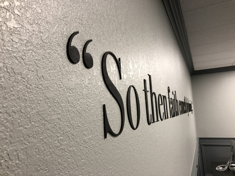
This is my first post, but I wanted to share how we added a quote (verse) to our walls. We wanted to use a serif font, but I was very concerned with spacing/kerning and getting it level. I decided to make each word a “puzzle” piece to keep the spacing perfect and to make it easy to make the verse level. I haven’t seen anything like this, so I thought it may help someone that doesn’t have a pass-through slot.
Nice job, and thanks for the clear explanation of your successful application. You better be careful or local museums will be contacting you to do the signage for their exhibits.
Really great job! I’d definitely envisioned a puzzle-fit placement guide for larger designs if I ever needed one, and this was a perfect execution of the concept.
We have a bedroom reno coming up and I eventually want to make a “headboard” using the same kind of idea – so glad to see it in action, right down to the command strips!
Would you be willing to share what thickness and material you used on the large wall letters. I very much like the way they stand out just enough to be there! but not so much as to look blocky,
This is truly a beautiful method and implementation.