Hey GF Fam… I have been working on this for two weeks with no success. I went to AI’s FB page and asked because I thought I was having issues with Illustrator at first. Then I went to my friend’s sign shop down the road. I thought he understood what I meant but i was obviously wrong. He knows I use a GF but I believe he uses raster images in his shop. Anyways… yall know what I am trying to do. The grey section… one piece. The black section… one piece. How in the world do I do this? It is coming out to be a zillion pieces. I tried flattening it. Ive tried so many things that I can’t even remember all of the ways. I have youtubed until I am blue in the face. What am I doing wrong? How can I go about this? I am just trying to make my hubby another logo for his 5th business that took off like a rocket! Thankyou guys for any advice!
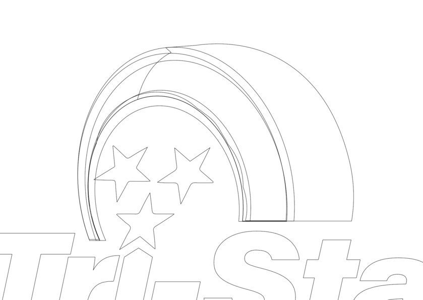
Poking at your file, I can see the the tire might be coming out as more pieces than you expect, here’s what it looks like in “Outline view” in Illustrator (View > Outline):
It seems you’re likely getting bit by something people often get confused by, which is when something is draw for Illustration, where how things are layered doesn’t really matter to the final rendering.
But those vector layers can matter when trying to pass it to a laser.
There’s a few ways you could clean this up… which I’d be happy to give you some pointers on, but I want to make sure I understand what you’re trying to do first
Yeah, in this case I think you’d do better to ignore the vector entirely and open it up in a raster program and grab by colour - then import those as separate items and trace them to get your individualized cut lines.
Yes, I am. That is exactly what I am trying so do. In a way that it will make the logo look as the full image does. I am not sure why I am having so hard of a time. I guess because of the way the layers are not full pieces. Or… I am not sure of the correct lingo… I know what I mean…ever had that happen? haha!
The image trace way is probably a lot faster and just as good. But mucking with vectors you can make things perfect =P and the perfectionist in me often goes this route.
I always feel icky taking a vector, turning it into a bitmap, and tracing it, so I’m with you on fixing the original file. I work with computers too much to trust “Computer, guess what I want!”
Wow! Thankyou! You went above and beyond! Wow! Wow! Wow! I am not sure I get so confused! I really wasnt expecting so many pieces when I opened the file. You were on point on that! That is exactly the lingo I was looking for. I cant thank you enough! I mean, the explanation with the videos and the files! I am so greatful!! You are amazing!
I personally use inkscape and have had some great results with using that to convert logos into svg’s. Let me see what I can whip up and I’ll send it on over
So first up is the color version, I imported via Ghost script into inkscape, and made sure to set the quality meter to about 230 (super fine) after the file renders you have the same thing as shown above however in SVG format, you can now burn each section using the light gradient to replace the color with different tonal burn shading. You can even get the tonal suddle difference in the silver rims buy doing the darker part (for example) by doing 550 speed, 27 power then do the outside part of the silver by doing ,550 at 24 or 25 depending on the wood you are using the difference will be slight but it’ll really make the shading pop and draw your eye to the logo for sure.
This is just your typical black logo design, the only issue with this one is that the rim kinda gets eaten up by the tire but if you need something quick and less Fancy that should be a great addition.