You know, I don’t hate the current UI design. It’s the first really big design overhaul in a long time.
Initial impressions -
Things I like:
Cleaner, brighter design. Less visual clutter
Somewhat enhanced contrast to help show what’s selected.
Things that could be better:
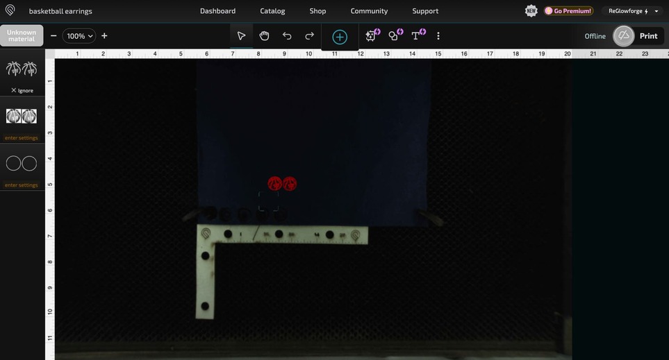
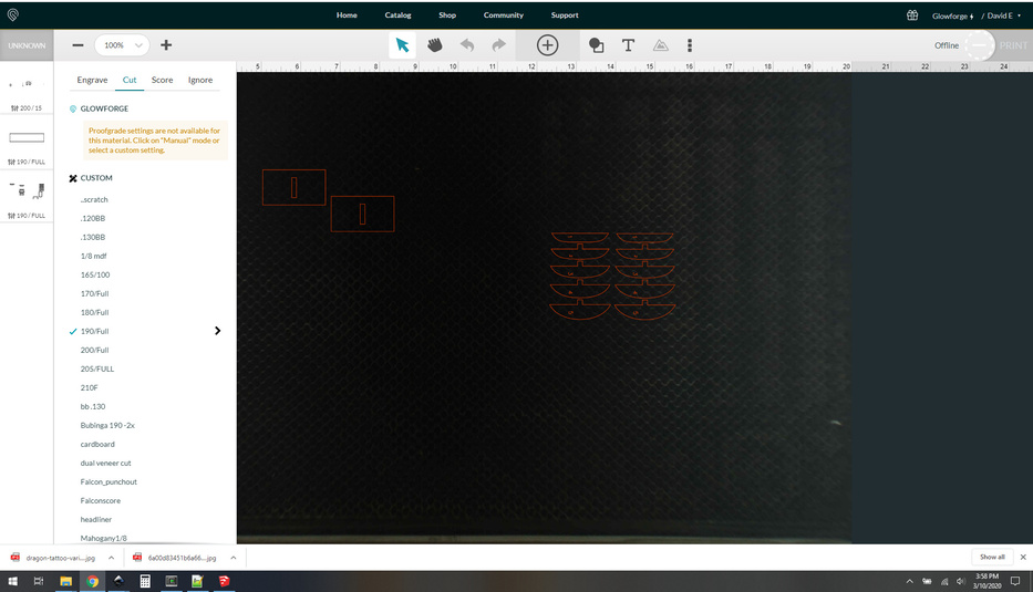
Unknown material still doesn’t show the height of the material you entered. Not sure why they don’t put that in there.
Set focus and refresh bed image are still buried in a secondary menu. These should be front and center.
Step summaries are still incomplete. It doesn’t mention focus height for cuts/scores/engraves and even worse: still nothing about LPI for engraves.
The catalog/shop/community/support links at the top nav bar still opens in the same window, that should be a new window/tab. This is made even worse by the presence of the dashboard link – technically it works the same way by loading the dashboard in the same window – but it feels inconsistent since it’s sort of “staying” in the GFUI.
Subjective things:
I don’t love the aesthetic of the skeumorphic print button. Everything else is a relatively flat modern design, the button is kind of fun but doesn’t really fit the design language.
I suppose I should email support about it, but I doubt they’re asking for feedback at this stage. I’m not sure who was their test group, but I’m surprised about the nav link inconsistency most of all. That has needed to be addressed for quite a while now.
I agree. Especially the focus and refresh being on the “main menu” instead of having to “find it.” Sure, we know where it is, but I know I use them a lot, especially the focus. I’m not wild about the new “Print” button.
Never went away for me, I’ve used it consistently to move parts of a design off and on-to the print area in the UI.
Other than the new icon for the print button, I don’t see any difference. Everything else appears to be the same, in the same spot, and the links work the same as they did before. Dan doesn’t mention any changes in his update.
One thing I noticed that was kind of odd: when I turn off my Glowforge, the print button in the app whirls incessantly like it does when it’s calculating the job.
Still waiting for someone much smarter than I to figure out how to make score lines act as score lines when uploaded to the interface. Sure, I know it’s lazy of me to be frustrated with the requirement to change them from cut to score, and sure, I’ve ruined more boards than I care to remember because I missed/forgot that step but jeez…
You can do it by changing the style elements in you svg but it would only work with PG materials.
The entire process is more work than manually setting the steps up in the UI. Once I tried it I immediately forgot the exact details because it was too much work.
Now I just use an ordered palette to set my colors properly. I do engraves then scores then cuts. It works for me, I rarely screw it up, and if I do it’s because I was rushing… my fault entirely.
There are many ways Glowforge could allow us to embed settings that are much simpler but I doubt they ever will. There’s not any financial upside to it, and given that it would make non pg materials more convenient it might actually cut into their business model.
The color scheme and fonts are all quite different from the last time I looked at the ui. On the surface it’s not a major change aesthetically in terms of layout but in terms of visibility – and therefore usability – I think it’s an improvement.
As usual I wish they’d increase the information density, but they are (apparently) still stuck on the unified mobile+desktop interface model. Insisting on a consistent UI across all platforms ties one arm behind their backs for desktop interface design. I’m not really blaming them, it’s much more expensive to support multiple platform-dependent interfaces… but it is a bummer because there’s a lot of low-hanging fruit that could be implemented on the larger real estate of a desktop screen.
As for pan… I never noticed that it wasn’t there. I use the “hold spacebar to pan” trick since I’m on standard keyboard and mouse desktop, but I bet that pan button is key for mobile/touch users. It’s a good thing to have that front and center.
Pan has always worked by just using two fingers on the touchpad. I use a touchpad even on a “desktop” PC, can’t stand a mouse.
Can’t tell a difference in font or colors, and I’m in the UI most days. Weird. Perhaps I haven’t received the update (although the print button has changed…)
They did a refresh and they left the biggest quality of life improvement undone still… Let us temporarily turn off a layer without wiping out its settings. Good grief.
Oh man, that’s a great idea. That’s always bugged me.
I’d also love a “pause” step where you can make the GF just home the laser head for some number of seconds. That, combined with “let us open and close the door while it’s paused without interrupting the job” would be really nice.
That’s actually pretty simple to implement with a couple of magnets. I use it all the time. I think someone even posted a jig here, but I just use tape.
It’s especially handy during pass-thru prints, but I’ve used it mostly for other purposes…
Yeah, but I’d rather not disable the safety aspect of it to accomplish this. It should be a software change on their end: if the machine is paused, the safety interlock warning can be ignored. Not sure why they’ve never done it, but it smells lawyer-y.
True, but I do sometimes have people around my laser who aren’t experienced, and I wouldn’t want them to be able to open the lid while it was in motion or the laser was energized. Just asking for trouble I think.
Again, I agree. Someone asked about engraving 1" material and I wouldn’t have an issue with it, but it’s not something I would suggest a newbie attempt.