my bet is on HW limitation. the GF can do it, it just can’t score that intricately that fast.
1 Like
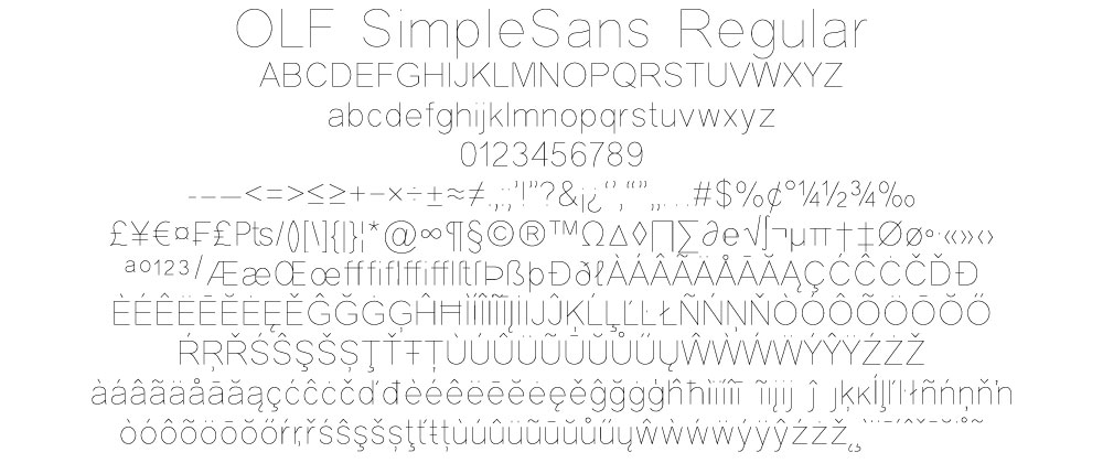
@jbmanning5 I provided those fonts as examples that show:
- Lowercase letters on a continuous baseline
- Simple letter paths
- Lowercase letters have the same height
The same applies to choosing a single stroke font. Here is a single stroke font I found:
https://www.onelinefonts.com/index.php?main_page=product_info&cPath=123_89&products_id=251
The goals are:
- To test another font and rule out that it is a issue with the current font.
- Use a font that has consistent lowercase letter baseline and height to rule out shifting caused by some sort of software rendering optimization.
Great ideas, except to the GFUI, this is just a lot of small paths. It does not understand that it is even text, so the chosen font isn’t the issue. You might as well suggest “upload a whole new SVG with a bunch of random sized squares”, that’d be about the same. I stand by still waiting for the GF staff, I’ve done all the experimentation I’ll do until they tell me to do something differently.
1 Like
I also think this is a valid test as it could indicate:
- That one of the movement axis is worse mechanically than the other.
- Many printers/plotters/scanners use different quality motors for X & Y. The software drivers/optimization can also implement different resolutions per axis.
1 Like
Yes I understand that these are curves/paths and that GFUI does not understand what a font is.
My point is that the paths created using this font, for some characters ‘s’ ‘t’, go below baseline of other characters ‘i’ ‘n’. You can see this in the Inkscape screenshot. The GFUI could be rounding the position of the path to the nearest DPI point causing the baseline to shift up and down. This would indicate a problem with the way GFUI software is optimizing/positioning the path.
That is no where close to being the same. I did some typeface design and saw that quality of font design varies a lot. One designer will create a much cleaner character path that uses bezier curves whereas other will use traced paths with tones of control points or segmented straight lines to represent curves. So using another font may result in completely different results.
Completely agree, only GF staff can really tell you what is going on. But I just had two Support posts closed without GF staff answering questions.
OK. I hope GF staff help you out.
There’s no such concept as DPI in SVGs. That’s the beauty of the format. This isn’t dithering some sort of DPI (which is a thing but only when engraving… again, ask me how I know, I did say I am not willing to engrave this – You see weird moire-esque variation in the final product), this is digital positioning. Even if it’s rounding x and y positions of nodes, you’d expect them to be consistent, and I have a pretty good handle on the precision and accuracy of the machine after a year and a half plus of ownership.
You can see lots of type rendered properly – even in the too-fast test speeds – especially on the bottom line of the piece, because that’s done first. Something mechanical is apparently happening partway through the job, causing subsequent paths to be placed incorrectly.
When you run this, I assume it does the typical burn in it’s calculated most efficient manner. Do the misalignments appear as it returns to do those elements? If so it could be slop/backlash caused by gantry inertia and the belts flexing. I’ll have to see if it happens on mine. I’ve been doing art without text so the fidelity hasn’t been apparent. I have had job to job alignment issues as the camera adjusts after a run.
i think we already know this by where the issue manifested. i’m not sure changing the orientation of the scoring would change this. the shapes of the letters go every direction constantly over short distances already, so changing orientation couldn’t really make a difference.
1 Like
Thought this might fit here, @ivan1 posted a pretty legit GIF the other day of the expected/desired tension.
1 Like
I’m so sorry for the delay responding here.
Thank you so much for the details. I’m looking into it now. As soon as I have more information I’ll update this thread.
How are you doing layout with single line fonts?
I played with this for a while and the only tool I found that worked was that one Inkscape plugin. Is that what you used to generate these paths?
I have a bunch of “single line fonts” but they all come out as a mess when used in a design app. It would be great if there was a way to use them.
Yes. The kerning and layout of the hershey extension is pretty nice. I use the default typeset option, they have others but I’ve not fooled with them.
I’ve completed research and I have another option to add to the ones you’ve identified. In my testing, the result printed with excellent visual alignment.
-
Group portions of the design into smaller chunks by color. For example, you can make each line of the plaque a slightly different color so that they will open in the the app as a separate step.
-
Apply the settings you wish to use to each step.
As you’ve already discovered, slowing the speed and/or engraving are also good solutions.
1 Like
Interesting idea about option #1, can you elaborate on the root cause and the rationale for this solution?
If I’m correct about losing steps/slippage due to high speed operation, then option #1 is still not a viable solution. If you have to slow down the machine to avoid losing steps or having belt slippage, then that should be stated and documented.
There appears to be an issue with the number of individual images or shapes in your files. I’ve made sure the team is aware of it.
I’m going to close this thread - if the problem reoccurs, go ahead and post a new topic. Thanks for letting us know about this!