Glowforge scoring/cutting inconsistent

I’ve been seeing some issues with complex vector scoring [not engraving], resulting in inconsistent results. It seems that my machine is slipping or skipping steps, especially at higher speeds.

I ran two of the same engrave at different settings, first at 350 speed, then at 200 speed (thinking that the higher speed may have been the issue), and finally at 100 speed. It was only at 100 speed that I saw proper alignment, is this to be expected?

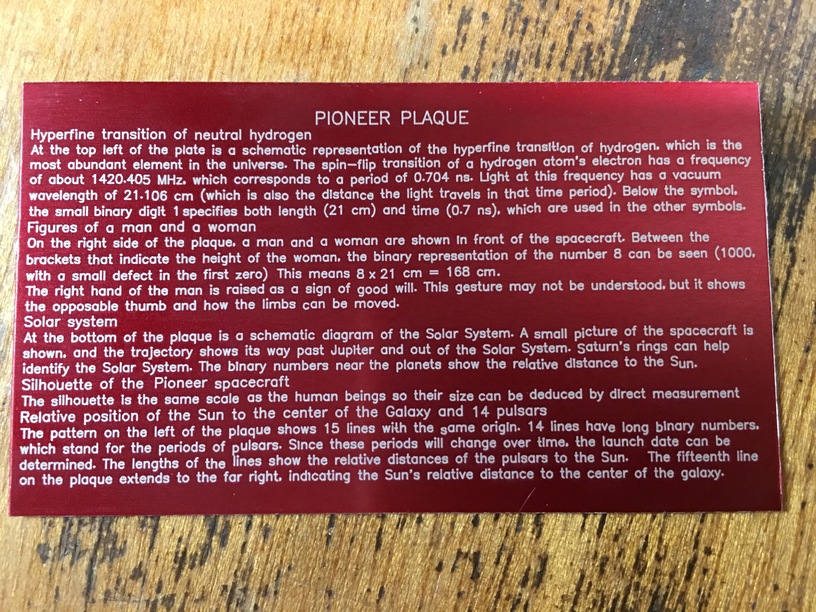
Here’s the 350 speed:

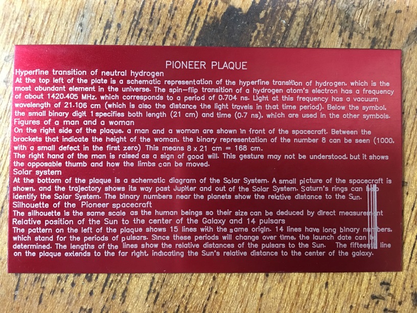
and the 200 speed [the vertical lines in lower right were from a previous score test to dial in settings and resolution, and are not part of this]:

and the 100 speed:

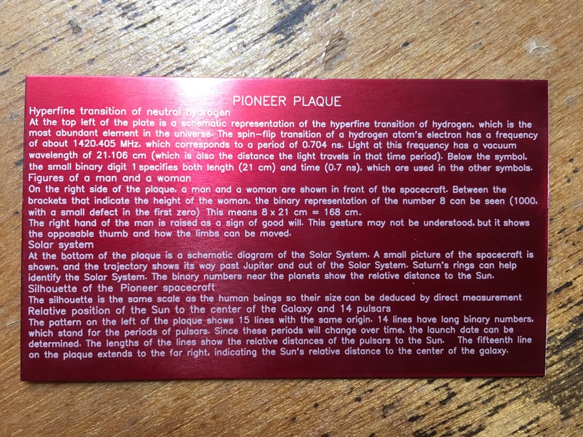
These are single-line hershey text fonts and look great until you spot the details. Note the words “hyperfine transition” in the first line of text:

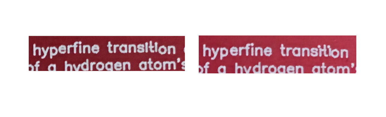
If you look closely in the larger screenshots of the first two examples, more inconsistencies can be found, this is the tip of the iceberg.

The original artwork can be produced upon request, but here’s a screenshot:

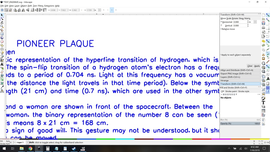
As you can see the “hyperfine transition” path is clearly properly aligned, so there’s either some sort of inconsistency in GF’s software, or there’s a physical problem with the machine.

Things I have done:

I manually moved the laser head and gantry through their full ranges of motion, feeling for inconsistency or noticeable resistance. It was fine.

I inspected the belts carefully for debris. There was none, but there is a light coating of typical laser grime.

I checked the belt tension. I am not sure what the tension is supposed to be, but the three belts I knew to look for had consistent “twang” to them, so it doesn’t seem like any of them are particularly loose compared to the rest.

I checked the crumb tray for wiggle or debris, there was none.

My materials were held in place very securely, there was no movement of the material.

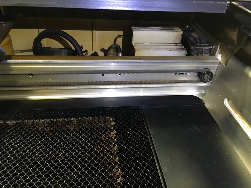
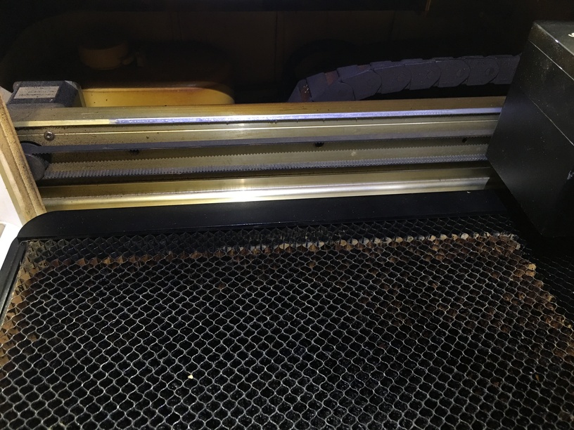
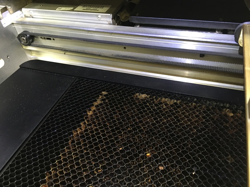
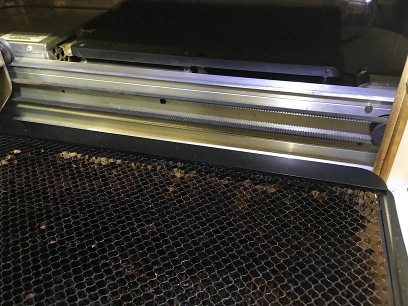
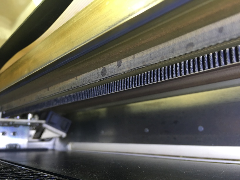
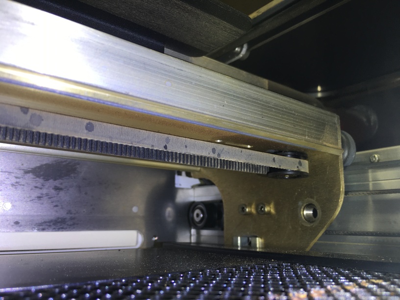
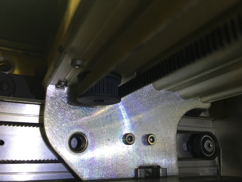
I’ve seen similar reports, they end in requests for specific pictures in other threads, so here you go. Closeups of the belts and wheels:

Left side:
Back


Front

Right side:
Back


Front

Gantry belt:

Is there any way to improve this situation or is it a limitation of the hardware? Can you give any guidelines about this sort of thing?

4 Likes

Just curious - can you load it in the UI and zoom in on those trouble spots?

One thing I can think of that could be an issue (and not saying that it couldn’t be losing steps, because it very well may be), is that the type size is pretty small, so it doesn’t take much for the type to get offset - do you think it could be a rounding error from decimal places in path location?

It’s not text, it’s a series of paths. If we assume you’re on the right track then GFUI would be moving paths at will up to about half a mm.

That’s probably a dead end, and especially so because the performance changes so much between runs. If the oath location were the issue the 100 speed run wouldn’t have been accurate.

Perhaps I shouldn’t have said type size. I know that it’s just paths. The rounding should/could change as the graphic is moved around the workspace… I’ve seen a number of files where people are scoring or cutting very small elements that have low decimal precision with similar behavior. :man_shrugging:t2:

I mean I’ll look but I didn’t move the item in the gfui between runs, I only changed the speed. The inconsistency run to run and increased inaccuracy rate at higher speeds really does point to something either physical or in the GF cutpath calculator.

1 Like

i think he’s right, though. if there was an issue with the file, it would manifest itself in all settings. since 100dpi came out correctly, there’s an issue with pathing at higher speeds.

i sometimes see this with certain settings on certain material presets on the universal. there are a couple of ways to run birch that the speed/pathing just overwhelms the belts a little and it skips. we’ve “bugged” them to universal to update in the next patch, and they’re acknowledged bugs.

2 Likes

Here you go:

The text is perfect in the SVG and looks pretty much so in the GFUI too.

1 Like

This might be a case of machine precision if the text you are using is very small. Looking at the Inkscape screenshot the font appears different than what is being printed with a lot of fine detail being lost. e.g. some characters ‘s’ ‘t’ go below baseline of other characters ‘i’ ‘n’.
The app could be optimizing the paths to the nearest achievable laser point and causing some characters to shift up. The speed may be contributing variable used in the optimization, with lower speeds increasing resolution and faster speeds reducing it, thereby causing the shift to be greater.
This can also be seen in the rounding of the ‘O’ in ‘PIONEER’ title which appears more jagged in faster prints.

Have you tried using filled paths in SVG file (Create text with type tool, select all text using the pointer tool, then do Path -> Object to Path, save as SVG )
Or just exporting the files as high res PNG (Create text with text tool, then File -> Export as PNG, change dpi to 1355, save file)?

Print both using Engrave at highest DPI setting.

2 Likes

Can you hear it “clunking” at higher speeds? I’ve definitely noticed the machine getting “bumped” out of alignment when I feed it sharp-corner cuts or scores at higher (>200) speeds. Since your text is so small, you must have LOTS of sharp corners, and even smaller dislocations will begin to accumulate over the course of the job into big placement errors.

1 Like

I’m not interested in engraving this. I’m aware of the method you described, it’s not going to be as fine a result as I’m getting with a one stroke font.

How do I know? Because I’ve tried it already. Yes it works but the lines aren’t as crisp and you have other artifacts that crop up because of the interpolation of the engrave job.

Inb4: have you tried x or y engraving settings?!

Engraving is a dead end for me here it’s not worth talking about, but for some other types of project that is solid advice :slight_smile:

2 Likes

Yup, but I would expect it to work as designed. I’m definitely of getting kind that it’s a physical limitation but I want to rule out some sort of GF sanctioned belt-retightening or something.

I’d like it to work at high speeds regardless of the actual path being scored. In my opinion this is basic operations and should be supported. If it isn’t I want GF to tell me so.

4 Likes

Hmm, I gave up on this early on, assuming it was a fundamental hardware limitation. The head’s pretty heavy, and physics is unforgiving. Plus it sounded painful, and I didn’t like that at all!

I’m with you, though, it would be nice to have official word.

1 Like

i think @gb0101010101 is right, tho. i think it’s just too many direction changes at high speed in small spaces for scoring at that speed. that’s why it was successful at 100 but not at higher speeds.

2 Likes

Yeah that was always my guess too.

The key phrase here is “too many”, and I’d like to know what the official word is on this.

i’ll be interested to hear the reply. i’m not sure how easy it will be to give a definitive response. this feels more like one of those things where the doctor asks “does it hurt when you do that?” and you say, “yes.” and the doctor says, “well don’t do that.”

3 Likes

Very good analogy. Yes everything should just work but when it does not then the community tries to find work arounds. Really only Glowforge support staff can say why its not working and if it will get fixed.

So what is the font size you are using? How big is the plaque overall?

Have you tried using a simpler font that has all characters on baseline and same height lowercase characters e.g. Gidole, Kelson, Rambla Alt https://www.canva.com/learn/minimalist-font/

Some fonts create much more complex outline paths and that fine detail is just not needed at small text sizes. This would also rule out the font as being the cause.

Do you see any unevenness is curves when doing cut, score, or engrave operations on other projects. If so this would indicate a mechanical problem.

I think his goal here is to use a single-stroke font so that he can score the project rather than engrave it, since it should be much faster than a line-by-line engrave.

2 Likes

Curious if you’ve tried the job with the “image” rotated 90 or 180 degrees, and do you get the same defects in the similar places on the board position, or do the defects match up with the text location?

Have you tried splitting the image up into 2 or 3 sections, have those all in the GFUI & aligned as you want, and then and not moving the plate between jobs , just run the first, ignoring the other 2, then ignore 1 & 3, run 2, and then ignore 1&2 (or even delete them) and run 3. Not sure if this would help at all if it’s a path/speed issue…

Also please try to clean your crumb tray. One shot looked like small bits were stuck in the holes, and that could prevent your material from laying flat (though doubt that’s a factor here). But in general any dust & debris could get blown around and potentially interfere with the laser beam itself or the belt and contribute to inconsistent results…

1 Like

I do think 90º is a valid experiment.

Maybe, but it won’t prove anything. I see alignment issues (likely lost steps) in both the x and y directions, I believe I’ll see similar issues even if I rotate it. If I’m right about the root cause, it’s either a limitation of the hardware or a maintenance issue with the belts – changing the orientation shouldn’t affect that. Still waiting for GF staff to chime in.