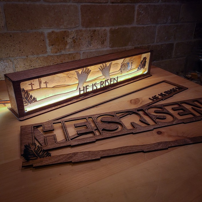
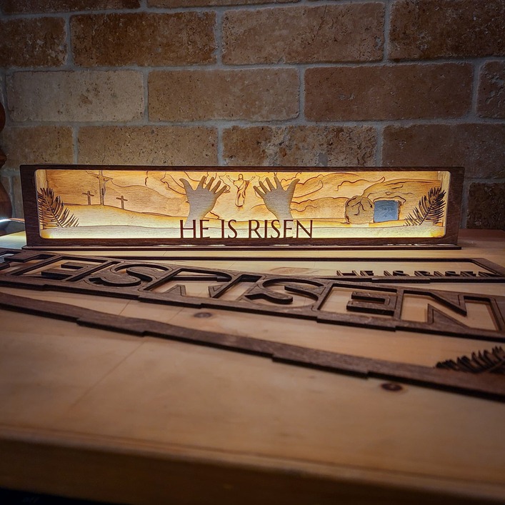
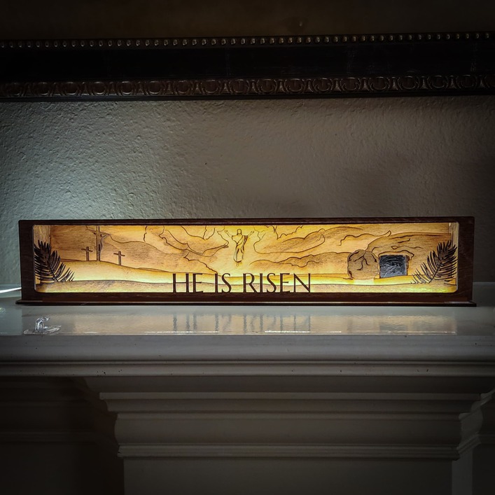
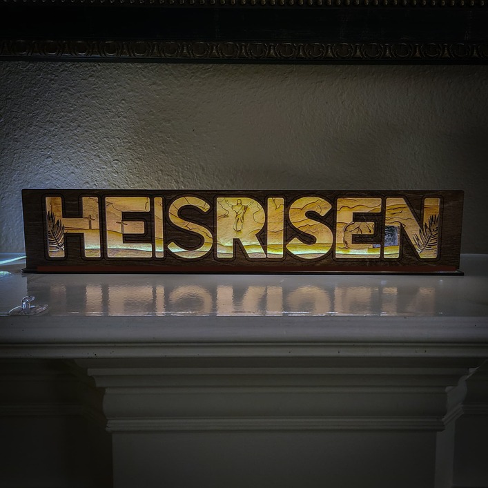
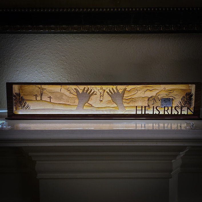
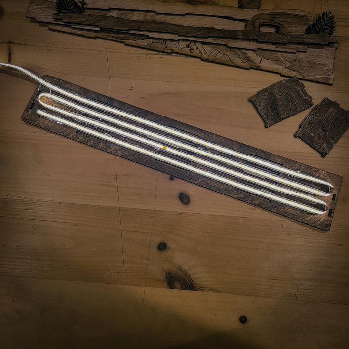
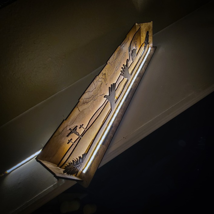
So I made a new file for Easter along the same lines as my Twas The Night Before Christmas Light Box I couldn’t figure out with or without the hands, or which way to go with the type so I included some options. What do you think?
41 Likes
That is really cool! I like the one without the hands, I think! But they are all cool and all have aspects that I enjoy.
7 Likes
I prefer without the hands. When i see the hands and the words, my brain thinks zombies… which i know isn’t the goal, but without the hands, the zombie imagery goes away for me…all of this could also be because i haven’t had coffee yet and I’m not seeing straight ![]()
The whole thing is great. I love the scenes you create in your displays.
6 Likes
This is absolutely stunning! May I ask if you are selling or sharing this file? I would love to make this.
1 Like
The third pic is my favorite. For me, the large letters make it harder to read and just looks cluttered. But that’s me.
2 Likes
If you check his profile, he has a link to his Etsy shop. You can find it there.
2 Likes
Yes I am selling the file on my etsy. https://rkledesigns.etsy.com
1 Like
I like it better without the hands - maybe make the hands smaller and possibly one on each side of the words like bookends or a set of two hands on each side of the letters as long as the hands are the same size or smaller than the letters - maybe - just tossing ideas around
3 Likes
Looks great
2 Likes
7 Likes
Dang, you beat me by 3 minutes.
3 Likes
Gorgeous! Just Beautiful!
2 Likes
Beautiful work! I like it better without the hands.
1 Like
This is so elegant!
1 Like
Another vote for no hands!
1 Like
Me too, but the hands remind me of the movie “Carrie”
1 Like
Very nice Easter project! Like many other respondents, I prefer the no-hands version. And I’ll also suggest that the understated font is perfect. Let the image do most of the talking.
There’s a “look Ma, no hands!” joke there somewhere but I’m not gonna make it.
Using the words to mask the image (Option 3) doesn’t justify all the complexity of the layers and a light box, to me. If the words and font are to do the heavy lifting, just do one layer and engrave the rest. The box with no hands and understated font, on the other hand, puts all the layers and light to good use. In my opinion, of course.
1 Like
beautiful!
1 Like
I really like it, very nice. Thanks for showing us.
1 Like