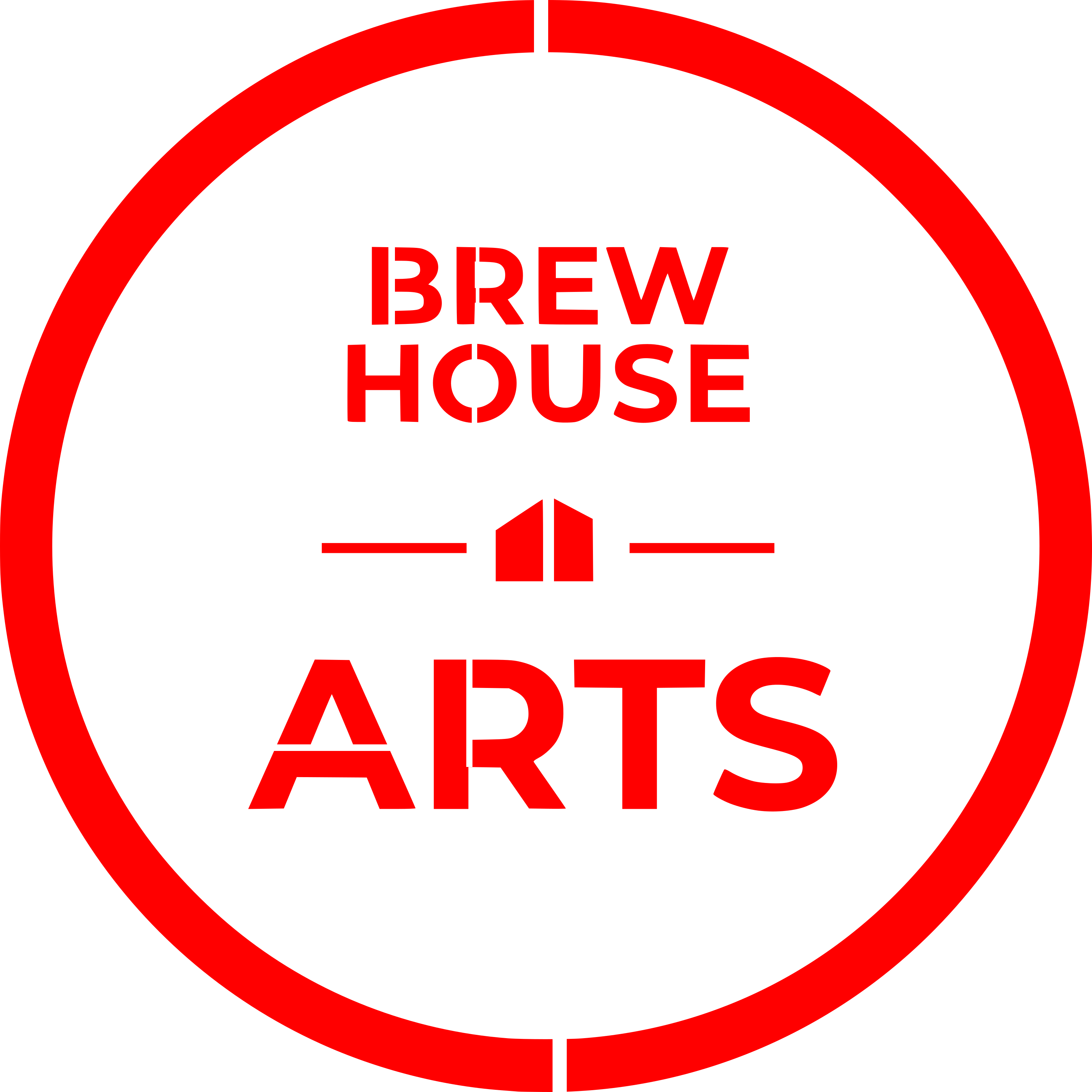
I need some help designing a stencil. A local non-profit would like a stencil of their logo so they can mark equipment, etc that belongs to them. The logo is very simple and I was able to convert the pdf to a vector file in Inkscape. The conundrum I have is concerning how I can make it a stencil and still keep their font. As you can probably tell from the logo, the centers of the “B” and “R” “O” and “A” and the center of the big outside circle will fall out when cut.
Is there a trick? Do I just add some “thin spokes” connecting the centers and the outside part of the logo?
If anyone has any ideas, I’d love to hear them. I am definitely not a designer, I just plug through things.
thanks @bwente and @rbtdanforth. I considered a stamp, but they would like this to be about 17" in diameter and would like to use it to spray paint their logo on metal carts, shelves, etc. I think if I add the “spokes” they could spray paint the logo and then add the areas covered by the spokes with a brush.
What material are you planning to use? Design changes may depend on that. For instance, if you use thin, flexible mylar, you will likely have to at least quarter the outer circle and, I think you are pretty much stuck with adding spokes to the B, Rs, O and A. Maybe look at a stencil font to get an idea for the best places to put those and the relative thickness of the spokes (e.g., cut the bumps of the B off flush with the straight back).
If you use something more rigid, like a piece of Draftboard or acrylic or something like that, you might be fine with smaller and fewer spokes (e.g., halving the circle).
At that size, if you want to get fancy, you could probably do it in rigid material without spokes by working in three dimensions. Make small scaffolds that hold the cut out parts in place from above. Then, one would just have to angle the spray paint around the scaffolds when applying it. [Edit: that may be what @rbtdanforth is getting at above.)
Depending on how precise it needs to be (and how careful the person using it is), you could also just make the cut-outs separate pieces and set them in place when you apply the stencil. Even fairly small pieces of Draftboard are unlikely to move from being spray painted over on flat surfaces. That might be perfectly fine for the sort of irregular use you are describing.
Alternatively: there are other tools that might do a better job. In this case, a photo process stencil of some sort might work well. If you don’t have or want to get into creating your own photo silk screens, perhaps a local t-shirt printer would make one for you/them at a reasonable price. There are companies online that will make them (.e.g, https://www.hdstencils.com ) and, there are products that simplify the screen-making process some (e.g., https://ikonartstencil.com/ – though, I think the films they sell max out at 12” in one dimension).
This logo might be better suited to silkscreen (which is technically a type of stencil). Have you seen the laser engravable emulsion coated screens from Xtool?
Another thought: cut the design from some adhesive sheet material, perhaps one of the laser-safe HTV products and, apply it to a mesh fabric (like screen printing fabric).
It’s not a good logo for a stencil conversion. Maybe they could be happy with a modified logo just for this purpose? If it’s marking their equipment it’s not like it’s going on shirts and stickers and so it might not hurt the branding.
Edit: This might be better done as a sticker, with outdoor-rated sign vinyl. Stickers will wear with heavy contact, but so will stencil paint. Then it isn’t a laser project, though.
Thanks @GrooveStranger. I have solved a lot of the issues by simply exchanging their font for a stencil font (already designed to work for stencils, imagine that ). Three thin spokes in the large outer circle seem to work for the too.
visually the BREW HOUSE font seems small relative to the space and “ARTS”, I would bump that up if I had input. I get they are trying to keep it equidistant to the outer circle, but if you want people to be able to read it from further away…