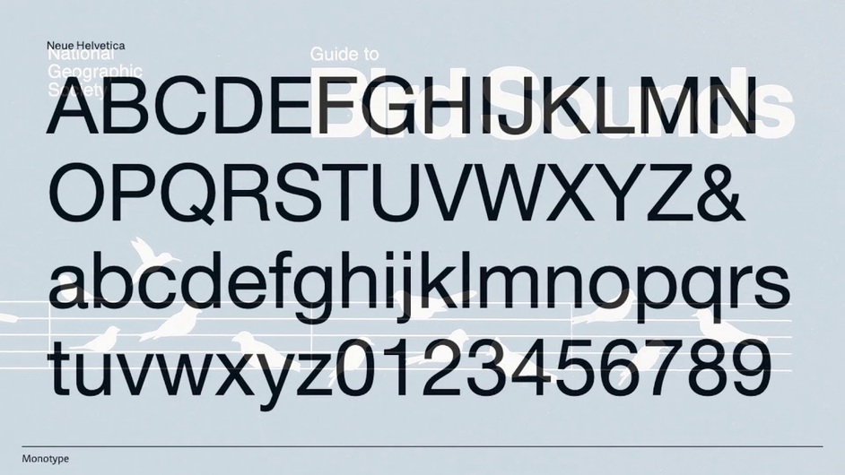
Typography discussions on the Glowforge Community forum have had almost as much energy as kerf adjustment, image alignment, and production delays. this video introducing a redesign of Neue Helvetica speaks to people who often give little or no thought to typeface selection. It actually can make us care about the fonts we choose.
A driving force of the renovation and renewal of Helvetica has been the tremendous explosion of media formats on which text appears. Helvetica was designed at a time before any widespread digitization took place. Since its last face lift as a digital font, typefaces have been asked to do more and more in so many different media.
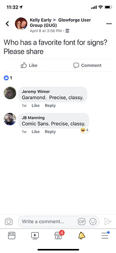
Most of our discussions about typography have concerned thematic or design appropriateness. Hence all the shade thrown at Papyrus and Comic Sans. But some discussions were very helpful in introducing others to some useful fonts, like Goudy Initialen that works for special cases like a tile with an initial engraved on it.
We haven’t discussed the relative merits of typefaces as they are processed by a laser, either engraved or vector scored/cut. Of course lots of factors enter into this. Materials, especially wood grain and density, sizing and readability are important. LPI makes a difference for the font, as does power and speed.
I don’t really have much to say about this, but that the update for Helvetica does make a difference, especially if you are engraving a small text for and edge lit LED. Since it is a sans serif, the simplicity of the lines makes is less prone to a running together in this use case.
Anyway, just something to think of. I know there are folks here with some great understanding of typefaces and how to use them effectively. There are others here who may have never heard of kerning and just don’t know what the fuss is all about. This video does a good job of explaining why we should care.


