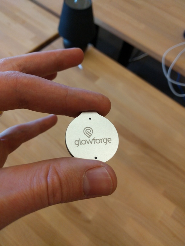
As many laserfolk know, anodized aluminum is one of the most unforgiving engrave surfaces you can work with. It shows every sputter, bump, misalignment, and other problem you can find.
So when the team from Trackr dropped by a few days ago and dropped off a half-dozen samples, I decided to try engraving one at “max resolution” - 1.3k lines per inch. (This was also a practical matter as I wanted our logo on my new Trackr). I took this picture with my phone and I’m attaching it full resolution + a crop of the logo. It looks just this smooth in person - there is no visible jaggedness at all. I’ll bring it to Maker Faire (have to remember to reattach it to my keychain!) so if anyone wants to drop by they can see for themselves.
The Trackr itself is 34mm in diameter, if that helps you get a sense of scale. My fingers are enormous.
Thanks Dan. Nice to see something new. I guess you’re still working out all the alignment issues though. Good thing I’m only borderline obsessive about these things
This is a vector source file that is raster engraved. For those who may not know, @Hirudin is referring to a cool technique where you do a light score around the edges of an engrave to obscure that it was done at low resolution. It’s a nice shortcut to make low-res look good, but wasn’t necessary here.
I think it goes back to the start when they called it a “Glowfor” and made the logo… then they sobered up and thought about adding a “ge” but the logo symbol stayed… But seriously - Nice job - I bought 10 of those TrackRs™ when they were first offered at a starter price. I wonder if they are all anodized or if just the newer or special ones… hmmm - where did I put that mailer…
It’s definitely not the first thing we’ve seen that looks clean and professional, but seeing the extent to which I’ll be able to create great looking items with so little work is still mind boggling sometimes.
Thanks for sharing, Dan! It’s always reassuring to see demos of the features that haven’t gotten much airtime yet. I hope to see grayscale engraving soon!
@tony! I see it. The logo springs from the center of the W. This was a careful choice. It makes the stylized G point and the W point come together like the laser point.


 But seriously - Nice job - I bought 10 of those TrackRs™ when they were first offered at a starter price. I wonder if they are all anodized or if just the newer or special ones… hmmm - where did I put that mailer…

