I wanted to see if there was a clever way to isolate the cutouts from vector text, it can be useful in some situations. It all came from this discussion (scroll down for the relevant bits). Here’s how I did it.
A quick note: this is a fairly advanced set of boolean actions, nothing too complicated if you understand paths in Inkscape, but if you don’t, I’m about to go too fast for you (sorry). Read some more forum stuff and come back sometime.
Aww come on, tell us all the details!
Nope. Think of it like the Harry Potter movies. They got way better once they stopped trying to tell the newcomers about the backstory. At some point, you’re either ready for this or you aren’t. It’s not terribly hard, but it might read like greek if you’re really new to this.
A second note: this is a simple example. This technique is overkill for something like this, but if you have large amounts of text or other complicated nested shapes it will probably be faster than manually selecting each island. (Note added courtesy of rbtdanforth’s astute observation that I didn’t spell this bit out. So consider it spelled.)
In the first image I started with a text object, then converted to paths, ungrouped and combined them. Then set a stroke and removed the fill. The result is that top nice black outline text in a single path. Copy and paste two more copies, and give them different colors, I chose blue and red.
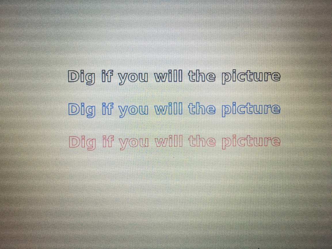
Like so. Three copies will make your life easier later.
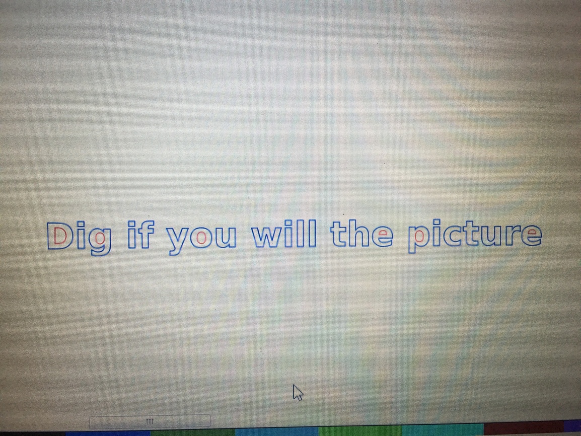
You’ll end up here.
To get the blue outlines which represent the outer edges of the letters, it’s easy:
- Select the blue letters
- Break apart (control-shift K)
- Select all the broken apart text paths (in blue)
- Path->union (control-shift-plus)
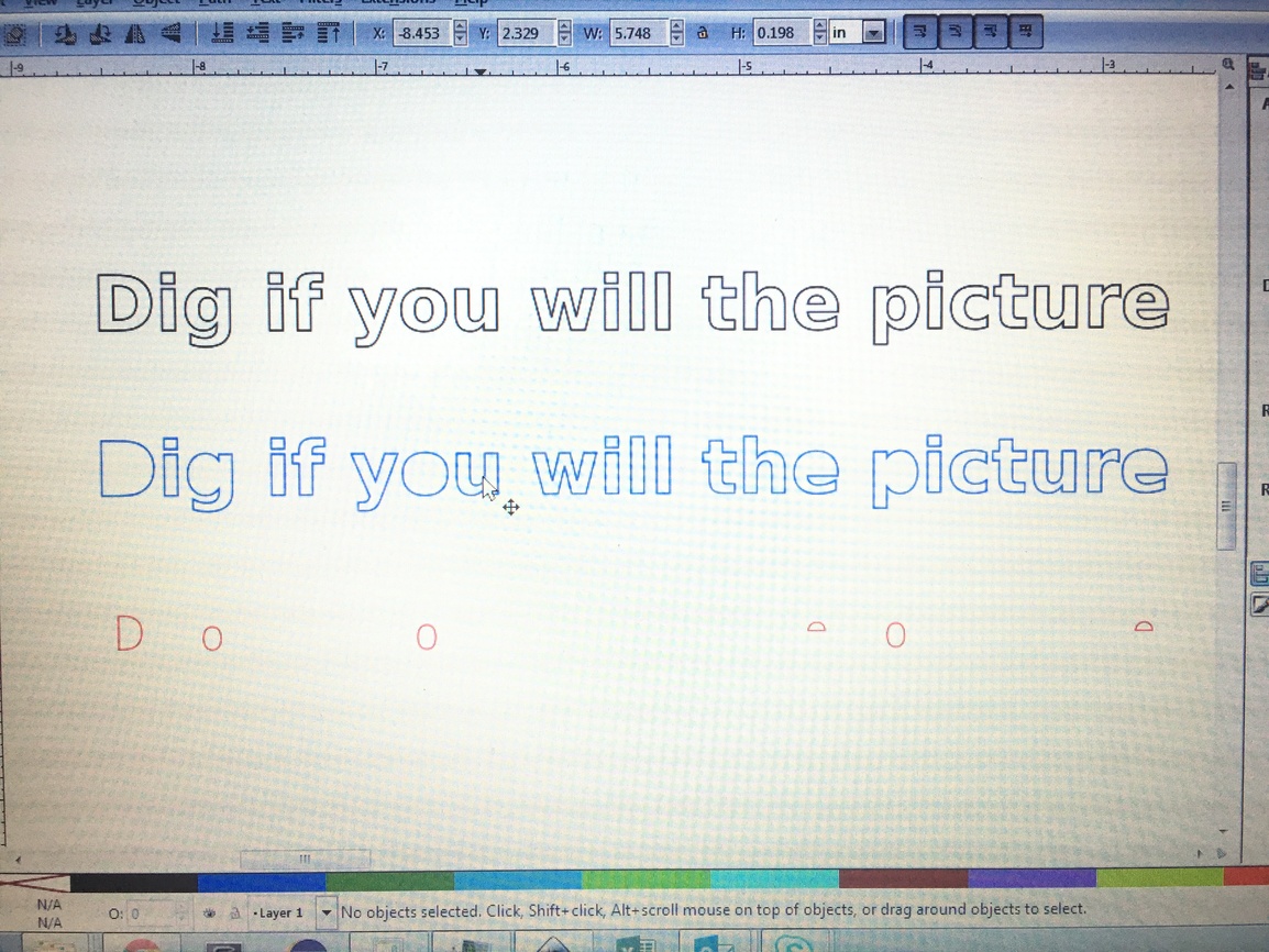
Intermediate steps complete. You’ve just finished the blue part.
It’s that easy. Now you have outlines to your letters.
Next is a bit trickier, bear with me, some of the steps are going to seem dumb.
- Select your red text. Ensure that it’s one path, not grouped, not unioned (it should be if you followed all my steps). Use control-k to combine them if you have to.
- Copy it. (control-C)
- Follow all steps above for making the blue outlines above. You’ll now have red outlines.
- Go into your preferences and set your inset steps to something really small. I chose 0.001". If you don’t do an inset, there will be artifacting later because of Inkscape’s precision limits with path booleans.
- Go back to your red unioned outlines, and break apart (control-shift-K)
- Select all your red bits now, and do inset. This will make your overall red outlines slightly smaller.
- Select all your red bits, and combine them (control-k). They are now one path.
- Paste in place. (control-alt-v) You’ll now have a fresh set of red letters (from step 2 above) atop your slightly smaller outlines.
- Select all the red stuff (both the fresh red text and the slight smaller outlines underneath)
- Do path->difference.
That’s it, you’ll have all your islands.
More intermediate steps complete, now you have your red part.
Now you can use the original black text as a way to snap things into alignment, then delete the black text. Now you should have the end result:
Nicely color coded for you to do whatever things you wanted to with the separate parts.