So I’m kicking around some ideas and certainly not spending the time I need to on it but wondering what others think.
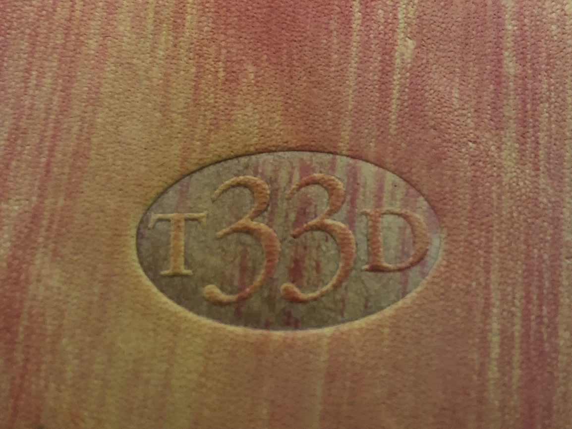
If I use the name “Three 33 Designs” I wanted to also have a stamp I can use that is visually distinctive while still tying into the brand. I was thinking something with just “Three 33” or even “Thr33” as the 33 plays for both the ee and 33.
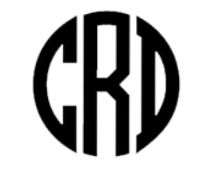
That line of thinking progressed to this:
Does anybody have any thoughts? It would still need some work but is it too abstract or silly?
That was more the seed of the idea. For a logo it doesn’t have to be literal but I like that it derived from the name. The full Three 33 Designs will likely be stamped on the inside. I just want something for the outside that can be identified.
i agree with @rhenley that i didn’t read it as you intended. and it’s not abstract enough to not be taken literally by someone who doesn’t know what it means.
the weights are very light. if you scale it down smaller, the ends of those 3s could be an issue.
Yeah it looks like initials. However, once you know the name I hope for an “aha” moment. As it stands it looks like initials to me which is OK. I mean, if you didn’t know the Gucci brand would that logo make sense at first glance?
I may be way off in my thinking but at least want something for a first test run this week so I can see how they are received. It is going faster than intended but I just got the GF and this is the last First Friday before Christmas so I want to get something out there. Things may change after the holidays.
I’m currently looking at fonts but the thin lines work surprisingly well. The test I did Sunday was really thin an actually stamped better than I expected.
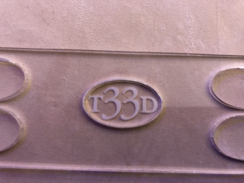
Great design! If you want to keep it and still have it read three 33, I’d suggest the TH3R3EE in the oval. It should balance nicely and will still read as your name.
I assume you were going for symmetry with that design, but I think it would look better and read as intended if you went with THR33. For more of a “stamp” look, I’d have the letters and numbers follow the curve of the oval, like this picture I stole from a quick Google search.
Add an oval outline around a curved version of THR33 and you have a winner in my eyes.
I get where you are coming from but five letters would be a bit much for that design - too much variation between the outer and center characters. Also the R would be the dominant element.
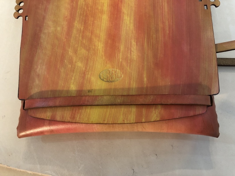
Thank you. On the next one I’m going to try the emboss after the dye step. While you can see the color continue through the logo the compressed leather didn’t take up the dye the same way.
I’m not worried about wetting the leather after the dye as I won’t mind a little bleeding of the colors. It will help them blend together a little more.
It was interesting to see how different the dye on the second one came out. It has a much more pronounced grain. I still like it but I have a lot to learn.
I bought some dyes but haven’t tried them yet - might have to wait till after the holiday season because I am so behind on everything that is not Glowforge related that I need to spend some time catching up, or my family is gonna disown me.
Very easy to work with and can be diluted with water. I placed my order with Tandy Leather on Sunday night then when I got the order confirmation I saw that it was coming from here in Las Vegas. I didn’t even look to see if they had a local store.
So I went down on Monday and picked up the package directly and asked them a ton of questions. The first clutch came out so well I ordered more of the leather before it went off sale and picked that up on Tuesday.
Both trips they were extremely helpful and I bought another bunch of supplies while I was in the store. If you have any leather related questions let me know and I’ll pass on what I’ve learned or ask them directly if I’m by the store.
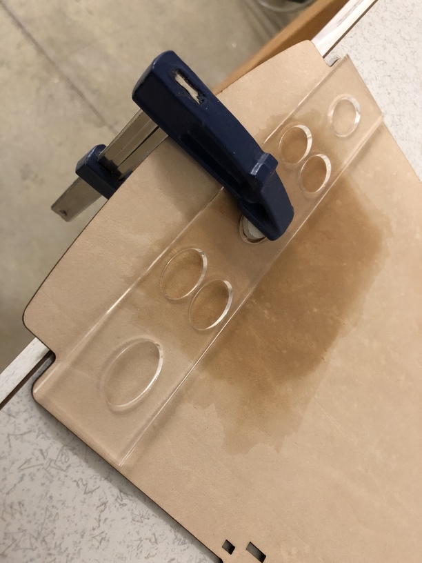
For the most part I’ve been making it up as I go along but it has really been easy since the GF does all the hard work. My next project will likely involve some stitching. I haven’t tried that yet.