Thanks…I already did remove the original background, but perhaps as @paulw suggested, I should add a light colored background back into it.
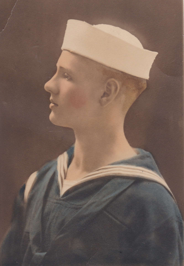
This is the original colorized photo, which I turned into BW.
Thanks…I already did remove the original background, but perhaps as @paulw suggested, I should add a light colored background back into it.
This is the original colorized photo, which I turned into BW.
Didn’t really do much at all to it other than change it into BW. I’m discovering here that the background may be the problem.
I believe the tool you’re looking for is called “Flood Select” in Affinity Photo – the equivalent of the “Magic Wand” select for Adobe users. Ideally, it will let you select the pixels that are a near-match for the top of his Dixie Cup and adjust the tolerance until you get what you want. Or select the background, adjust, and reverse the selection…
Here’s a vector outline. The facial features should be a separate layer from the profile.

This makes perfect sense and I thought of doing something like this. I have actually worked with images where I had to trace certain features and create separate layers…however, I don’t have an auto-trace feature in AD…is that how you made this? I could do it with the bezier pen tool, but it wouldn’t be as easy as an ‘auto’ tool. Thank you so much! I downloaded it, but now that brings up another question…is there a special trick to getting it to align perfectly over the original image?
I drew this on my wacom with a pen. Don’t you have an iPad pro and an apple pencil? I got one a little while back and I’ve been using Adobe Draw and loving it (except for the multi-touch shortcuts… ugh)
No good trick to line stuff up if it is two separate files. Eyeball it. the thicker outline should give a little leeway.
Or keeping the original art in a layer in the file. That’s probably a good methodology.
hmm. Discourse seems to be stripping the bitmap data from the SVG files. Here’s a PDF with the image still in place on a different layer.
Daddy Christmas 1919 withAssests.pdf (4.5 MB)
I have both a Wacom and an iPad with pencil. I’m still hanging tough learning to use the Wacom. After I spent that much money on it, I owe it to myself to learn how to use it…and use it well. (Love the Apple pencil). Thank you so much for both files…you do good work! I very much appreciate your time on this. I will be sure to post my (hopefully) successful engrave. You have provided me with something fun to try out…and as always, I’ve learned more new things. Always an adventure! 
Thanks! I just opened AP for the first time last night, so not surprised that I wasn’t aware of that tool…or of any tool for that matter. I will be looking around more as time goes by.
That is wonderful! Yes, the challenge is that a white hat on a white background (or transparent background) is going to be like a sheep in the snow. 
You might try experimenting with sharpening. This will create distinct regions around the edges that will make the engraving more distinct.
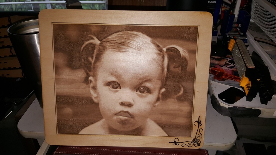
I suddenly have a craving for some hot wings after seeing this picture!!! Wonder Why??? 
Awesome!!
I’m not real happy with the eyes or mouth on this one. That is why if I am going to continue doing this I’m going to have to become a script and filter guru.
Interesting. It is kinda creepy looking. 
Did the original have a red-eye issue? Or a light reflection bouncing off the top of the irises?
The smile was likely a contrast issue due to the white teeth which got compressed in the final image with not enough levels to get the teeth.
Just a thought… And I mean that… I’m working ATM so I haven’t tried this.
What if you B&W the image, then copy that onto a tan background, then maybe color-match to give you a possibly-more-accurate preview? I dunno. It’s a thought-in-progress until I get to PhotoShop.
Or just become a set decorator for horror movies. There is a fine line between creepy and adorable. ![]()
@Xabbess , I finally got a chance to mess with the photo of your dad and took the background out and sharpened it up a little. I’ll upload the png file of it if you want to try it as an engrave and see if it works.
(It might come out darker than you expect because I deepened the shadows a bit to give a larger range. And it’s a pretty large file…it might need to be reduced in size a bit.)
LMK if it works.
Daddy Christmas rev. 1919.zip (1.1 MB)
Wow…! Jules, thank you so much…that’s incredibly kind of you to take the time to do that. I tried medium and dark settings before and neither of them really worked. Any thoughts on settings? I’ll be thrilled if this works.
I haven’t done too many photo engraves, so I’m not sure from this point. (Maybe you could try both, really small, and see which one works best?)
And hey, it’s your dad…
I know. Bless his heart. Speaking of that…I sure hope you’re getting along better and better every day.
I’ve uploaded the png and it looks great, so far. I will try different settings and see what happens. Will keep you in the loop. Thank you, again. ![]()
honestly i’d find an artist and ask them to do some restoration work for you, or perhaps even have a painting done from the photograph (perhaps digitally, which you can sometimes find quite affordably). the problem you’re having, i think, is that the contrast (both on the original and on jules’ version) is quite low - that is, if you counted all the individual shades of grey and plotted them on a line to show how far apart they are, you’d only find a few dots clustered around each other. that means that the laser doesn’t have a lot to work with in terms of showing detail.