My first Laser tile

Thanks. I’ve been using 125 LPI and it leaves very visible lines, but I only wanted to change one variable at a time. I just ran one at 225 LPI and it’s much darker and more filled in. Not sure why @numosbk was getting the same result at 125 but for me it makes a huge difference.

I’m going to try your settings now and one more photo engrave, and I’ll post my results.

2 Likes

I’ve run out of steam for the evening, so I’ll save the full-scale one for another time. But here are my test swatches.

That top one is the super dark, high-contrast black I was looking for. Thanks very much for the numbers! Everything below that is 500/50. Interestingly enough, all the focus heights above .3 were basically identical, but lower than .3 looked like crap in varying amounts.

The other thing I think is quite interesting is that when it’s in focus, you can basically see the pixels. There’s no smoke contamination, and so little melting or spreading of the beam, that even at 450 LPI you can still make out the edges of the lines. This stuff is high-res!

Finally, this is a better look at the picture from my earlier post. This was from when I first got the tile and made a guess at the settings. As you can see, when it’s not the size of a postage stamp, you can see how horribly it came out. Thanks to the help from everyone here, I know what this tile is capable of and I think I can do a much better job next time.

30 Likes

Oh wow! I haven’t seen any with that level of black. Very crisp!

1 Like

That’s incredibly useful. Thanks @Chris1

2 Likes

Thanks for those numbers. I am moving forward to trying my tile very soon, and your work here will be of great help.

I’m really happy with the range of grey levels available with the 1000/100/450/vary power setting. In fact, the usual trick of cranking exposure way up to prevent the shadows from being lost resulted in an engrave that looks a lot like it does on the screen, with the highlights completely blown out. That’s a good thing, because it means I can probably get a better image by actually taking advantage of some mid-tones.

The only problem is a weird vertical banding. I don’t know if that’s something about the way the glaze is applied, or an artifact inherent to the Glowforge.

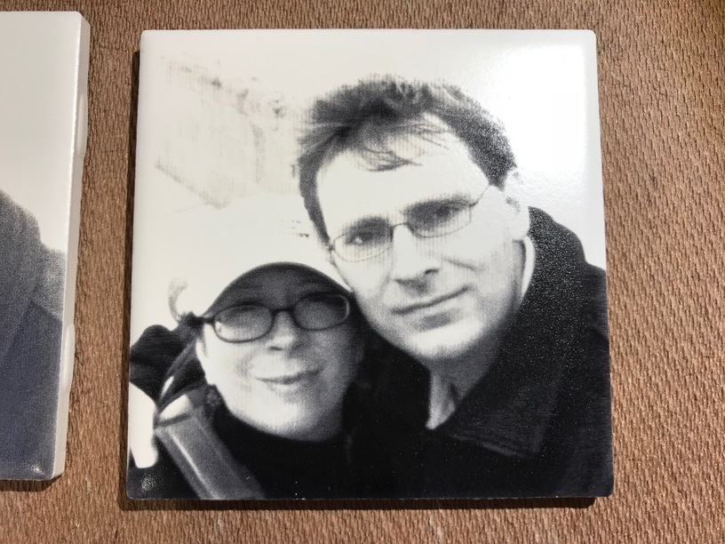
And we need to actually get a decent picture of the two of us.

19 Likes

Wow, that one turned out great. Did you modify your picture to get everything so clear?

1 Like

Engrave a solid square, then rotate tile 90° and engrave the same square on a different part of the tile. If banding is oriented the same on both, it’s the tile. If it’s rotated 90° on the second square, it’s the Glowforge.

8 Likes

Well, like I said in the post, I fiddled with the levels to make it very contrasty, as that’s what typically works on wood where there’s not much color difference between burned a little and burned a lot. This tile is a different beast, it allows for some subtlety. But instead of the shadows being crushed, it’s the highlights. The shoulder strap and hat is a good example. I’m used to things like cork, where that would be just solid charcoal on the bottom, but you’d be able to read the logo on the hat. Here the strap almost perfectly matches the source file but the hat is completely blown out.

I’m out of time but I think the next step would be to determine the lightest grey that shows up at all, and the darkest grey that is distinguishable from black, and map everything to that range. After a closer look, that banding occurs in the nearly white areas, so if I can avoid that tone it may be less pronounced. Of course I’ll try the experiment of rotating the tile too.

Here’s the exact file I uploaded:

9 Likes

Wow is right

1 Like

just ordered the sampler pack of these. It’s your fault. :wink:

5 Likes

No, I do enough bad stuff on my own.

1 Like

Here’s an update on those stripes. I did the test that @tim1724 described, and it indicates that the pattern is not in the tile, it’s coming from the Glowforge. Maybe something about the way the power is modulated at low levels? I hope this can be improved, because these tiles look great apart from that artifact.

Here’s the file if anyone else wants to try it. 1000/100/450. Vary power, min 0.

light_rectangle.svg.zip (717 Bytes)

10 Likes

I figured it was most likely the Glowforge, but I’m glad you tested it. :slight_smile:

I really hope they can improve that.

The laser does that with engraves on acrylic. (More material impacted in the center than at the edges of the beam, depending on where it’s focused?)

I believe @takitus and @mpipes had excellent results with defocusing the beam a bit. :slightly_smiling_face:

2 Likes

Here is my test. Upper right 1000/100/450 dots – Lower Left 1000/100/450 Vary power, min 0

4 Likes

Not sure how that would lead to vertical stripes.

My earlier post demonstrates a variety of focus adjustments, with thoroughly un-excellent results. For now, if I do anymore tiles, I’m going to either avoid “vary power”, or avoid light grey.

1 Like

The plot thickens!

1 Like

Even though the head is moving left to right, it is doing fire-stop-move-fire correct? Every horizontal pass should stop to fire at the same spot on the x-axis. The beam is surely overlapping, but as it is being fired into a highly photon sensitive material I think you could still get vertical banding. Or am I thinking wrong again?

1 Like

I may be wrong, but I would think that the beam would be modulated assuming continuous motion during the engrave.

However, all of the motion is controlled by stepper motors, and if the timing of each step is even a little off, there may well be some flutter in the horizontal motion. That would lead to some parts getting a little more dwell time than others. It could also be related to the tooth width on the belts…just guessing.