I ordered the “Free Shipping” box…lot 'o tiles. 
3 Likes
That’s how I get them. They’re cheaper that way because shipping is a major part of the cost.
A neat trick is to take a larger picture - say 16x12 and putting a set of tiles in to cover the bed and engrave over the whole set as if they were one big piece. It spreads the picture over the whole set. Pretty cool effect.
6 Likes
Cool…I’ll have to try that.
Samples?
Let me just say I’m very impressed. The 5% setting did not work for me, but upping it to 50% worked fine. Not sure if it’s an optimal setting – will need more experimenting. Thanks again for the tip! I’d post a photo but I’m unsure of the ownership of the test image I used.
2 Likes
Ordered a box today. The 10% off coupon did not work, but they refunded after the fact.
@YawString, Sorry for the late post.
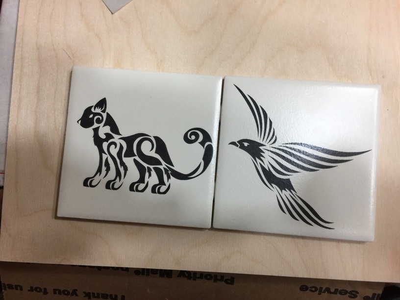
Two 4 1/2" laser tile test engraves, both focus @.135 other settings, 500 speed 50% power, the cat at 225 LPI and the Raven at 125 LPI.
The big thing is the speed difference, I did not notice any difference in appearance between the cat and the raven.
“Note: the images I used Bing for the search with, License, all creative commons, so I should be able to use them for my own use.”
And I did receive my box of 6" tiles, now I have lots of tiles to play with.
28 Likes
Those are just beautiful! I’ve got a box here that I need to decide what to do with!
1 Like
Those are beautiful! Something must have gone wrong with mine, it’s just light grey and washed out. I’m going to try again on a B&W image with your settings just to make sure it’s not the tile.
I didn’t take a photo and it’s not accessible now, but this still from the video is fairly accurate:
6 Likes
I don’t remember seeing it before but I see that the vendor website now has a settings and technical tips page…
10 Likes
Looks good, I did a photo that came out just like that.
I am not a Photoshop, Gimp or Affinity Photo expert.
After the first try, I did some work on the photo in Affinity Photo and adjusted the contrast, shadows and highlights, also tried several other things, adjusted the Exposure until I got the blacks in the photo, as black as I could get them.
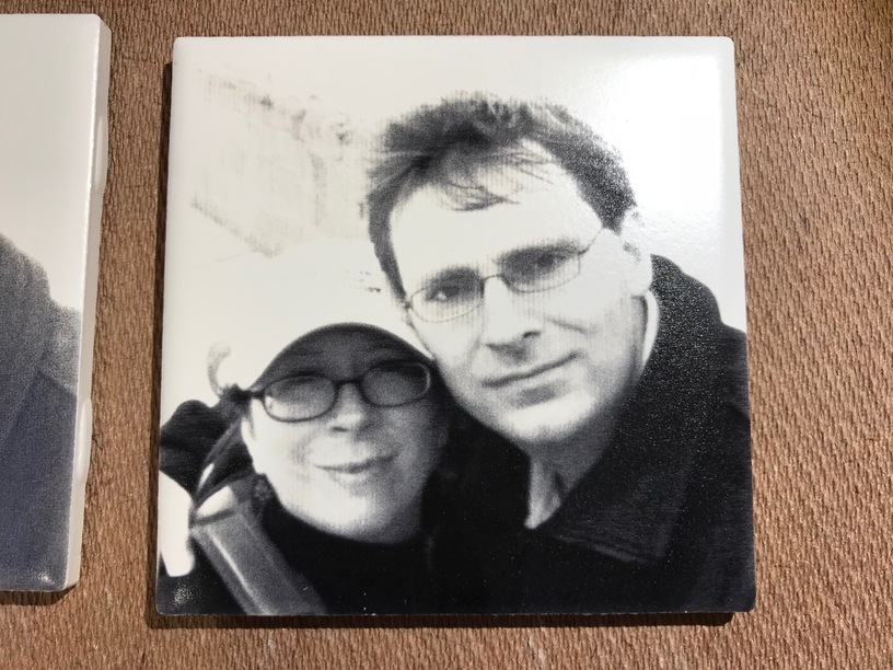
The remake of the photo came out a lot better.
toooooo many things to learn, it makes my brain hurt.
4 Likes
Haven’t yet tried one of my tiles, but I can sure identify with you, here!
What are the chances that you mean 4 1/4" tiles and focus @.315?
I’m still struggling to get that solid shiny black. But my tiles are 0.3" in height, and defocusing down to .135 just produces some speckles. I’m currently running a bunch of experiments but the best I can get is a medium dark grey.
4 Likes
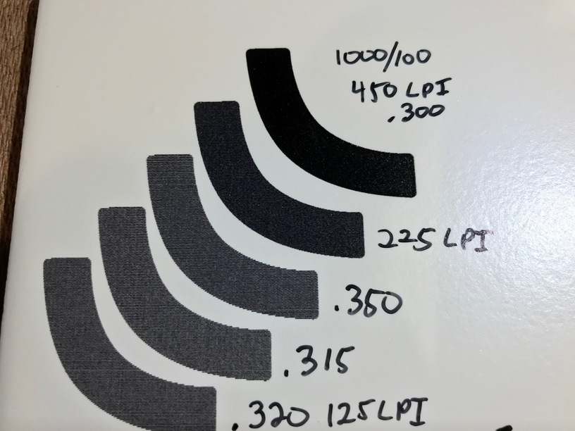
My best results so far have been at 1000 speed, 100 power, 450 lpi, 0.3" height, didn’t change focus. – I do think that’ll be too dark for some types of images but I like it for the test image I’ve been using.
8 Likes
Thanks. I’ve been using 125 LPI and it leaves very visible lines, but I only wanted to change one variable at a time. I just ran one at 225 LPI and it’s much darker and more filled in. Not sure why @numosbk was getting the same result at 125 but for me it makes a huge difference.
I’m going to try your settings now and one more photo engrave, and I’ll post my results.
2 Likes
I’ve run out of steam for the evening, so I’ll save the full-scale one for another time. But here are my test swatches.
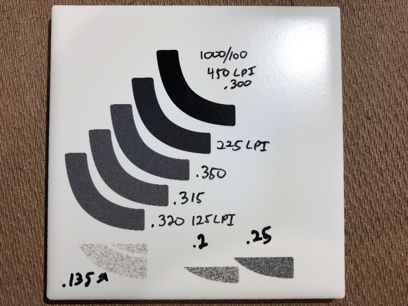
That top one is the super dark, high-contrast black I was looking for. Thanks very much for the numbers! Everything below that is 500/50. Interestingly enough, all the focus heights above .3 were basically identical, but lower than .3 looked like crap in varying amounts.
The other thing I think is quite interesting is that when it’s in focus, you can basically see the pixels. There’s no smoke contamination, and so little melting or spreading of the beam, that even at 450 LPI you can still make out the edges of the lines. This stuff is high-res!
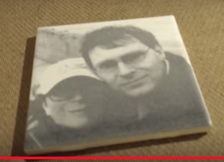
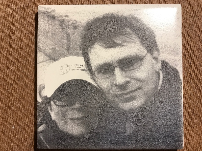
Finally, this is a better look at the picture from my earlier post. This was from when I first got the tile and made a guess at the settings. As you can see, when it’s not the size of a postage stamp, you can see how horribly it came out. Thanks to the help from everyone here, I know what this tile is capable of and I think I can do a much better job next time.
30 Likes
Oh wow! I haven’t seen any with that level of black. Very crisp!
1 Like
That’s incredibly useful. Thanks @Chris1
2 Likes
Thanks for those numbers. I am moving forward to trying my tile very soon, and your work here will be of great help.
I’m really happy with the range of grey levels available with the 1000/100/450/vary power setting. In fact, the usual trick of cranking exposure way up to prevent the shadows from being lost resulted in an engrave that looks a lot like it does on the screen, with the highlights completely blown out. That’s a good thing, because it means I can probably get a better image by actually taking advantage of some mid-tones.
The only problem is a weird vertical banding. I don’t know if that’s something about the way the glaze is applied, or an artifact inherent to the Glowforge.
And we need to actually get a decent picture of the two of us.
19 Likes