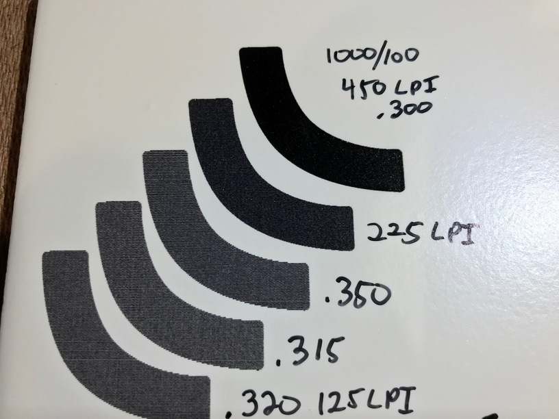
Looks good, I did a photo that came out just like that.
I am not a Photoshop, Gimp or Affinity Photo expert.
After the first try, I did some work on the photo in Affinity Photo and adjusted the contrast, shadows and highlights, also tried several other things, adjusted the Exposure until I got the blacks in the photo, as black as I could get them.
The remake of the photo came out a lot better.
toooooo many things to learn, it makes my brain hurt.
What are the chances that you mean 4 1/4" tiles and focus @.315?
I’m still struggling to get that solid shiny black. But my tiles are 0.3" in height, and defocusing down to .135 just produces some speckles. I’m currently running a bunch of experiments but the best I can get is a medium dark grey.
My best results so far have been at 1000 speed, 100 power, 450 lpi, 0.3" height, didn’t change focus. – I do think that’ll be too dark for some types of images but I like it for the test image I’ve been using.
Thanks. I’ve been using 125 LPI and it leaves very visible lines, but I only wanted to change one variable at a time. I just ran one at 225 LPI and it’s much darker and more filled in. Not sure why @numosbk was getting the same result at 125 but for me it makes a huge difference.
I’m going to try your settings now and one more photo engrave, and I’ll post my results.
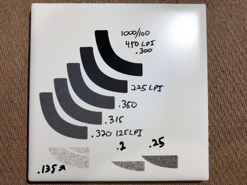
That top one is the super dark, high-contrast black I was looking for. Thanks very much for the numbers! Everything below that is 500/50. Interestingly enough, all the focus heights above .3 were basically identical, but lower than .3 looked like crap in varying amounts.
The other thing I think is quite interesting is that when it’s in focus, you can basically see the pixels. There’s no smoke contamination, and so little melting or spreading of the beam, that even at 450 LPI you can still make out the edges of the lines. This stuff is high-res!
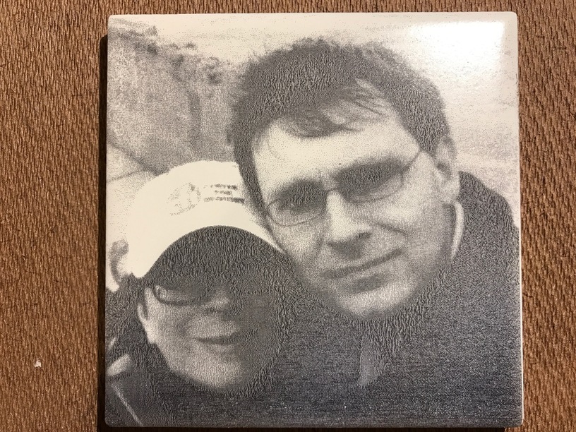
Finally, this is a better look at the picture from my earlier post. This was from when I first got the tile and made a guess at the settings. As you can see, when it’s not the size of a postage stamp, you can see how horribly it came out. Thanks to the help from everyone here, I know what this tile is capable of and I think I can do a much better job next time.
I’m really happy with the range of grey levels available with the 1000/100/450/vary power setting. In fact, the usual trick of cranking exposure way up to prevent the shadows from being lost resulted in an engrave that looks a lot like it does on the screen, with the highlights completely blown out. That’s a good thing, because it means I can probably get a better image by actually taking advantage of some mid-tones.
The only problem is a weird vertical banding. I don’t know if that’s something about the way the glaze is applied, or an artifact inherent to the Glowforge.
Engrave a solid square, then rotate tile 90° and engrave the same square on a different part of the tile. If banding is oriented the same on both, it’s the tile. If it’s rotated 90° on the second square, it’s the Glowforge.
Well, like I said in the post, I fiddled with the levels to make it very contrasty, as that’s what typically works on wood where there’s not much color difference between burned a little and burned a lot. This tile is a different beast, it allows for some subtlety. But instead of the shadows being crushed, it’s the highlights. The shoulder strap and hat is a good example. I’m used to things like cork, where that would be just solid charcoal on the bottom, but you’d be able to read the logo on the hat. Here the strap almost perfectly matches the source file but the hat is completely blown out.
I’m out of time but I think the next step would be to determine the lightest grey that shows up at all, and the darkest grey that is distinguishable from black, and map everything to that range. After a closer look, that banding occurs in the nearly white areas, so if I can avoid that tone it may be less pronounced. Of course I’ll try the experiment of rotating the tile too.
Here’s an update on those stripes. I did the test that @tim1724 described, and it indicates that the pattern is not in the tile, it’s coming from the Glowforge. Maybe something about the way the power is modulated at low levels? I hope this can be improved, because these tiles look great apart from that artifact.