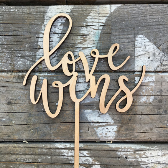
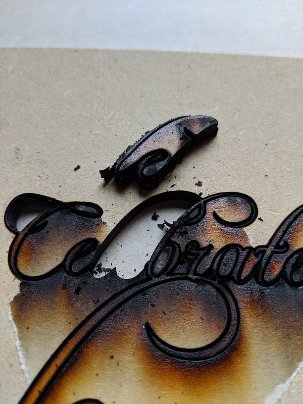
It’s failing because the resolution when I cut on draftboard isn’t very good. It basically burned out the little spots (like the inside of an ‘e’) and the only way to do it is to make the letters larger than I’d like.
My questions are:
Is there a better Mac workflow than:
Script font, in Adobe Illustrator, convert to paths, then use the Pathfinder panel to create a union (so each letter isn’t individually cut) then save as SVG then import, then change from engrave to cut…
Is a different proofgrade or uncertified material going to give me a better substrate to work with?
Any non-linear thoughts as to how you’d approach it, given the constraints of:
… it needs to be no more than 6 inches across
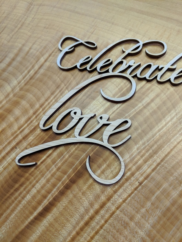
…it needs to be one unit, with a stick at the bottom
…it has a lot more letters than this one does.
Not sure I’m following you here… What do you mean by “burned out?” You’re performing cuts, right? Are you referring to flashback on the underside, burn debris on top, or ???
1: That’s pretty much the exact right procedure. (If your art has a stroke instead of a fill, GFUI will automatically set it to cut.)
2: I find draftboard to be a bit more prone to burning than PG plywood. Acrylic work very nicely for something like this.
3: The art doesn’t have to be only the text. You could add decorative elements (hearts, stars, clovers, horseshoes, etc.) to help hold things together.
Ok – you may indeed be attempting to cut too much detail in the draftboard. If lower power settings and or faster speeds won’t cut through, you might consider engraving your highly-detailed design, then cutting the outline of the entire piece.
What I will sometimes do with figures like that is put a stroke on the figures (after you have converted to outlines) the width of the expected kerf, then do Path…outline stroke, then unite the stroke’s outline with the figure. Basically you are padding the size a little to account for kerf. Keep in mind that you will also need to delete some inner lines inside the letter counters to get things to look right.
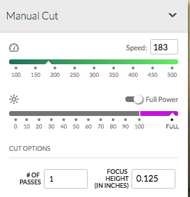
Yah, that ain’t right. It should be able to go through in one pass. Is that multiple passes, or just very slow with high power?
Did you use the proofgrade settings, or for some reason do manual?
If that’s one pass, it’s too slow, and may be out of focus. An upside down lens, or an issue with the mirror under the top of the head may be the culprit.
If you don’t figure it out soon, I can put together a list of the steps I use. Essentially, I create a path from a vector polygon, enlarge the stroke, union or combine the lines then do a stoke to path to generate the wider cut lines.
Digital files are highly variable. Digitizing in earnest started in the 1960’s so there are lots of differences in the structure of vector files. Many lines used to be double digitized before topology was invented.
I find that I have to use slight variations of my process to get the same result. Experience (making lots of mistakes and experimenting) is valuable!
i think the real solution was probably using maple hardwood.
i don’t think all the extra steps you went through before getting to illustrator did much for you. sounds like a lot of work that could have been done more easily right in illustrator.