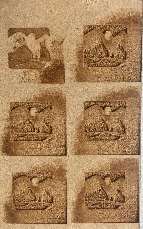
I’m working on a project that requires reproduction of a logo that uses shading for much of the design detail. The detail is not being well represented when engraved. I’ve run multiple tests with various settings, both default (it’s proofgrade material) and custom. Here’s a test piece using PG Draftboard in all six PG Engrave modes (same source image, not the logo in questions, which I’ve also attached.)
On examining these tests, I thought - you dummy, you need to switch to a density mode - dots or patterns. So I went thru the project in the GFUI, switching each to manual, and quickly discovered that’s how several of the defaults are set up.
So despite the differences between “vary power” and “convert to dots”, it’s still engraving deeper, as opposed to darkening, for darker shades in the source. There’s also little difference in engrave depth between the majority of these default modes. Looks great if you know what you’re looking at, but loses all definition if you don’t know what it is supposed to be.
I’m not very adept at engraving so hopefully those who are will weigh in. One thing to keep in mind though is that the darkness/contrast of the engraving can vary quite a bit depending on the material. For instance with this image I would expect to see much better contrast using Proofgrade maple.
The laser cannot really ‘paint’ the wood. Burn char from a cut is about the only thing it produces (which can vary with wood type used) and that can be cleaned off with Fast Orange and other cleaners.
What you get is a 3D effect, not a lighter or darker painting.
The 3D effect can be brought out with proper lighting, but I agree, if not in the right light, a 3D engraved chunk of wood does not look all that spectacular.
In a good light source like these, with a bright light from above, they look great though.
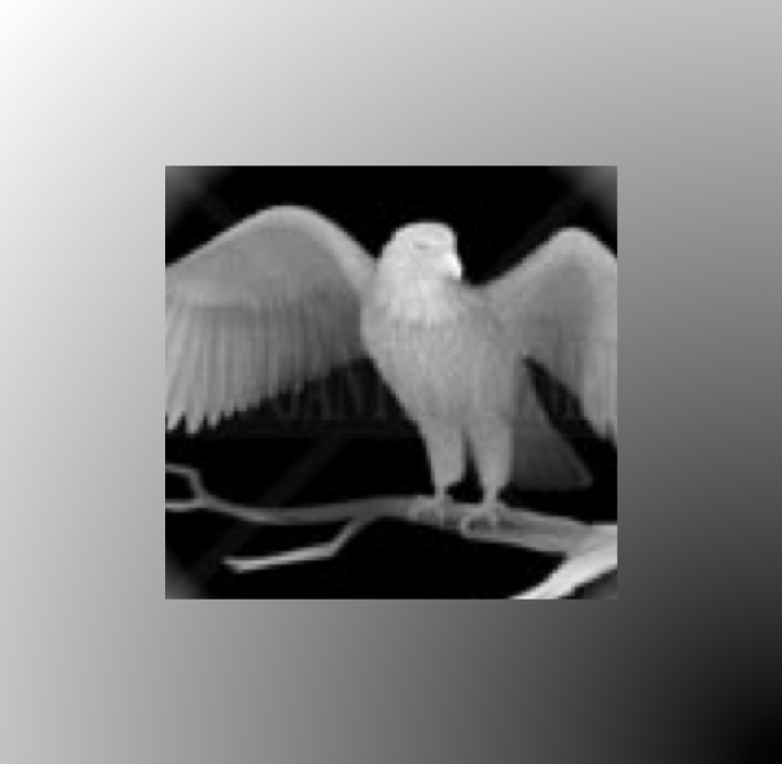
your original is very low quality and does not have good detail (i think i also see a watermark in there). you’re always going to have trouble getting a good engrave from an image that is blurry and doesn’t have good detail.
if you’re able to get a high resolution version of the image, you’ll have more luck.
Understood - this image is just something I threw together for testing, and is printed around .75" square. You are correct - low res (I think 256x256) and indeed, does appear to have a watermark. I just copied some random grayscale image that had a range of shades from a Google search.
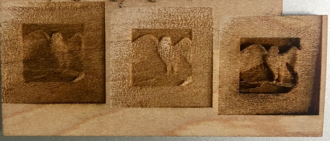
I did, however, just print a test of the desired logo onto maple as suggested by @cynd11 above, using default 3D Engrave settings, and the results are MUCH better than I had managed to achieve on draftboard. I have a few simple changes I can make to get a better look, but the maple has given me a much more detailed representation of the shading needed for this graphic.
It’s not really evident from the last pic, but to the naked eye, the detail in the right-most engrave is fabulously detailed compared to everything else I’ve done. It’s the only one, for example, where the beak is clearly visible, and the variation in depth really makes the overall image appear almost real. None of the draftboard tests came close.
TY, agreed. Starting to realize - although that can usually be adjusted via image contrast/exposure balance, in this case, the intended effect which defines the image is not coming thru because the levels are similar, it’s too subtle.
I’ve asked for source of the original design so that I can play with the contrast of each component. In the meantime, what I’ve been able to achieve with hardwood vs draftboard is going to impress the customer. I just know it could be much better…
I agree, the fix to get a really good result will come from the file end. You can only eeek out so much from a low quality file. I think getting a higher quality image will make a big improvement. You’ve done well with what you got though!
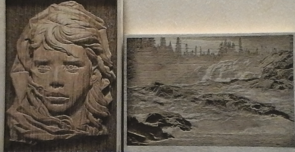
It may not be needed if you get a good file, bu there are lots of good examples of tweeking an image for laser engraving. This one has pretty good visuals I think.
The source image I have for the logo is pretty good and the difference b/w engraving on draftboard vs hardwood is significant, I had just not considered that to be so important.
Draftboard engraves are “muddy” in my opinion. Whether that’s because lack of a grain structure or whatever. It’s MDF.
If you want to do an engrave on draftboard, I would do a convert to dots and then a low power which should serve the result of just marking the wood, not engraving into it and the dots will serve as tonality in the image.
AND
If you want some cheap wood to play with, the Home Depot hardwood floor samples are a good start (free). But they are thick at 0.400 and hard to cut even if they do engrave well.
I also got some of their barbecue planks, since they can be cut better at only 0.250 thick’ish.
Amazon also sells the planks. The planks are knotty at times, but it is for learning the system, so a blemish will not stop the progress.
Thanks again, everyone. The logo engrave on maple hardwood scraps looks great, now I understand why my draftboard tests were so bad. I’ll probably produce the desired output on something exotic from Rockler in their 1/8" sheets - there’s a specific reason based on the customer that I want an interesting grain.