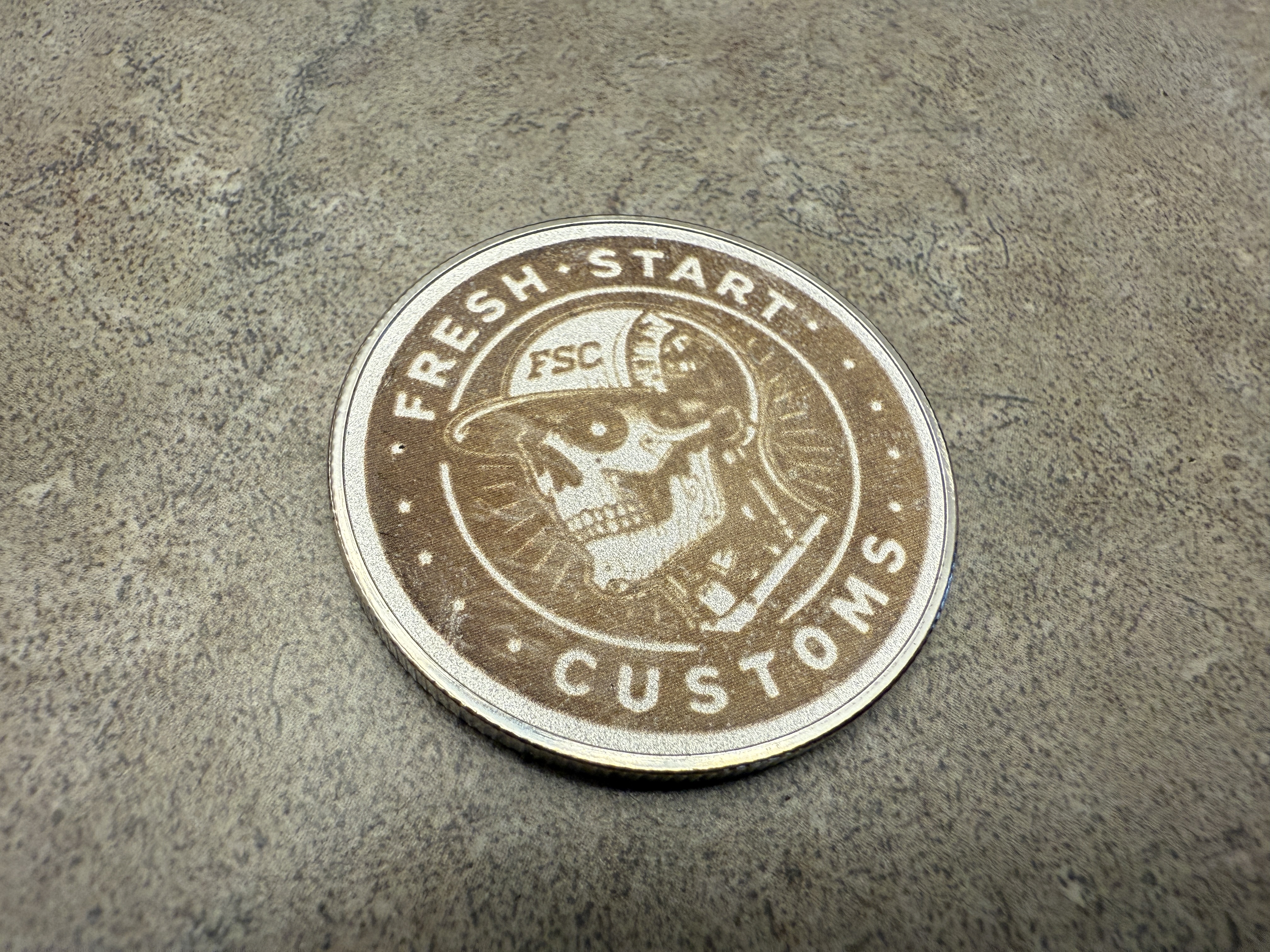
So question for you all. I kinda want a logo that’s easier to engrave that doesn’t have gradients in it like my current one which I do like just harder to engrave. I came up with this new logo cuz it has a wood grain face and mechanical tech in the head since I do videos on laser engraving stuff and tech stuff then my hat I wear in most videos. I kinda like it but on the fence but my family members don’t care for the skull look lol. What do you all think?
18 Likes
Probably just me, but I feel like a skull doesn’t match “fresh start,” only because something had to rot away to expose that skull. It’s a cool looking logo, just doesn’t match the name of the business. Feels more like a “second chance” or “next life” or “undead rebirth” instead of a fresh start. ![]()
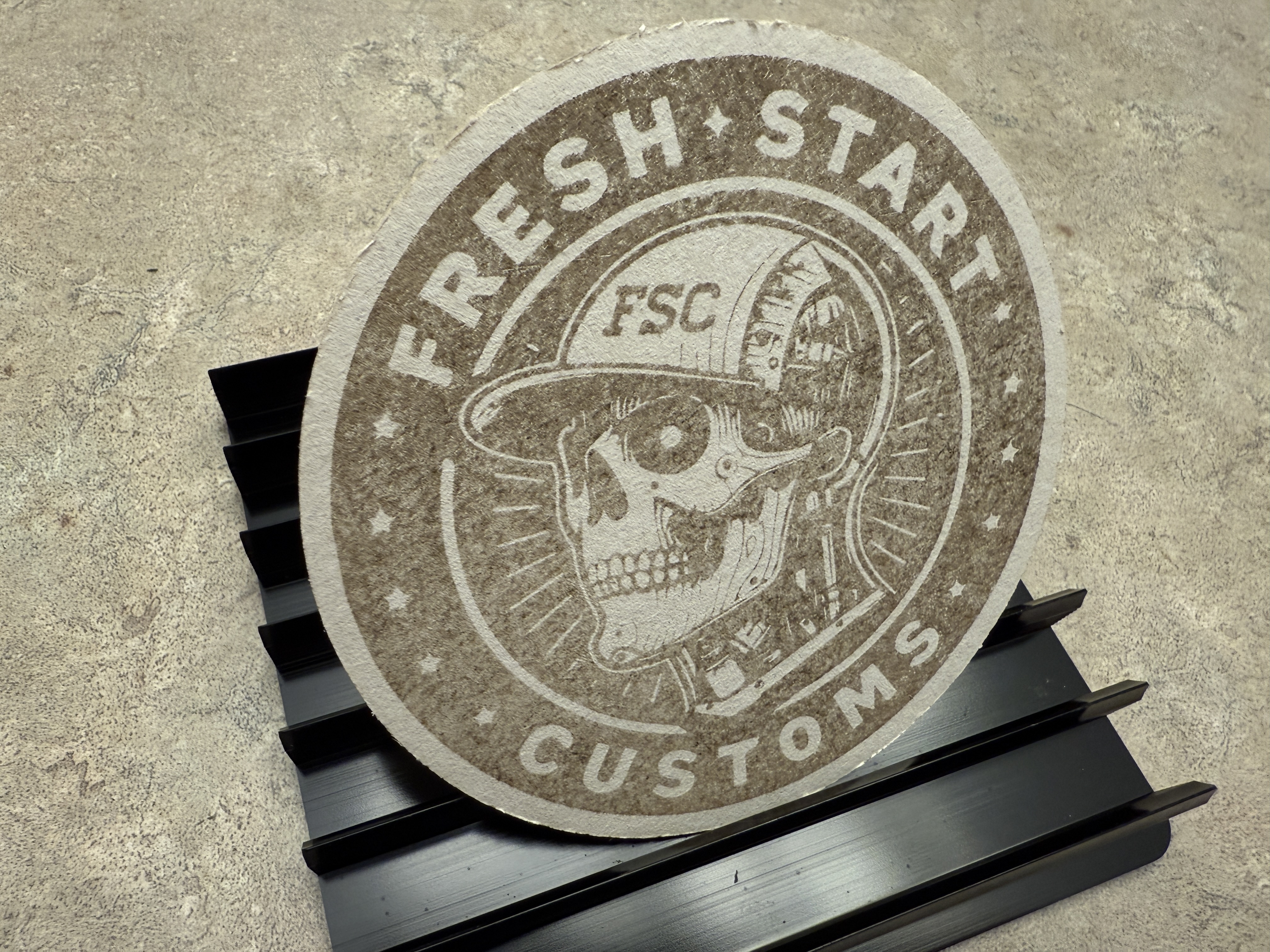
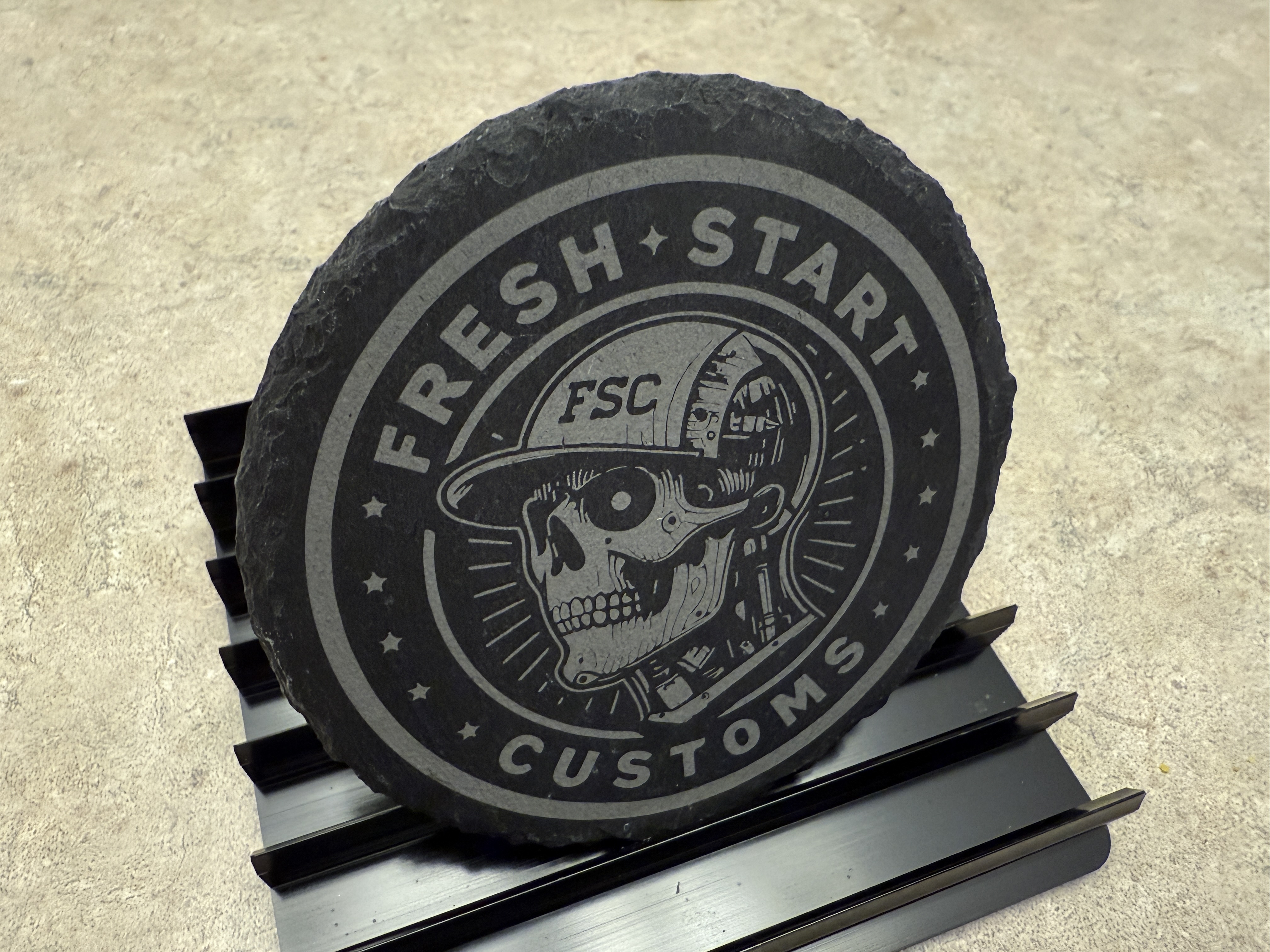
It looks super cool on the slate though.
19 Likes
what @CMadok said. nice design, but really not relatable to the logo name.
13 Likes
Yeah I can see that. Thanks
6 Likes
Thanks for the input. Probably should go back to the drawing board lol
6 Likes
I kinda love it, but there would definitely be a lot of people who say “ew”.
Is your current one your icon here? I feel like it would not be hard to make that both readable and not require gradients…though I would keep the full name surround that you’ve got on the skull one.
8 Likes
As a dnd nerd, it works for me. But also on the philosophical: For there to be a fresh start, the old had to end, otherwise, it’s just be a start; A fresh new day, the last one had to end; A fresh new life, had to leave the old one behind; A fresh new take, had to abandon the old opinion(if only to relate to another momentarily).
While some may not like it for the sake of morbidity, it fits quite nicely in many respects.
11 Likes
Too dark.
You’ve got the skull and the hat outlined (and you like them but, as noted above I don’t see how that is a Fresh Start), now invert everything around it so black text, rings, etc. Basically you have it already between the cork and slate coasters (since obv you had to engrave the skull for the white on the slate).
In my mind logos should be clean and crisp. Just my opinion since you asked! ![]()
Do what makes you happy.
9 Likes
Skull logos are common in certain circles. Military unit/mission patches, motorcycle clubs, tattoo and body arts, metal/punk bands etc. If you’re not adjacent to that, or if you don’t want to give that vibe, I’d stay away from that space.
9 Likes
I’ve got to agree with most here, Fresh Start might be better represented by a Phoenix?
7 Likes
Phoenix if you feel you’re rising from ashes, certainly.
Personally I’d go with something that associates with the primary goal or product.
8 Likes
Agree. Rather than look for something that speaks to the owner, it’s better to figure out who the target market is and figure out what would grab them. It’s just like product design - it doesn’t matter what we’d buy unless we’re looking to sell to us - better to figure out what the people we want to sell to want.
8 Likes
Maybe a loaf of bread or breakfast instead.m. Far from the skull and a totally different vibe. But every breakfast is a fresh start
5 Likes
It’s clean and nicely done, but somehow the concepts of “fresh start” and skulls just kind of clash, for me. “Fresh start” speaks of life and new beginnings, and skulls are endings, death and decay.
5 Likes
I browsed “ideas for fresh start logo” and this one stood out. Many others had a person, or a plant, but this one combines them nicely. You could easily create something similar from public domain clip art, convert to outline and score it… the defocused score is always handy for a thicker line.

6 Likes
I just knocked this up inspired by above while meditating. Hit me up if you want the SVG to play with and create vector paths from…

6 Likes
Thanks. I was hoping to have something with the FSC in it still. I am still thinking things over lol
4 Likes
You mean the text around the outside? I assumed you could just replace the skull with something like this, but keep the outside text.
So something like this?
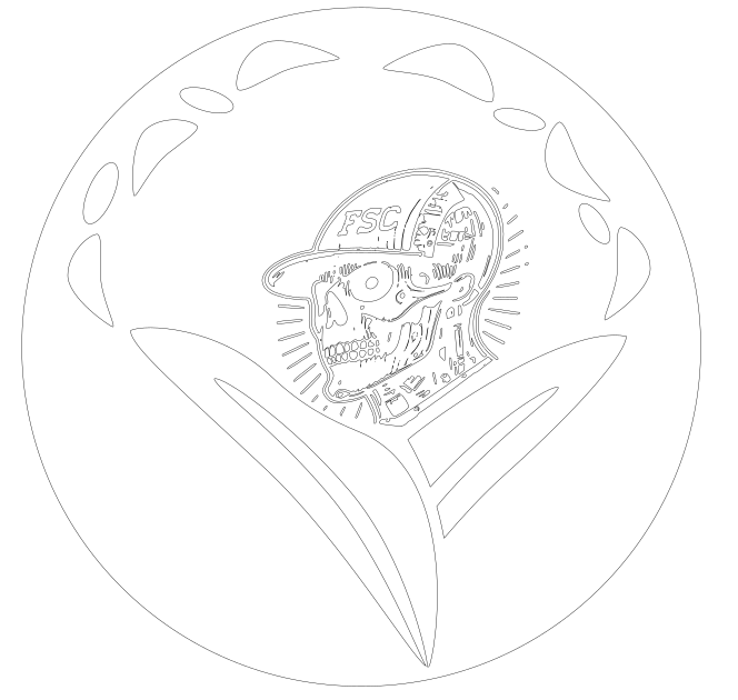
(again - with the text converted to score around the outside…)
A few rounds with “simplify” and a bit more cleanup, and sharpening up the FSC text on the hat makes it look quite good imo…
3 Likes
My idea logo would be a way to show it as just the letters FSC with some version of a laser engraver or beam but work in progress. I have a few ideas drawn up.
5 Likes
It’s difficult to make a logo that is clear, scalable, and distinct. I’d probably avoid putting too many literal elements in the design, it’ll be crowded at smaller sizes.
While it’s possible to have multiple marks for different size renderings I would recommend shooting for one that works at a wide variety of scales. It’ll simplify your life and make your branding more consistent and recognizable.
5 Likes