This one lookspromising. Perhaps remove a few of the parts in the hoop overhead and space them irregularly to not suggest a jump-rope
5 Likes
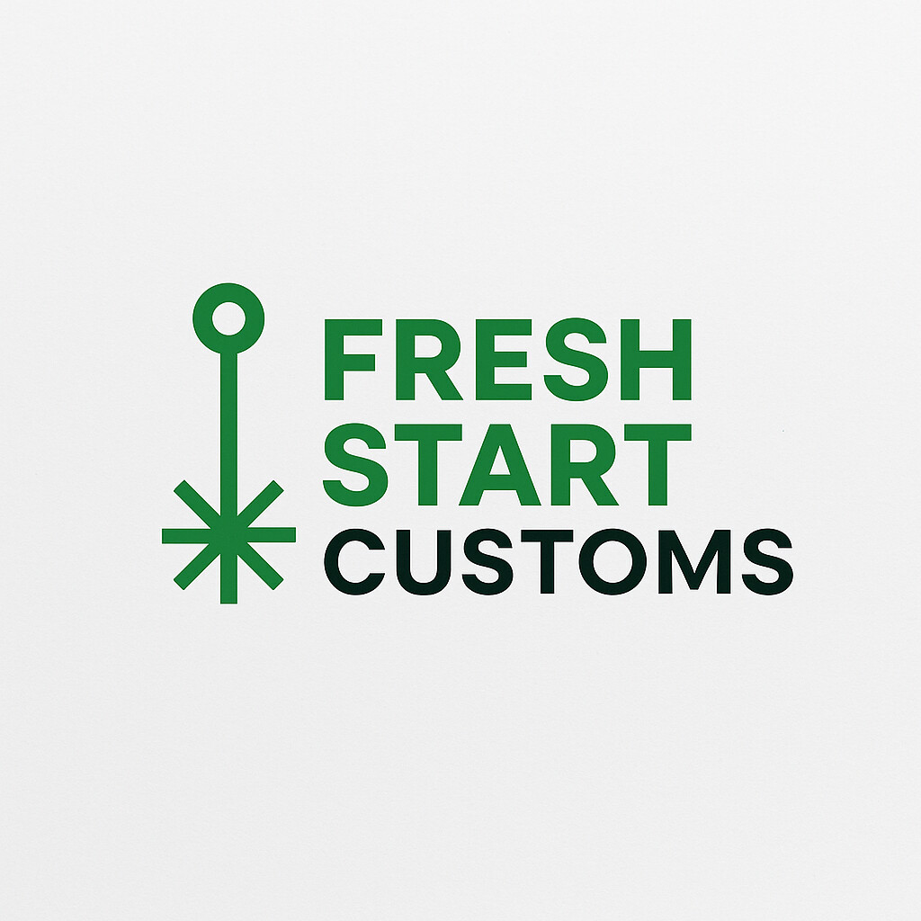
I’ve been thinking about what is common among all famous logos and it is they are as simple as they can be and still be unique. Look at @Aloha second one above and you have a great starting point.
6 Likes
simple, simple, simple. the more complex it is, the more you’ll have trouble creating it in multiple ways. do you want it on a tshirt? gotta be able to do it in simple vinyl or screen printing. will you ever put it on a board with a bunch of other logos at some event? it may be scaled pretty small and then any detail will get lost. and, most importantly, how will it laser engrave? so, simple = most flexible and safest. in the good old days, one of my favorite tests was to make it 1/2" and then fax it to someone. if it looked like crap, it was an unsuccessful design.
the most recent couple i’ve done (i don’t do a lot at work any more since i’m in-house) are my own and the guitar build company. both engrave well and both are simple tshirt prints either in vinyl or silk screen.

9 Likes
We’re showing our age here! Not sure I could get myself on the receiving end of an actual fax these days ![]()
8 Likes
we still have copiers that can fax in my office. thank god, because some things in the medical field still have to be faxed or sent snail mail. so every once in a blue moon, i actually use it.
but it’s not still as good of a test as it used to be because faxes are now over the internet and they don’t degrade quality the way they used to. both from the heavy compression to go over a really crappy essentially modem and the printers aren’t crap thermal printers anymore either.
7 Likes
I had to subscribe to an electronic, web-based fax service for several years.I think they still exist…
I think there was one instance in the last two decades where I had to go to a FedEx print store or similar to send one.
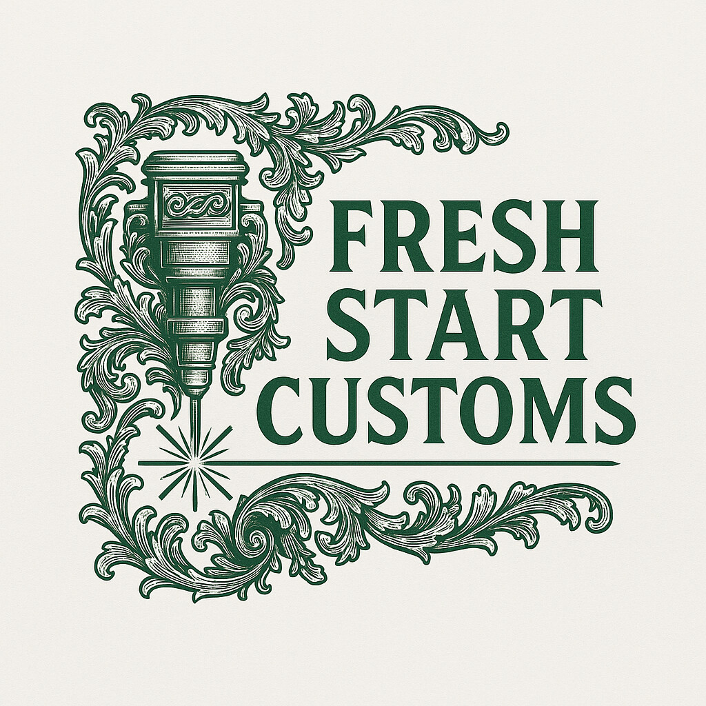
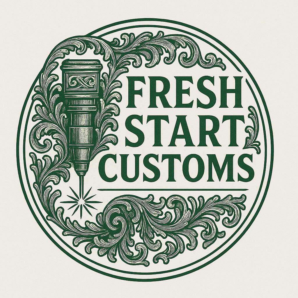
Back to the logo, though - although the first and third by Aloha are pretty for print, they won’t translate well to laser, and the goal here was to come up with something that doesn’t need gradients to engrave well…
5 Likes
they’re nice looking, but they violate the “simple” rule, which can be fairly important as a logo. fine lines and complicated designs create too many long-term potential issues and limit the flexibility. granted, this isn’t a corporate logo that needs to work in oh so many places, but still, why limit yourself?
there’s a reason iconic logos are iconic, and i’ve never seen a complicated iconic logo.
7 Likes
I had the online fax until recently. I got it years ago when I needed to send one, and I’d gotten nothing but junk mail on it since -and then this month they said I’d have to pay for the privilege ![]()
4 Likes
I think those are much closer to what you are looking for.
6 Likes
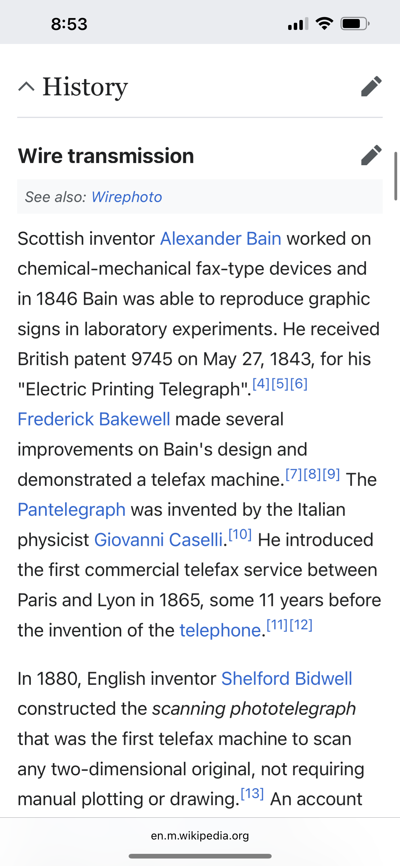
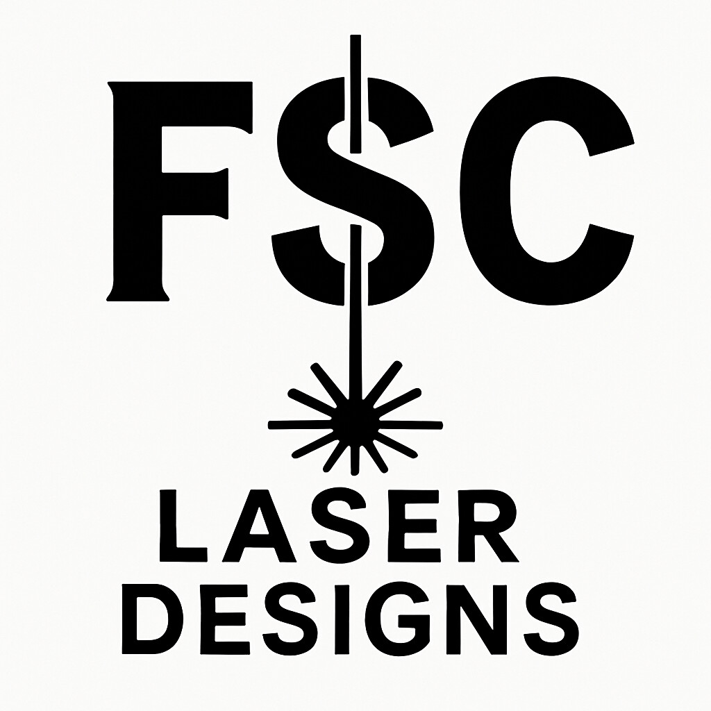
I like the line going through the S better, the drop one makes it look like jewelry or a chandelier ![]()
4 Likes
I agree, I like a laser going through it.
4 Likes
This is what I mean by scalable. When you go to smaller sizes with your logo you lose your detail and separation.
I think the bolder version from before works better in that regard:

4 Likes
The FSC with laser, as long as the full name is in the circle around it, I like that.
It says more about why there’s a laser symbol, which isn’t obvious to much of the public…
5 Likes
If you incorporate laser into the name you’re limiting your business model.
On the one hand it tells you what you’re getting but on the other hand it makes it so that if you want get into 3-D printing or if you start doing CNC…
Heck if you even wanted to do a partnership with a graphic artist and you’re selling prints or something. I think fresh start customs is a great business name; I’m not sure I would limit it to being laser-specific.
6 Likes
Good points
2 Likes
You’re right, the first FSC with the magic wand laser, and the words “Fresh Start Customs” around it would tell people what FSC means. I don’t think “laser designs” needs to be in there, maybe just Fresh Start Customs Designs in that circle. But then other versions, you can just have the FSC with the magic wand and then the full words “fresh start customs” in a line somewhere else, like the logo small on the pocket of a sheet with the full name on the back type of thing.
@wenning08 I like the first logo better, with the line going all the way through, in case you didn’t notice… because it looks like a magic wand…
5 Likes